FVN Reviews & Recommendations » MAY WOLF 2024 reviews
MAY WOLF 2024 reviews
This year's installment of the MAY WOLF game jam once again tasked participants with making a wolf-adjacent visual novel in one month. And some visual novels were made! So many, in fact, that reading through the entire set became kind of a tall order!
But I have completed the task; scroll below to see my takes.
Top Picks
Here are my personal favorites and some other solid entries grouped by genre.
- If you're in the mood for something light and cute, read I'm Now the School Delinquent's Lover, but I Want Out!!
- If you like urban fantasy, read Ugolino in the Tower or Imperfect Facets
- If science fiction is more your thing, read A Rebound From MARS!
- If you want romance in classic visual novel fashion, read Donut Holes or TUNING OUT
- As for fantasy, read The Wayward Tower
- For an intriguing mystery story that doubles as the most stylish audiovisual package in the jam, read One More Light
- To just experience some good comedy, read Maywolf Mysteries or Badminton Ace
- If you consider yourself someone with a refined taste in literature, read SPAGHETTI
Look Mom, I'm on TV
This year I participated with a submission of my own, My Municipality – Oi kuntani mun.
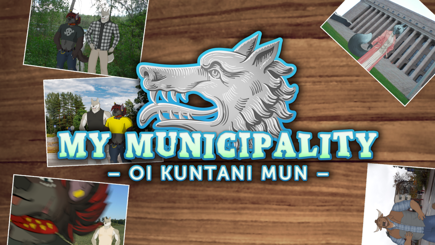
My Municipality
by purkka
What if love was stronger than the Municipal Regions Act?
Read it if you want to see the Helsinki–Sipoo municipal border conflict of 2006 dramatized as an animal tale with hints of romantic comedy and nonfiction.
The Whole Menagerie
As for the rest... here are the reviews, presented in a completely random order to sidestep the difficulty of compiling a sensible ranking.
I try not to go deep into plot details since doing that rarely makes for good criticism anyway, but there are minor spoilers of all sorts. If something catches your eye, just go play it!
Also, needless to say, I'm just one lion with a website and an unhealthy obsession with Madame Web. Don't let my negative opinion prevent you from checking out a game if it seems interesting; as far as I'm concerned, coming across something you like that way counts as a success in curation.
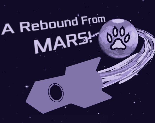
A Rebound From MARS!
by Kraaj
Shine bright like a dogman
Show Review
I appreciate the boldness in sticking to a fairly monotone color palette and the clean, sleek UI. The VN is simply pleasing to look at despite having somewhat of a lean towards minimalism, and it gives and all the carefully scripted sprite animations and animated scenes a nice extra punch.
Narratively, A Rebound From MARS! takes a while to get going due to waiting for what feels like slightly too long to establish the stakes and the mechanics of the whole thing. Luckily, the comedy, the lush descriptions, and mining the conceit for some smart character moments keep it a breeze to read in spite of the gargantuan – by the jam's standards – length. Maybe it's just this being the first installment in my MAYWOLF2024 journey, but I didn't peruse the Itch page that thoroughly and was genuinely surprised to see this almost hit the word count limit.
As a jam entry, I think the game misses some opportunities to use the theme more thoughtfully; I can see the idea, so it wouldn't surprise to hear all that just didn't fit in.
Recommending a double feature with: UNDER THE SKIN (2013) dir. Jonathan Glazer
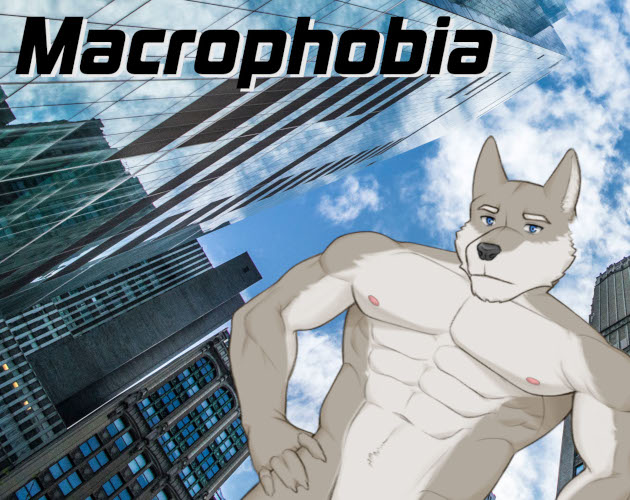
Macrophobia
by GatrGroh, PeppekzMagiMerlin
A short furry visual novel with a massive wolf.
Show Review
Okay, can't lie, Macrophobia is more than a little rough around the edges in terms of visuals – see: the low-quality backgrounds & edits, the standard Ren'py interface, the title screen. But its kinetic, frenetic energy is nevertheless fun to see in a medium traditionally not built for those things. The premise of the story is a very visual one, and it's a big factor in the game's favor that this is reflected in the presentation as well.
With only what feels like the basic starting point to read at this point, it's impossible to judge the plot fairly. I will say, though, that the writing comes off as hurried and burdened by its concern for lore & logistics, with a lot of "as you know" dialog and dream sequence backstories and comparatively little characterization or depth. For something that makes the setting its central attraction, I wish it spent less time in exposition mode and had more room for the detailing and the vibes of the world to settle in.
Just sort of difficult to enjoy in this state, edging the reader with not much grace towards a payoff that never comes.
Donut Holes
by CuriousCritters, Mako, NoteYote, ForsetiFox
Sometimes the sweetest treat is the wolf we meet along the way.
Show Review
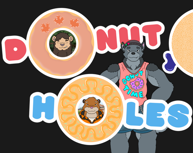
It's what we like to see: a well-flowing story that uses a lot of classic tools (the three-act structure, the food/sex thematic intersection) to a great effect. There's a tangible sense of specificity to Donut Holes, too, both in how it considers the furgonomics of making donuts and how it portrays running a food truck in general.
The cartoony art style fits the vibe perfectly, and the character designs feel purposeful in their use of color & animal characteristics. Although the interpretation of the game jam's theme is not the most creative one, I like the effort & care put into its visual implementation – the thinnest variant feels almost unbalanced in how lanky it is, which really makes the later sprites pop. Simply a solid, thoroughly enjoyable package.
Worth More Than Words
by JMJerbear
Entry for May Wolf VN Game Jam 2024
Show Review
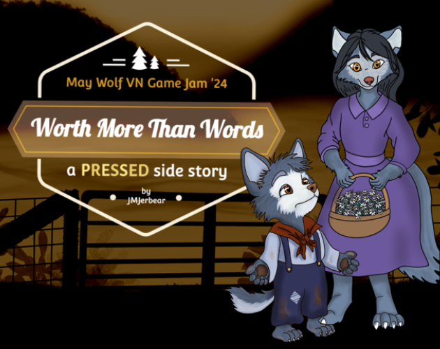
The art does its job, although all the sprites staring directly at the camera gets a little monotonous to look at. If there's an area of development, it might be the shading, lighting, and the color choices being so simple that they don't really evoke a mood; the main image isn't quite strong enough for its role as the visual centerpiece.
While I'm not familiar with the main work this VN is a part of and can't judge it in that context, the frame story doesn't really justify its inclusion and just eats away some essential simplicity here. There are enough narrative layers that it starts to hurt the story, and most of the visuals exist for the least interesting parts as well. It doesn't help that the interpersonal conflict feels like it's all stated instead of dramatized – you don't get enough about these characters to be able to engage emotionally or for a true sense of dialog to emerge.
For something this small in scope and intending to present itself as a standalone work, I'd shift the focus towards the monolog, which does have compelling bits of historical description. It's a classic setup for a short story burdened by all the extra fat.
The Awakened
by JMJerbear
May Wolf Jam 2024
Show Review
First of all, it kind of bothers me that for what is a story with elements of action and intrigue, The Awakened makes telling and explaining its primary narrative mode. Character relationships are stated instead of shown, worldbuilding is mostly exposited, and there are tangents where societal issues of marginal relation to the story are discussed at length – the game simply feels undernarrativized. One aspect contributing to this is the lack of narration. It feels very surprising, considering the subject matter; the physicality, the sensations of transformation don't really come across.
Also, while I get the sense that the tonal whiplash is intentional, I'm not sure if the game leans quite hard enough into it to really sell the absurd vibes. It feels like the story is more so using its light mood as a means of sandpapering away aspects of the premise that would cause friction and conflict. This kind of approach can work if done well, but here I think it causes the game to lose a lot of its stakes.
Regarding the presentation: though there's a lot of art, I'm not really sure if the quality vs. quantity tradeoff is worth it here. You can see plenty of signs of game jam rush, like many of the sprites having parts of their ears cut off.
And, as for the jam's theme, the idea is obvious enough and even firmly grounded in what was established about the setting, but the (admittedly good) punchline nevertheless feels a little tacked on instead of being what the story is about.
Apathesis
by ragmaan, Tetracera
Some ideas are harder to swallow
Show Review
It's nice to see something this formally ambitious in the jam. The result feels slightly clunky and underplaytested, however; how vague the feedback is and how easy it is to misinterpret as the game misleading you means that it's too easy to lose track of what you're doing and what you already tried. How much new text there is across iterations, tricking you into thinking you discovered something new or are on the right track, doesn't help. Simple as the underlying mechanism may be, the game doesn't communicate it well enough to provide compelling puzzle gameplay – I spent more time wondering how exactly this thing works (do you need to exhaust all options & see all text? do you need to make whatever the correct choices are just once, across multiple iterations, or during a single one?) than "solving" it. (as in, looking at the script because it was really just not fun anymore and i was afraid i had somehow misunderstood the point)
The prose gets points for style, even if the dialog in particular feels overwrought and rhythmically weak at times. Between that and the image choices and the audio design, there's definitely a mood successfully established. I don't mind the character portraits remaining quite thin – it feels purposeful. Those two guys who show up sometimes not amounting to a lot or not leaving much of an impression maybe feels like a slight misstep; there was room to exaggerate them a little just to juice up the character interactions.
As for the ending, I feel like it lacks the proper buildup to land as an anticlimax. The tension dissipates away in the "gameplay" portion, at least if you're spending a lot of time stuck in it, but it doesn't feel like this is taken into account – the story essentially goes from 0% to 100% and the abruptly ends. There's nothing too surprising or incongruent about the general nature of the climax, but it just doesn't feel like it follows from what comes before tonally.
Apathesis deserves praise for taking a big swing and its strong sense of style, but the final product is often too frustrating for its own good.
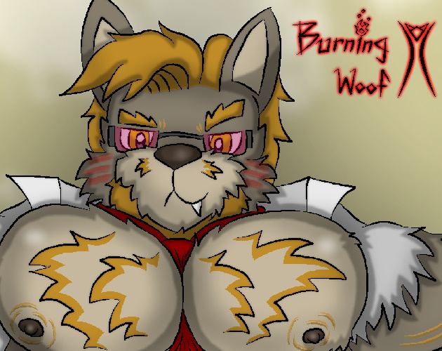
Burning Woof
by WackyWoof
Discover the Burning Woof event, in the company of a new sexy nudist wolf friend
Show Review
The art is charming and has all kinds of nice extra touches that help the game establish its style & mood – there's a sense of steady directorial touch. Similarly, the comedy is hilarious, even if the whole doesn't feel perfectly balanced between humor and drama. Despite being overall pretty light in tone, low in conflict, and transparently horny, Burning Woof isn't really structured around its excellent gags or sex per se; the slightly less compelling character drama and slice-of-lifey exploration of the setting are what pushes it forward.
In that way, it kind of feels like a game not playing to its strengths. I was interested in the premise, but while the comparison between Burning Man and furcons is a fascinating idea, it was conveyed almost entirely via the author's note at the end – the way the work itself talks about the event feels plainly documentaristic, with not much deeper insight or satiric edge to it. The whole thing is basically taken at face value, and I guess I was just expecting some kind of novel angle, since the setting is such a narrative centerpiece even the interpersonal conflict can be seen as an extension of it?
Also, when it comes to the prose: grammar, punctuation, and vocabulary are often rough in a way that feels hard to ignore. There's a strong voice, but in my opinion, being more thoroughly edited would only help bring it out. Most of all, the linguistic quirks bleed into each character's dialog in a way I think doesn't feel entirely purposeful and makes them not as distinct as they could be. The VN is not unreadable or anything, and there are plenty of neat descriptions and fun lines, but the writing could be sharper.
Honestly, I'm not trying to be a hater here; Burning Woof was a breezy, engaging read with a clear vision. There's just a lot about the execution and what the story ultimately accomplishes that gives me a slight pause.
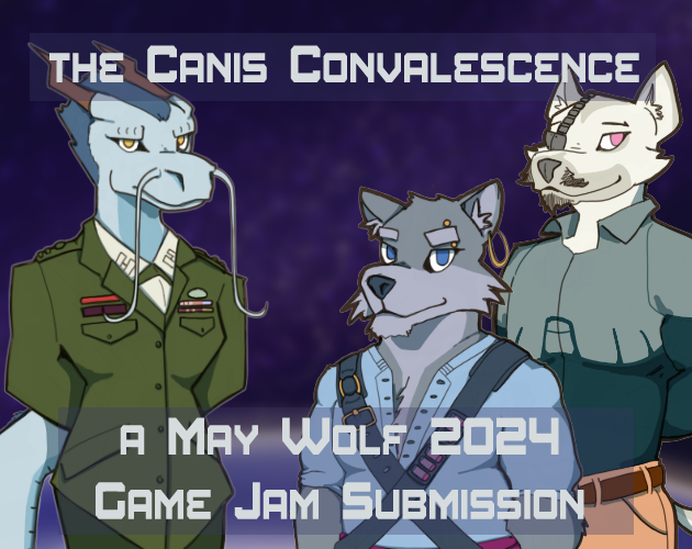
the Canis Convalescence
by the Magic Tuba Pixie
a MAY WOLF 2024 Game Jam Submission
Show Review
The Canis Convalescence is brief, but not to its detriment; it feels appropriately scoped & paced and has a clarity to its arc. Only the middle section comes off as kind of rushed – with such a long in-story timeskip, I feel like the relationships could have been developed further, although I like the endings. There's a "grounded and understated drama... in space!!!" vibe to it that I really enjoy, and the 4th wall breaks feel tasteful and carefully placed enough to not detract from it.
Not a lot of polish issues, either – the writing voice is fine and even makes the unconventional 2nd person feel quite natural to read, and the art is nice. Background images being different aspect ratios looks a little weird, though; I feel like all of them could just have been cropped. Also, the complete lack of audio (unless my computer was acting up) is kind of a shame.
Just a very solid game overall – as a jam entry, it occurred to me just now that I didn't actively think about the theme while reading and am not sure how, if at all, it was implemented?
(Also: might be prudent to remove the old version from the page entirely, looks like I accidentally downloaded that one)
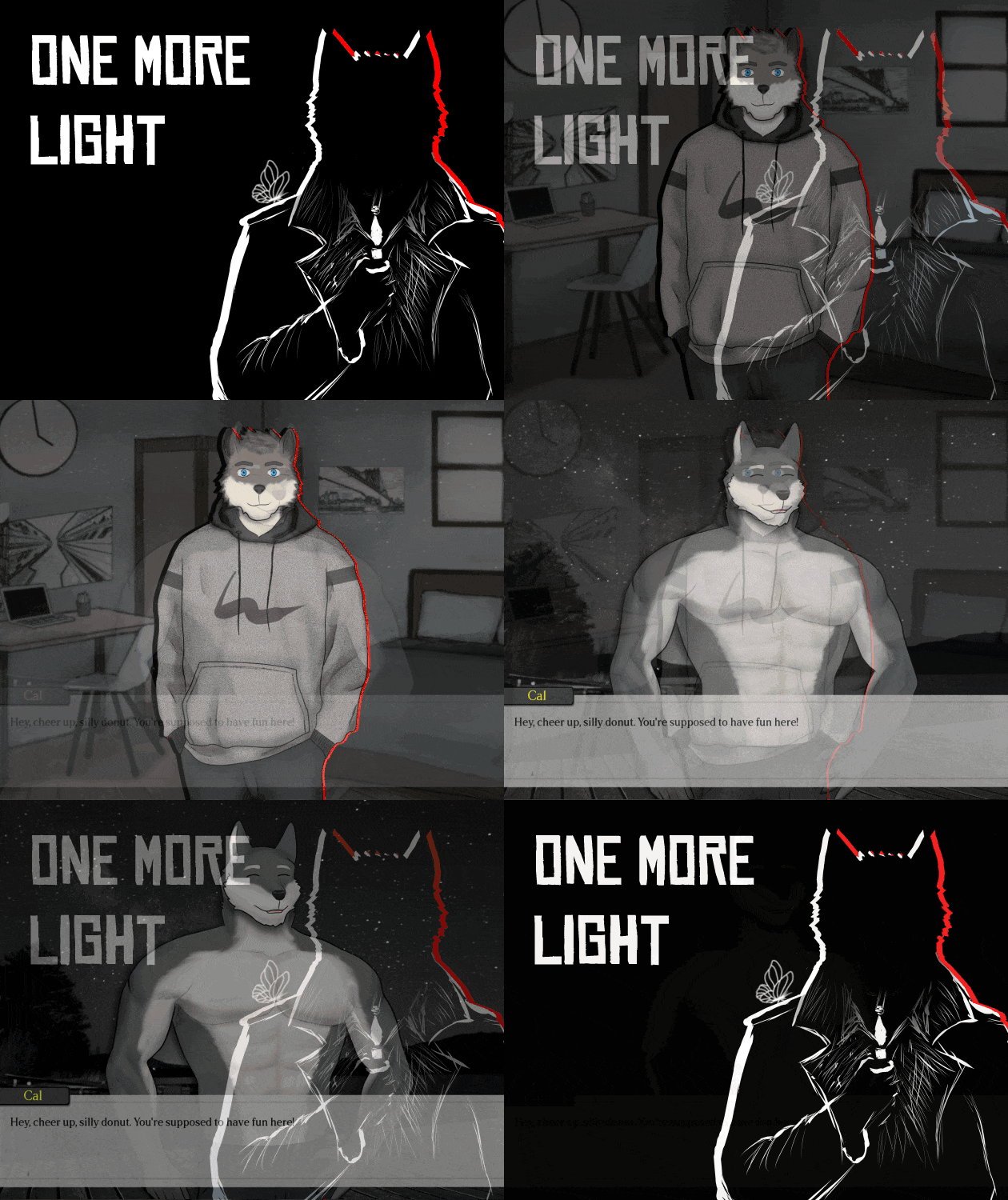
One More Light VN
by ErebusWulfe
A furry visual novel. The thread of fate has always been here.
Show Review
First of all: oh my god, this thing is so stylish? Definite jam winner material at least in terms of production values; the attention to detail is amazing, and the entire medium is explored and used. A very jarring background image showing real-life humans might be the only visual misstep, as painting furries over photos is relatively common. It really feels like an oversight.
Though unfinished, the story's patient pacing and its willingness to go for big swings already show a confidence in storytelling I always appreciate. The direction is also just so sharp; visuals are always used with purpose and to emphasize what the narrative is saying. Something feeling like a cheap gimmick or too melodramatic is a risk when you have this much stuff going on, but One More Light remains steadily tasteful and controlled. The only thing I'm not crazy about is the amount of pauses – less could be more in this case, especially when the numerous animations already stop the flow of text every so often.
The prose is pretty good, too, despite typos and such being common enough to betray the fact that the game was made under a strict time limit. Character voices come with a sense of grounded realism, and I think the narration avoids feeling too flowery despite playing with a lot of different images and metaphors. The writing is pleasant to read all around and clearly pulling its own weight.
What else is there to say – very good, and very impressive for a game jam project. I have to confess to having liked the moody opening slightly more than the VN going all plot mode, but don't count that as me not being excited for more.
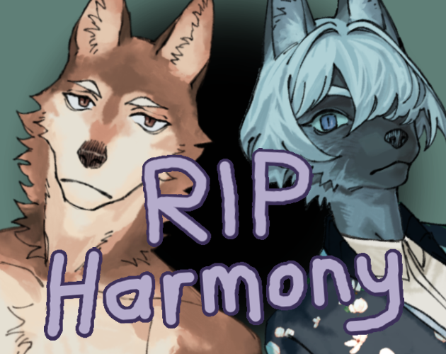
RIP Harmony
by bored_kitty
A first date (gone wrong)
Show Review
Mostly, I think, the game's briefness works against it – with so many surreal non-sequiturs and scenes of characters telling what they're like instead of it being shown, it didn't really feel like as if they had actually been on a date, you know? Even this sort of primarily comedic piece benefits from an impression that you've been on a journey with the characters and witnessed things happen. RIP Harmony ultimately feels more like a collection of admittedly funny contextless moments than a narrative. I didn't really get the framing device, either.
Can't really say I had a bad time playing the game – it's engaging enough on a line-to-line basis. Such a short length just demands more of a clarity of purpose to every element for the final product to not feel entirely weightless.
Wraith
by hornsey
A young woman must fulfill her best friend's last request.
Show Review
The premise feels fresh, and the prose is sharp – the opening line is great, one of the better ones I've seen in the jam so far. Without spending a lot of words, Wraith also manages to establish a striking mood and paint fairly believably character portraits. The biggest writing adjustment I'd make is keeping the lines a little shorter on average; some are long enough that they don't fit in the UI, and in general, I think visual novels read a little smoother with tight sentences that really drive you forward to the next text block.
Presentation-wise, the game is pretty plain. How the sprite is positioned unfortunately looks somewhat goofy, and the unedited backgrounds – many of which don't necessarily look like they belong together – don't really help avoid the impression that you're looking at a bunch of stock photos. The credits sequence is a nice bit of visual flair, but I would have liked seeing more of that in the actual story, too.
(As for the jam's theme: ??? maybe i'm just bad at reading but i didn't really notice anything that felt relevant)
New World Symphony
by KarlSmith, PeppekzMagiMerlin
The symphony of a new life.
Show Review
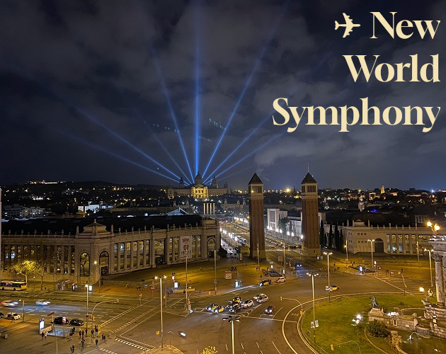
My apologies to the New World Symphony team, but the first "centerright" was possibly the funniest thing in the game, if not the jam in general. Though I was aware of the find-replace mishap, it slipped out of my mind after I got into the story and caught me off guard so hard I laughed until there were tears in my eyes. Sincerely, thank you all for this beautiful moment that perfectly embodies the spirit of game jams.
As for the actual content of the thing: the roughness of the prose (in terms of typos, grammar issues, etc) aside, I thought the writing was very good at sprinkling in little details and finding novel ways to phrase things. The characters, their relationships, and the dialog felt impressively textured and specific, and there was some genuine tension and drama to the final moments! All in all, though a careful editorial touch could make the VN a lot smoother to read, it has a voice, and that's always the most important thing. (That's enough caps lock, though.)
My biggest gripe is probably how the story is structured. It kind of unevenly slides from the first big scene to the second, not really feeling like an effective, fast-paced montage but not giving things enough time to breathe, either.
What else... the music, although pretty subdued, is nice, and I like how bold the CGs were with their use of color. How the jam theme is used feels so literal and on-the-nose it kind of loops back into being good? Pretty solid entry overall, and definitely has its charms beyond the already-iconic centerright/centerleft issue.
Expanding Sizes and Feelings
by Hollow
Confessing massive feelings doesn't always go how you expect.
Show Review
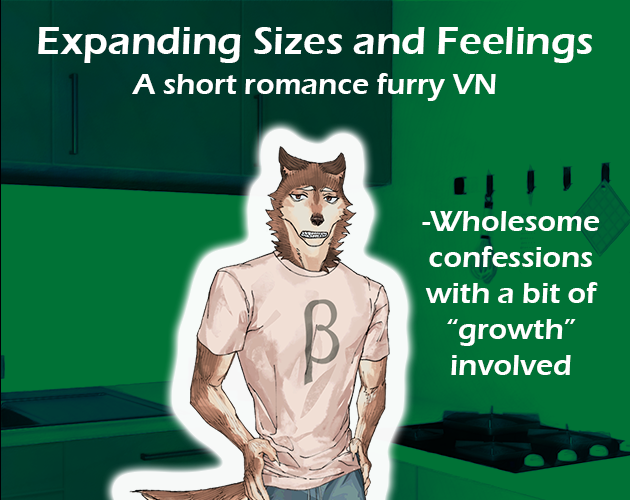
The prose is functional; I think the biggest nitpick I have is the repetition of some phrases and words. In terms of pacing, the game patient but not slow, taking its time to set up properly and managing to imply enough history to make the developments feel earned. I also like that the comedy inherent to the premise goes so understated – it's all pleasantly mundane in spite of involving a wacky magic gem with inexplicable powers.
That being said... given that there's a not-insignificant amount of words to read and that the plot leans towards thin, with the mechanics and the mysteries of the whole thing being so vague, I feel like Expanding Sizes and Feelings could have safely ended on a more conclusive note. I'm not even necessarily talking about resolving every plot thread; just something more satisfying as an emotional ending would be enough.
The jam theme is applied in a bluntly literal but effective way. The only thing I'm not quite sure about is the "and" in the title – I feel like the metaphorical link between physical and mental expansion would be the most interesting thing for a story like this to explore, and there's not necessarily a lot of that in here.
What We Were Wolf
by ShapeshiftGlitch
Life After Betrayal
Show Review
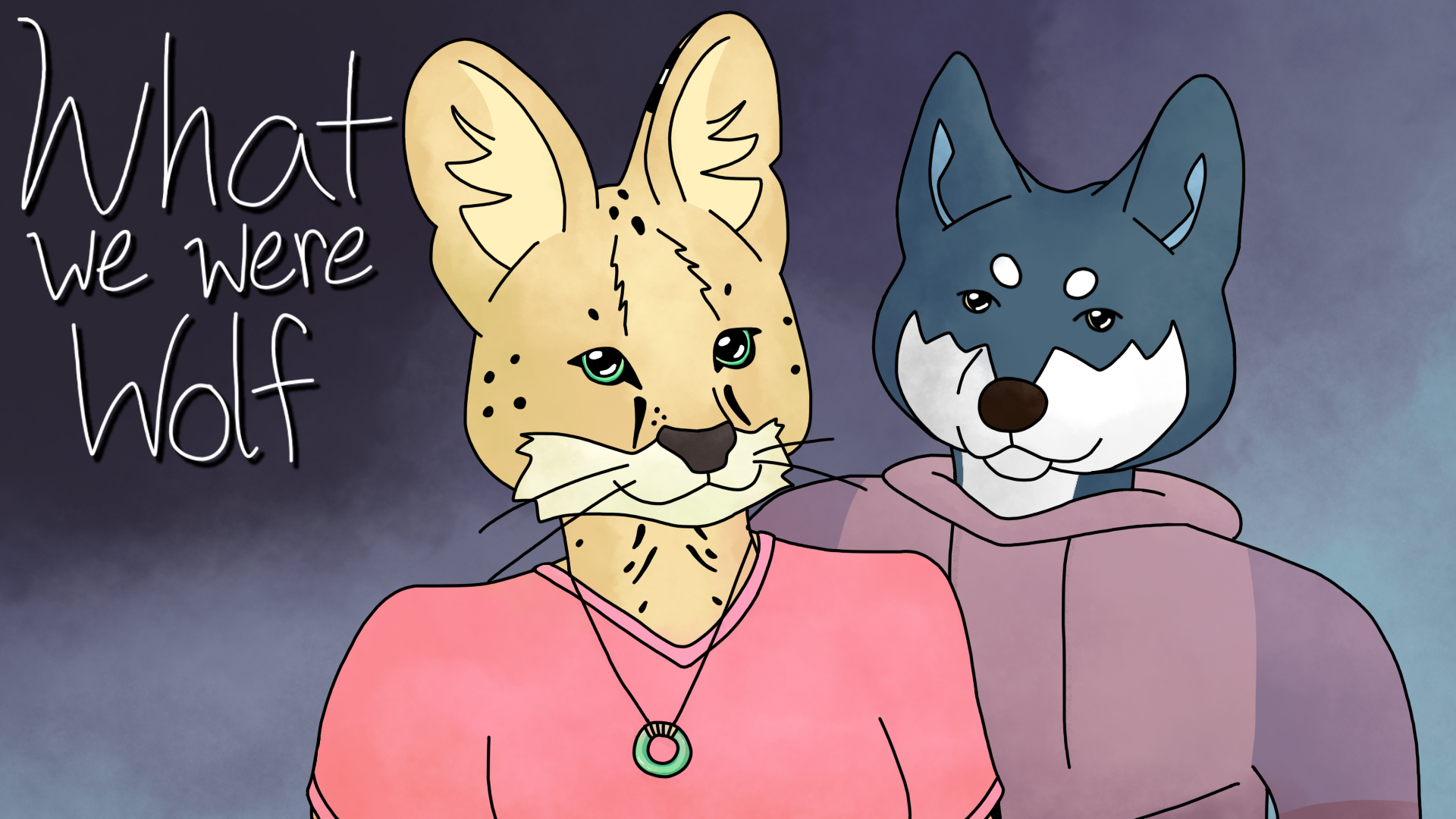
The art is, first of all, lovely. The sprites are amazingly expressive, and the stylish animations make What We Were Wolf feel so kinetic to read. It's just nice to look at!
I get the lack of narration as a stylistic choice, but I feel like the dialog doesn't quite pack enough of a punch to make up for it – the game feels incredibly fast-paced, no scene having really time to land properly, and the tone stays muted throughout. With this kind of thing, I feel it would be okay to exaggerate and dig deeper into melodrama, kind of like a lot of stage plays do. This, I think, leans slightly too far towards literal & flat. (It might also be that the visuals aspect does feel a little sparse sometimes; the VN rarely lingers on images long enough to really evoke a mood.)
It's a compelling exercise in style, but I feel like the execution could be honed to make a stronger whole. The jam's theme feels very satisfyingly realized, though.
Astrophobia
by Laputan Machine
What a way to cap off your honeymoon.
Show Review
Stylish right from the title screen, which sets the tone perfectly. One area that could be pushed further is animation – the title cards feel a little jarring with no transition to or from them, for instance. You also kind of notice the fact that the sprite doesn't have a ton of expressions; the heaviness of the subject matter and the extreme emotions the story invokes aren't really visible, and it doesn't necessarily feel purposefully dissonant. But apart from that, the art & the UI are polished and pretty to look at.
Writing is nice as well! The characters feel precisely defined enough for the small scope, with bits and pieces of history but not so much backstory the story drowns in exposition. There's a lot of sharp imagery (the remnants of a drink in a glass being compared to blood is a particularly memorable one), and the story only ever feels appropriately claustrophobic, maintaining a forward momentum despite its place in the "nothing happens" genre.
Whether the ending gets too fanciful is debatable. I did not hate it, but it maybe felt like it lost the grounded tone of the preceding material without really reaching apocalyptic heights to match it in effectiveness?
Finally, as for the jam theme, I do see it there, but I also wonder if the game could have just gone with the Sun going supernova to wrestle with the idea a little more explicitly. If I was just reading this with no context, it would be pretty difficult to guess that "expanding" was the prompt. That being said, I enjoy what the game does with the concept overall, so don't listen to me.
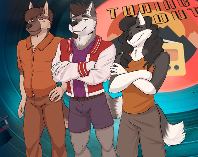
TUNING OUT
by Dana
Holden, a young husky, just failed out of college, he must now decide what he wants to do. A furry LGBT romance!
Show Review
The production values are impressive for a game jam project – the sprites are plentiful and detailed, music & background images suit the story, and the fully custom UI is a nice touch. The prose feels good to read, too, with the English version repeating words sometimes being the biggest nitpick I can point out. (I particularly appreciate having the option to change the language right in the title screen, since God's silliest game engine Ren'py just hides it in the settings by default...)
The plot feels meaty but never overstuffed; there are a lot of scenes, characters, and locations, but everything serves its purpose. The jam theme is interpreted creatively, although you could grumble about the game not really engaging with the image itself that much. Still, it's just a very solid piece of writing, competently put together on a technical level and constantly enjoyable to read.
I think the biggest question mark is Roy just being so, so, unlikeable from the first time you meet him. It makes TUNING OUT read almost as an anti-narrative subversion of its classic VN premise – you hang out with the manipulative bad boy childhood friend, an archetypical character on several counts, and keep waiting for that moment when he gets complexity or some kind of explanation... and it just never comes. Even the most straightforward interrogation of why the protagonist is so into him only happens close to the end of the other route. I get the idea and enjoy the story a lot overall, but Roy's stuff does feel more compelling as an intellectual exercise in genre deconstruction than a dramatic narrative – it makes the point early and doesn't really elaborate on or complicate it in what follows.
(Fair warning: the game gets pretty labyrinthine with its choices, and I'm pretty sure I completed both main routes, but I can't say if I missed anything crucial!)
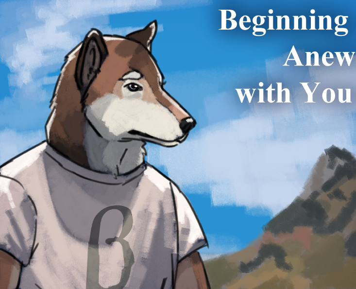
Beginning Anew with You
by DeputyB18
May Wolf 2024 Submission
Show Review
The writing is generally pretty pleasant to read and feels polished; character voices are adequately distinct, descriptions do their job. In terms of pacing and structure, the opening feels quite weak – no need to do the whole "I just woke up" routine if there isn't life-savingly important setup in there – but the story moves fast enough after that.
Mostly, I think it just felt kind of impactless? While I get that the premise itself doesn't come with the highest of stakes, the whole thing feels so devoid of conflict and tension. Not every scene feels like it really progresses the central relationship, and both Callum and the protagonist feel ultimately quite flat as characters.
I think this kind of lowkey slice-of-life thing lives and dies by its style and flavor, and Beginning Anew with You might not quite be there. The writing is detail-oriented, yes, but it spends a lot of time talking about fictional video games and comparatively little fleshing out the setting and the characters. There's nothing straight up unenjoyable in the game, but for being more than 10 000 words long and having plenty of space to make its point, it feels like it's missing a hook, the memorable thing that makes it interesting to read.
I'm Now the School Delinquent's Lover, but I Want Out!!
by Konpeito
'Fear' and 'Love' are the same, aren't they?
Show Review
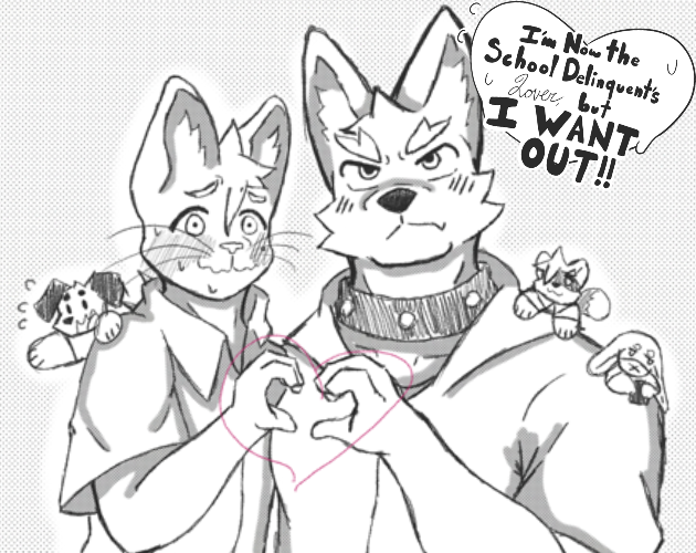
Easily a standout entry; utterly charming and competently written, with a steadily executed aesthetic that gives the game a unique visual identity before you even download it. The character designs are all brilliant and don't feel even slightly burdened by the lack of colors, and the illustrations play with the visual language of comics in what feels like a fitting nod towards the obvious influences. Full points for style.
The interpretation of the game jam's theme is fine; I get it, even if the slightly weird repetition of the word "expanding" feels like the most explicit sign of that being what prompted the story. It could have felt weightier in some other way, I suppose. At first, I honestly thought it was going to be one of those "expand your horizons" cases since that feels more fundamental to the story on an emotional level and the "expand your time with him" angle mostly just sets off the plot.
The first couple of scenes are fantastic – there's a fun satiric touch to how the game uses its archetypical characters to examine a setting where queerness is unremarkable, with the high school bad boy using his frankly bizarre grip on the entire institution to stage an elaborate confession of gay love. As the story goes on, however, the sense of escalation to the drama and the absurdity of it all feels pretty muted, and the conclusion comes off as a little jarring in how sudden it is. I like the full-color illustration, though – it's visually punchy, one of those things that remains an enduring classic because it works.
But if the original ending is sort of weak, the very last part (which I'm understanding is some kind of bonus thing added after the initial release) feels even less appropriate as a stopping point. The scene itself is cute and fun like the rest of it, but it's more in the business of filling the gaps than revealing anything genuinely new about the dynamic of these characters, presenting a final turning point, or summarizing the journey so far. I wish there had been a stronger, more conclusive note to really cap off the narrative gracefully.
Let's not be hyperbolic and say the ending ruins the entire game or anything, but I'm Now the School Delinquent's Lover, but I Want Out!! does feel a little underwhelming on the whole, a great setup in need of a conclusion to match its highs. Still, very enjoyable, can't imagine anyone having a bad time playing it.
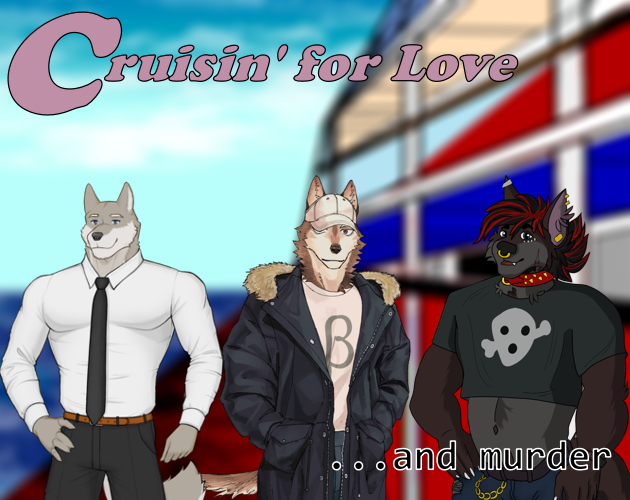
Cruisin' for Love... and murder
by pawggers, tydir
When a reality dating show goes wrong. May Wolf 2024 entry.
Show Review
Cruisin' for Love... and murder – it's a lot of fun! Its satire of reality TV is delightful, and its tasteful use of NVL mode keeps the game feeling dynamic to read while also smoothing over the timeskips. Although the art is very "game jam" in its level of polish & detail, things like the animated title screen and the use of music to indicate when the characters are on camera are very much appreciated, as are the accessibility options. In general, the work feels like a VN very in touch with its medium.
It won't probably surprise you to hear that being unfinished hurts the overall product a lot. I have to admit: not even having the titular murder in the story yet felt blue-balling to the degree that I started second-guessing whether I had imagined the second part of the title all along. The plot elements Cruisin' is playing with – murder mystery, a competition with a clearly defined endpoint – just have a very hard time shining without a climax in sight. I think leaning further into the reality TV inspiration and structuring the VN like an episode of one of those could have salvaged the concept, but this stretch is just too brief to really have an internal structure or a clear arc with a satisfying payoff.
I'd love, love to see more of this, but the currently released portion just reads badly as a standalone package and is hard to rate favorably as an entry in the game jam. (Also, as a sidenote, I'm having a hard time figuring out the connection to the theme?)
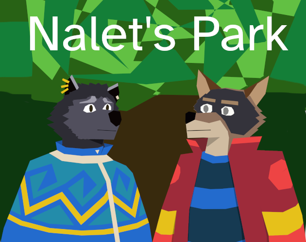
Nalet's Park
by xtmva
Hennalin meets a wolf & expands lirs point of view.
Show Review
Firstly: Nalet's Park is nicely atmospheric and comes with an art style that feels like it matches what the evocative prose is going for perfectly. Good music choices, too.
Despite the short length, the conflict works on an emotional level, and you get just enough about the characters. The game does need a little line editing in the form tightening – I think having relatively short lines is just very important for this medium – but the incorporation of poetry is a fun choice that serves the scope of the story well, providing natural opportunities for transitions and timeskips. It's a great mix of formally familiar and adventurous, recognizable as a VN while having such a fresh touch.
As for some nitpicks: the societal conflict in the background could use a little more explication – it feels kind of abstract since so much of it is just in what the characters say. Also, the incredibly brief ending stings a little; given that the prose is pretty good at conjuring evocative imagery, it would have felt right to end on something a little more vibrant than the very simple exchange. The angle for the game jam's theme feels a little obscure, too, although I get how the concept is used in the poetic sections.
Still, Nalet's Park packs a punch for being such a short read. Congratulations on your first published VN.
Maywolf Mysteries
by Rio (gayohell)
A quirky, furry muder mystery!
Show Review
So, ok, the presentation is admittedly quite sparse – there's no audio (discounting some sort of technological mishap on my end), the title screen is imageless, Hiram's name color is too dark, and some of the backgrounds work quite badly with the sprites in terms of perspective. When a story has such a strong sense of tone & style, it would be really nice for the visual and auditive aspects to reflect it as well. Although the writing feels very natural for the medium, there's really nothing making Maywolf Mysteries feel like it benefits from being a visual novel.
That being said, while information is not conveyed with perfect clarity all the time, the amazing script nails most of the crucial elements of the genre. The characters are memorable in their limited screentime and easy to get a grasp of, the in-story time limit makes the pacing feel sharp, and the solidly constructed mystery itself has a unique furry flair to it thanks to the, uh, mechanics. While the meta elements could have felt slightly tiresome with weaker execution, the wacky worldbuilding is just so much fun it's hard to care. Even the title strikes a perfect balance between descriptively literal and expressive.
Anyway, this might be on me here, but after forgetting to pay attention to the jam theme in particular, I'm not sure how it is supposed to be invoked. In any case, it feels like a missed opportunity not to do some meta stuff with it, considering the tone of the piece.
A quite unpolished game in general, but won me over with its sheer sense of fun.
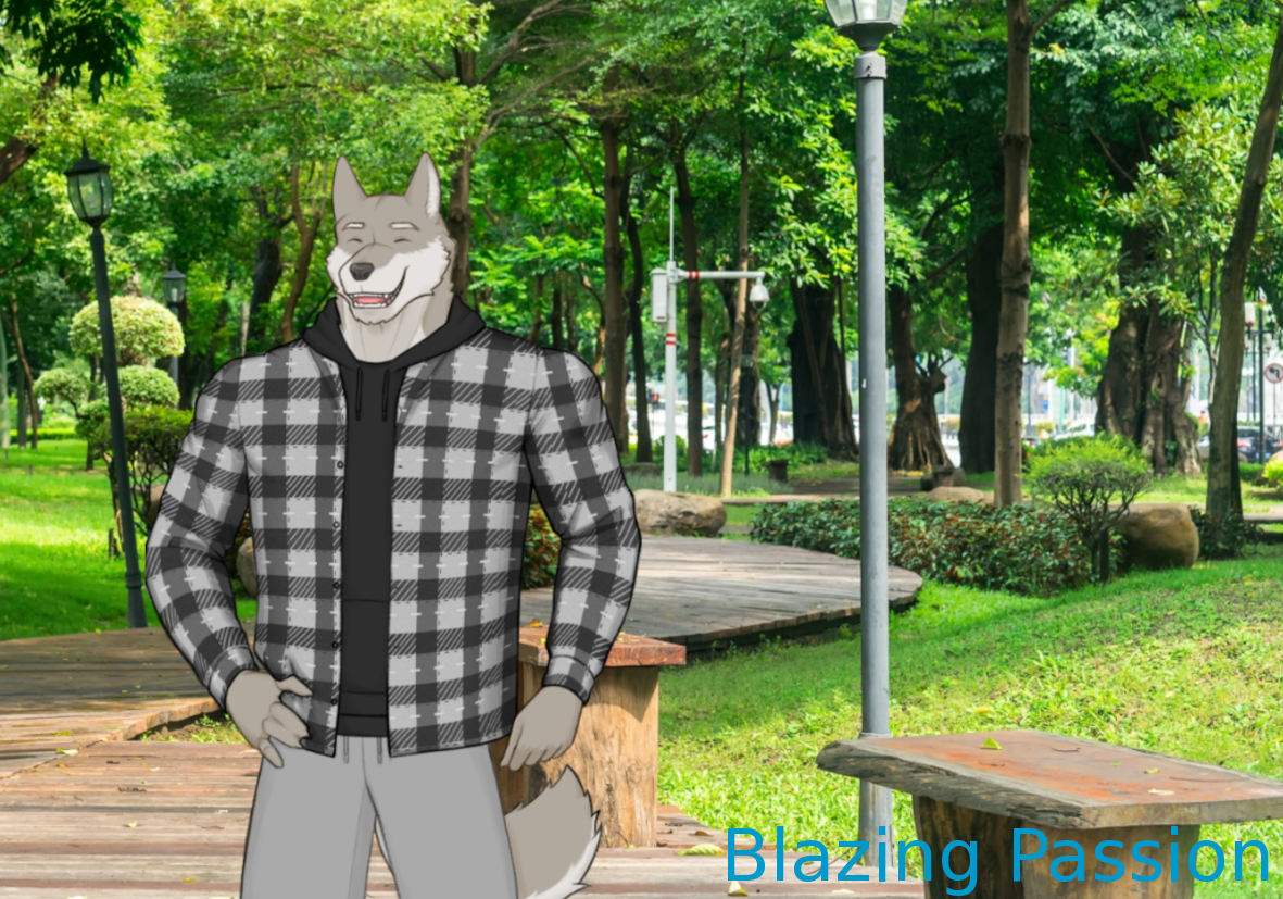
Blazing Passion
by NeveN
Show Review
The presentation is functional but somewhat barebones on the whole; the backgrounds and music choices are inoffensive, and all the other stuff is mostly just the Ren'py defaults. While the engine does deserve some of the blame, not having the option to choose the language at startup is a pretty painful UX papercut – I really recommend looking into a better way to do it, since you're in the business of releasing dual-language VNs. Some more nitpicks: transitioning instantly back to the titlescreen from the last line is somewhat of a mood-killer, and the title is cut off in the Itch thumbnail.
As for the writing, it's sharp and comes with a clear voice. After having playing that VN, it's fun to spot the NeveN-isms – all the short, witty comments with exclamation marks remind me of Erik's narrative voice. There's a lot of fun character writing in the beginning, and I also like how the game is patient enough to revel in the mundanity for so long that the genre shift really lands. I wonder, though, if having stronger foreshadowing would have made the juxtaposition feel stronger (at the cost of some surprise, I guess).
Overall, I do get the sense that the game could have been slightly more formally adventurous and stronger with its imagery; how the backstory is ultimately revealed, for instance, is not particularly interesting or effective. Just would have been nice to get the chaos and the excitement of the finale get reflected in the form and the prose as well, you know? The poem is well-written and a really nice touch, though, especially as such a stark tonal break. I'd probably call that the best moment of the game, even if I maybe feel like there could have been something in the visuals or the audio to really underscore it.
Anyway, all in all, Blazing Passion is an enjoyable read; my congratulations to the NeveN team for delivering yet another solid MAY WOLF entry.
Fungal Connections
by PeppekzMagiMerlin
A spreading experience of sharing!
Show Review
The writing does feel raw in many ways – punctuation, caps lock overuse, strange phrasings – and there are enough ESL-isms that it's gets distracting. A gentle but firm editorial touch to hone out the issues would help a lot; you can kind of tell that only the beginning was edited at all.
Besides surface-level polish issues, I'm kind of bothered by the game constantly explaining things. Emotions are sometimes needlessly stated (the "in my angry temper" feels extraneous when she has shown to be angry quite clearly), the flashback does a lot of slightly awkward backstory filling via characters mentioning facts about their daily lives, and the most interesting and evocative moment in the back half is told in monologue without any kind of visual representation of the events. It might be that there's just too much explained in general; the story being this short, the central conflict really needs to be in the spotlight for its emotional stakes to work. There's a decent amount of information conveyed, and you do get a sense of who these characters are (especially the protagonist, who has some good comedic bits), but their interactions in the main plot feel hard to engage with because it's all so hurried and abstract.
The premise is admittedly a creative one, especially in how it uses the game jam's theme. (A fungal network expanding wasn't my first thought when it was announced!) And while the central character design is not bad or anything, I really like the original mushroom dragon lady in your devlog – curse you, MAY WOLF's stringent rules.
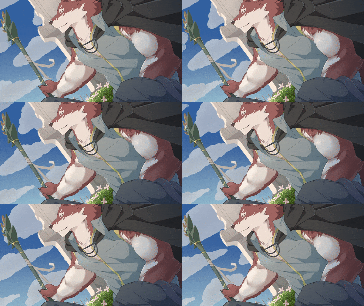
The Wayward Tower
by Team Wolf in a Tower, Baldoh, Cardigan, Metriobarynx, ErebusWulfe, Origin
May the road lead me back to you once more.
Show Review
Clearly a blockbuster entry in terms of production values. Besides having a lot of nice art and a great central character design that communicates a lot visually, the dynamic animations of The Wayward Tower elevate its information-heavy opening in particular. The original music rules, and though stock photos are used extensively, they're picked with enough care to look cohesive together. The UI feels fully thought out, too – the skeuomorphic icons scream "fantasy", and the font suits the fairly grounded drama of the story while also recalling the journal central to the plot. The text box maybe feels slightly underdetailed in comparison, though.
Smaller nitpicks: some of the transitions feel PowerPoint-adjacent in a way that clashes with the mood a little, and the buttons in the title screen have some sort of weird border around them. These are non-issues in the big picture; it's a gorgeously made VN.
The writing is solid, carefully maintaining a good balance between otherworldliness and the relatable mundanity of the emotional conflict. If feeling harsh, you could accuse it of veering too far towards overexplaining at times ("Warren, this wise master of magic, can be as excitable as a puppy" – needless to state when already shown), but in general, the game doesn't get bogged down in lore, maintaining a mercifully tight focus on the character drama. Bits of backstory feel thoughtfully incorporated, too; there's a sense of the history between these two without the need for explicit flashbacks. Just a really smooth read, honestly.
While the jam theme does not feel like the most important piece of the puzzle (I maybe wish there had been more about the journals), I like the images and ideas the story plays with. Not to get too Literary Analysis 101, but the protagonist's cyclical life of being unable to settle down feels like a fitting representation of the self-sabotage inherent in his reluctance to confess his emotions, even if the magical mechanics of the back half muddle this interpretation a little. In any case, I think the climax works on an emotional level, being precisely open enough.
Just a very good entry all around; not necessarily groundbreaking or rapturous, but a pleasant reading experience that feels solid on a technical level.

Imperfect Facets
by Neiffarious
That Single Flaw Makes it Real
Show Review
Really good, though not without its question marks!
Imperfect Facets feels appropriately scoped and tightly paced, telling a complete, satisfying story that doesn't overstay its welcome despite being one of the longer entries in the jam. The worldbuilding is integrated smoothly into the narrative; even without many instances of what you could call direct exposition, the mechanics and the stakes of the whole thing are clear enough, and all the little tidbits only serve to make the setting feel more interesting.
There's a clarity to the structure, with emotional beats and setups and payoffs where you would expect to find them. Elegant POV switches help the game maintain its momentum, and I don't think the result feels too fragmentary for it. The only thing I'm feeling slightly iffy about is how straightforward everything feels after the crucial setup is done – the classic Hollywood second-act twist is missing, and you can kind of notice the story being moved more by inertia than exciting new developments in the back half. To surprise is no obligation, of course, and I get the impulse to not introduce new stuff as the game jam's word count limit draws closer and closer, but I wonder if the finale would have hit even harder with more complications to the plot.
The prose is perfectly pleasant to read; the descriptions of cosmic horrors do their job, and the dialogue flows nicely. In terms of character writing, I'm kind of unsure about everyone having such a short temper – it feels like people yell at each other so much it threatens to pull the tone closer towards farce than intended. The sense of escalation is hurt a little, too, with the visit starting off so horribly it's difficult for the drama to get a lot more intense.
Sound design: very good, but ultimately way too sparse. Everything you hear works, but having such long silences to sit through goes way past what would be appropriate as a means of emphasis (if that was the intent). There are plenty of dazzling magic-adjacent visuals, though, and the cohesive backgrounds successfully convey a mood. The initial car scene feels a little sloppy with how the sprite is placed, but besides that, the work feels very natural in its use of the medium.
Overall very good and largely devoid of the kind of jank and lack of polish you would expect from a game jam project. A solid package that tells its compelling story so well it's made to feel effortless.
Hour
by MayoMilkshake
Give it an hour before everything goes back to normal again.
Show Review
Kind of difficult to get into. The writing lacks polish; the tense is inconsistent, and there's some room for tightening, with many simple actions being described quite thoroughly. What feels like the main event – the two characters interacting – is brief in comparison, and it's hard to get a sense of either as a character or their relationship. Visually, many of the photo backgrounds used are noticeably low-quality, and the extremely simplistic art style clashes with them.
The structure feels a bit disjointed – there's the mystery of what the protagonist experienced last night, then a flashback showing the truth basically unprompted, and no real conclusion that would connect the two parts. I honestly also just cannot make any sense of the explanation or what it's supposed to imply?
Being a part of some kind of larger project, the game feels basically impenetrable without further context. I wasn't really able to enjoy as a standalone thing. (No idea how the game jam's theme is supposed to factor in, either.)
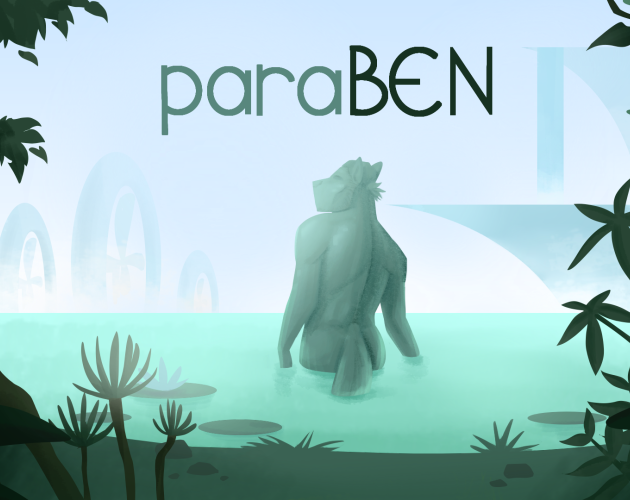
ParaBEN
by eyematerror, HypoNova, mechapenguin
The people we've never met still influence our present...
Show Review
The concept is pretty bold and a very difficult one to pull off in shortform – as a result of the therapy session being quite one-sided in its focus on a guy who basically doesn't exist, there are so, so many gaps you have to fill yourself to get invested in the present-day characters and their situation. It's also just a challenge to write therapy that feels specific, especially if it revolves around characters the reader has no prior familiarity with. A lot of the dialogue here feels general and interchangeable, like something any therapist could say to any patient dealing with vaguely similar problems.
I have to admit that it didn't really work for me on an emotional level; the ending just lacked context and finality to provoke a reaction other than "huh, I guess that's what happened". It also feels like the Itch page lays out the premise in much clearer terms than the story itself, and there might be a risk of confusion if you don't read it too closely.
On the art side, the character designs are fantastic, some of the best I've seen in the jam. They manage to both feel cohesive within the fictional world sketched by the story and purposeful in regard to the individuals wearing them, and all the details are just lovely to look at. While I wasn't able to engage with the transformation & journey of Jesper on a narrative level, the two outfits are so good they almost sold the development by themselves. Excellent work there.
How the game is put together feels less polished. I appreciate being able to see the entire designs, but the use of full sprites feels pretty weird, and the UI is both somewhat underdetailed and kind of messily made in general, showing pixel artifacts near the borders. The buttons are also often in danger of disappearing against the background. On the web side, it feels puzzling that the Itch page doesn't have any styling, since the game has a pretty well-defined aesthetic and a clear signature color scheme.
I respect ParaBEN as an experiment and am thankful for its excellent character designs, but unfortunately, the VN just didn't really grab me.
Psycho Spiral Beast
by Runiza
What is reality?
Show Review
Psycho Spiral Beast: incredibly weird and kind of rough all around. Writing-wise, the tense is inconsistent, typos are plentiful, and many sentences flow strangely. The medium isn't used perfectly, either – dialogue is sometimes jankily presented through the narration, and a couple of lines are too long for the Ren'py default text box design.
Surface-level issues aside, the story is just kind of confusing and doesn't feel like it coheres into any kind of clear point or emotion. If "What is real and what isn't?" is supposed to be understood as the central question, I have no clue about the answer. Mostly, I guess, it feels like the plot opens in the middle without ever circling back into whatever inciting incident started it all and ends without a clear conclusion.
I'm kind of doubting myself as a reader here, honestly – did not get it. (No hint of the jam theme either, as far as I can tell.) Points for sound design, though.
Silverstone: The Morning After
by BrickZed
Develop your relationship with your one night stand! Who knows what will happen?
Show Review
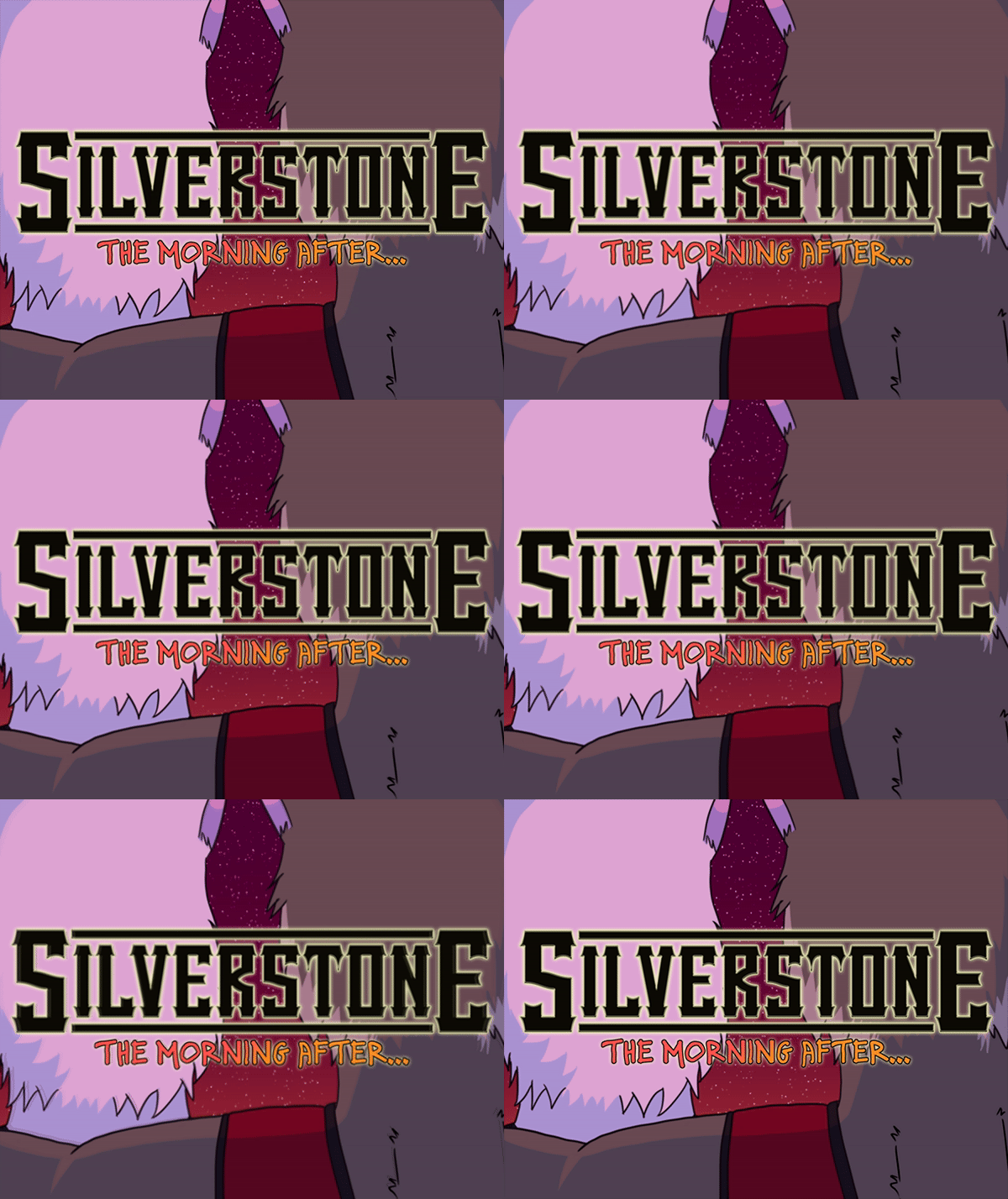
A pretty good read! The presentation is admirably polished – the UI is stylish (I could lose the texture behind the text box, though), and there are plenty of nice audiovisual choices that underscore the horror moments effectively. One thing I'm not quite sure about: does the art style lean too far towards cartoony & cutesy to really work with the genre? This kind of juxtaposition can feel purposeful, but I fear how the characters are drawn is just kind of inherently silly, making the goriest image in Silverstone: The Morning After fall flat. Also, while I shouldn't be mistaken for a music critic, a lot of the songs sounded, for a lack of better term, a little "default presets"-esque.
The VN gets a lot of mileage out of its nonlinear structure. I like how it recontextualizes various details across the routes. Though this may just amount to personal preference, I thought there were a lot of choices, however, especially since most of them served the same function of deciding what ending you were heading towards. The story did not feel difficult to navigate – getting all three endings was straightforward – but more could perhaps have been done to experiment with the mechanic.
As for the prose: smooth to read, largely without the kinds of polish issues characteristic to game jam projects; the horror scenes in particular were full of atmosphere. My feelings about the character drama are more complicated. I think the post-credits scene for one of the routes, where the story goes into retrospective mode, felt like the most affective moment in that regard – the main story itself is so sudden and limited in scope that it's hard for it to hit emotionally. I felt like there was not enough outside context to really hone in the impact of this one night for both parties and really sell its narrative importance.
Also, there's nothing wrong with wearing one's influences on one's sleeve, but referencing Echo while also replicating its central horror elements – a small town known as a hotspot of paranormal activity, a mysterious voice haunting the protagonist via the narration – felt kind of jarring. Maybe it's just that with the setting not getting a lot of description and all the questions remaining without answers, the game simply had no opportunity to set itself apart yet. Still, it doesn't necessarily make for the most thrilling intro to the larger project lore-wise.
While all elements may not play together perfectly well, the amount of work put into the game is impressive, and it has fantastic moments of horror. Looking forward to more, especially if it keeps those strengths while also becoming a little more precise and purposeful in its literary intentions.
Replay Video
by JMJerbear
Another Short Entry for May Wolf Jam '24
Show Review
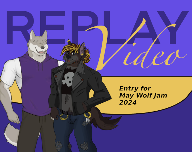
The surreal premise compels me in a strange way, and the dreamlike visuals feel like they communicate the essence of the story. As for the writing, I have largely the same feedback as for your other entries: with no narration, it feels less like a story is happening and more like the characters are explaining a story at you. Characterization in particular takes a big hit here, with so many scenes where characters state their personalities and traits to each other rather than it all being conveyed through a narrative.
Wolf Bolo Two
by WagleUnagi, skellymanbob
Wield YOUR Wolf!
Show Review
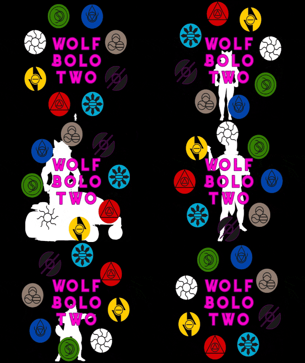
If some other games of yours almost break the fundamental limits Ren'py, then this one might just actually do so; it made my laptop (which is, like, not that shitty and can run Minecraft just fine) scream for mercy. Some of the most visually intense scenes were actively laggy, while button presses in the codex took seconds to register. Limits of the jam and the engine aside, I feel like Wolf Bolo Two might be reaching a point where performance should be an active consideration – a lot of people play VNs on low-end devices, after all.
The sheer density of the visuals is kind of reflected in how the game reads as well. I was confused by the pixel filter at first, but in hindsight, it may be the only thing making it possible to see what's going on when so many characters are on the screen at the same time. Alternate ways to deal with this could have been explored, I think; the worldbuilding would have allowed having the wolves appear and disappear more flexibly. The UI is fun in its theming, though, and downright tasteful while still remaining true to the Unagi spirit.
In terms of writing, I think the conceit is communicated well enough at the cost of a lot of exposition-heavy dialogue. Honestly, battles aside, the pacing almost feels too quick? There's a lot of stuff happening and not a lot of downtime spent just hanging out in this world and forming an emotional connection to these characters. It's too early to judge the plot in its entirety, but I hope the last act has some crazy stuff in store, since everything has felt quite straightforward and literal so far. (oh and apparently the whole thing is a reference to a video game i haven't played, maybe someone who has will have something more insightful to say)
It does feel more than a little disappointing that there is no interactivity to the battle system, considering how many words the story spends on it and how hard the technobabble threatens to drown moments of characterization and plot happening within the fights. The structure even mirrors what you'd find in games you can actually play –there's the tutorial battle against a weak enemy, fights getting progressively more difficult and convoluted, filler random encounters between plot-relevant boss battles...
You just have to wonder: is it necessary to replicate the inspirations this faithfully without some kind of additional layer to provide the engagement you'd get from interactivity? There are strictly linear ways people enjoy this kind of thing – watching streamers play games, card game animes that do a little more to narrativize and dramatize the fictional game – but I don't think Wolf Bolo Two really reaches for the appeal of any of them.
There are a lot of bold ideas executed here. The first minute or so, with its onslaught of wacky exposition and wild visuals, was some of the most thrilling stuff in the entire jam for me. Unfortunately, a lot of the later parts just felt... kind of tedious to read, in a way? The constant references to other FVNs stop feeling exciting after a while, quality banter is too sparse for how endless the battles are, and the plot is as simple as the characters are thin. Really hoping to see a third-act rebound for this, but the currently released portion is far less compelling than your entry last year.
The Greener Side
by Vanillabell
Show Review
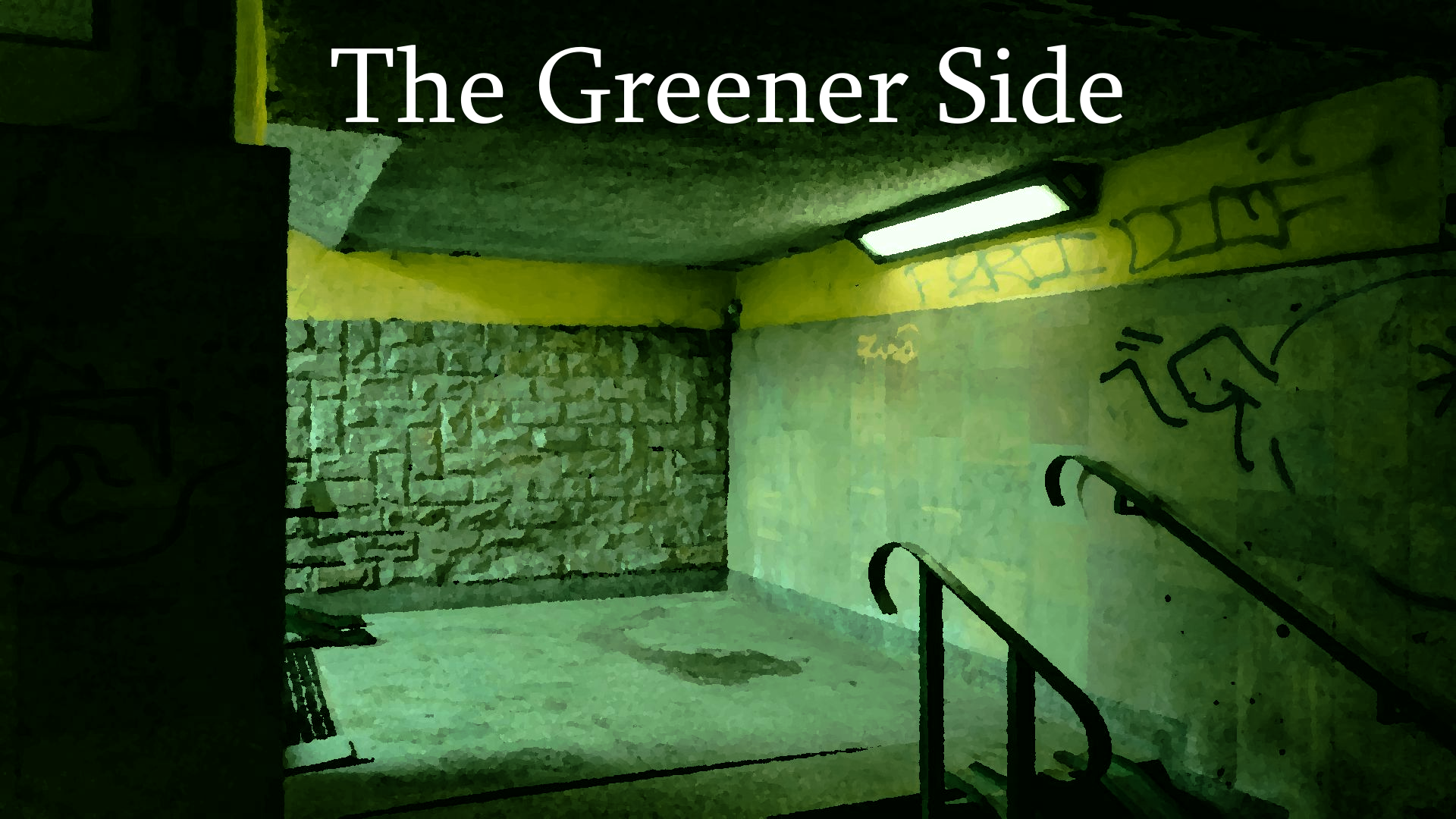
The presentation is kind of rough, firstly – the UI is both really plain-looking by itself and not that different from the Ren'py defaults, even using the same font. Besides that, there are a lot of "missing image" errors. The backgrounds feel well-chosen, however, and the dungeon in particular is a nice interpretation of what that could look like in an urban fantasy setting. I also like all the things the game does with sprites, even if animations aren't as plentiful as they could have been.
In terms of writing, The Greener Side is not a bad read; the pacing feels fast even with all the travelogue in the beginning, the character voices are distinct, and the tastefully implemented worldbuilding wisely prioritizes fun details. The frequent punctuation errors (most often a missing comma) are kind of distracting, though, and some character backstories are exposited smoother than others.
I think the story's greatest strength is feeling appropriately tropey, with the isekai conceit and various other fantasy elements being given an entertaining, gently satiric spin. The ending feels way too brief, however – I'm actually not even sure if this was supposed to be it or if there's more to come, which I guess various unresolved plot points suggest. (It's also very sudden in its implementation, with the instant kick back to the title screen feeling slightly jarring.)
The overall lack of polish betrays that we're dealing with a game jam project, but the story is inoffensively realized and eminently readable. I honestly had a pretty good time with The Greener Side, just wish things could have been pushed a little further all around.
Ugolino in the Tower
by Loudo
Clinging at you in your tower of silence
Show Review
Even if you can smell the looming submission deadline (there's a noticeable amount of typos and text blocks in need of line editing), Ugolino in the Tower has some of the sharpest writing in the competition. It's no-nonsense pacing never slows down after the great opening line; the atmosphere is all in the action, and worldbuilding bits are incorporated with a careful eye for both the clarity and the stakes of the story and the flow of the narration on the whole. More than just making the work pleasant to read, every quiet moment feeling pointed and weighty does a lot to sell the urgency of the situation.
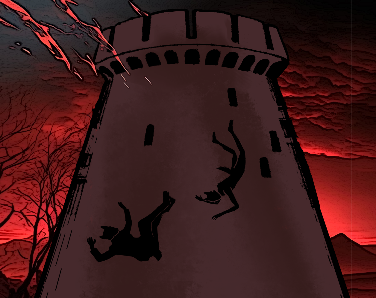
The imagery is sharp, with the game's particular focus on the physicality of lycanthropy conveying the social situation of the protagonist so well that laying it out explicitly feels almost extraneous. Equally stylish and meticulous is the presentation; a scene of two characters enjoying a conversation provides some of the most striking imagery in the VN. Heavy use of negative space and silhouettes also just matches the mood the narration establishes perfectly. Not a single visual element feels out of place, although some of the assets themselves could use a little polish – unaltered photographs feel slightly out of place with the game's striking aesthetic, and zoom-ins of the sprites' eyes are distractingly low-quality.
When it comes to what could easily have been the most disappointing aspect: the game convinced me of its episodic release model better than any other unfinished work in the jam with its insanely good final stinger. Honestly, I'm pretty content lingering in the excitement of the next part for now, like how good TV used to work before bingeing came along.
Insanely good as a jam entry (the weak link probably being the implementation of the theme) and a thrilling start for a VN in general. We'd be looking at a breakout hit if the plain Itch page and the sort of messy and muted thumbnail didn't undersell the game's strong visual sensibilities.
Three Aces
by TJDogwood
One night can change your life.
Show Review
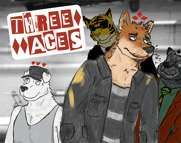
Stylish (the art style is just lovely) and well-written, with straightforward prose that does a good job at conveying information and a strong specificity of time & place. The tone is grounded and gritty without being miserable, and the central conceit of a card game where everyone knows everyone is cheating is so sharp as a metaphor that the social commentary basically writes itself.
Presentation-wise, there's stuff to nitpick. The single jam-provided sprite sticks out pretty badly, the lack of any kind of transition to the opening scene is kind of jarring, and how the card game is visualized works on a basic level but is really subtle and understated. Making use of more visuals and maybe animations of some sort to emphasize what actions everyone is taking would make a difference in terms of clarity, I think; as of now, the prose has to explain a lot by itself. Besides that, it would just be a cool way to use the medium to go all in on showing the card stuff.
As for the other formal elephant in the room ("Should this video game about a card game be playable?"), I found it all so engaging and so skilled in its use of the premise that the thought didn't really cross my mind. It's clearly a story not only written by someone who enjoys card games but someone who knows how to turn them into compelling drama! The player lacking choices has also felt like a pretty effective literalization of how the narrative portrays the competition in general; turning it into an actual game with strictly defined rules and boundaries would be missing the point, I think. Excited to see how this comes up if the VN does decide to go nonlinear in the future, but if it's entirely kinetic, I'll say the point lands.
While the "to be continued" screen dampens the mood somewhat, Three Aces does feel pretty well thought out as a serialized work – far from being all setup, the first act contains a fun twist and ends on a stinger that teases the continuation perfectly. My only concern is that the story is probably something the reader would want to finish in one go anyway. It's dense with information, and I have probably already forgotten something crucial while typing this.
Definitely a "more than the sum of its parts"-category entry; it all just works so well together, and I'm excited to read the rest.
Badminton Ace
by readthisifyouareahomo
Just a couple of guys playing Badminton
Show Review
this is my CHALLENGERS (2024)
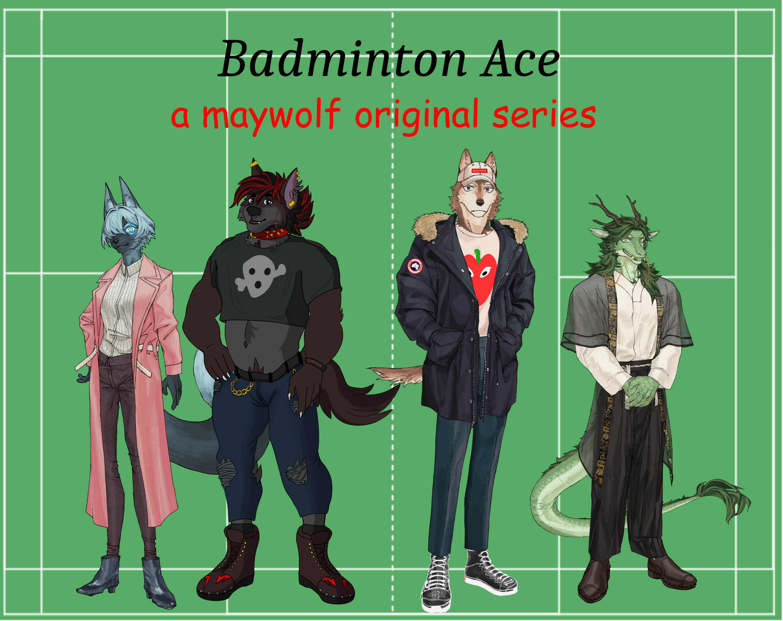
The prose is as unpolished as you'd expect from what is basically an unashamed joke entry; won't go into specifics in the interest of not killing the author. It also does kind of feel like the shitpost status is used as an excuse to not present a story about sports in a compelling way, in terms of both the writing and the visuals.
That being said, there are some really, really good jokes in there, the 8K words fly past relatively smoothly, and many aspects of the production (like the soundtrack being full of the sweet tunes of Kevin MacLeod and other classic public domain composers) feel purposeful. Can't say I had a bad time, and the author's comedic chops are obvious to the degree that I'd love seeing them make something... if not more serious in tone, then at least willing to risk sincerity on an occasion or two. Badminton Ace is a perfect example of the kind of barely-tasteful satire that remains tolerable and even enjoyable as long as the whole competition isn't just those.
Pursuit
by AzzyFlame, KrazyonKatnip, Jinyeon, TiredLeo
Show Review
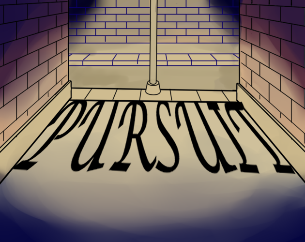
While the writing is pretty polished for a game jam project, the programming work is rough – dialog tags errors are so frequent it doesn't feel like anyone read through the finished product before hitting Publish on itch. There's no title screen (just using one of the pre-existing backgrounds or CGs would have worked in a pinch) or music, either.
Going for full custom assets is respectable, but the backgrounds feel too sparse, with a couple even lingering long after the characters have left the places they depict. I wouldn't have minded a stock photo or two to fill the gaps. Sprites lacking expressions, meanwhile, leaves the whole thing feeling pretty visually static. (Also, is it just me or have some of them, the protagonist's in particular, been stretched horizontally? What's up with that?)
As mentioned, the prose is readable, and the sex scene has a pretty good flow to it. I think my biggest doubt about the story is its tendency to go for what feel like extreme tonal shifts – the game starts on quite non-horny note, and then the protagonist is suddenly admiring a guy's ass, which is both described at length and portrayed with an illustration. The same could be said about the near-instant jump to plot and action; even with some mild foreshadowing, it feels like it comes so fast there hasn't been enough time for character work to put weight into the emotional stakes. I do like the double meaning of the title, though.
Finally, Pursuit doesn't have the most elegant ending in the jam, with a "to be continued" that feels lacking both as a conclusion as setup – not a lot has happened so far, and the idea of what will happen next remains somewhat vague. I get what it's going for, but the execution could be smoother in a lot of ways.
SPAGHETTI
by Kag !!
You're on a date. Try not to freak out.
Show Review
(Note: major spoilers)
Bold in concept, well-written, with a clarity of purpose to every element that I dare say surpasses most of the competition.
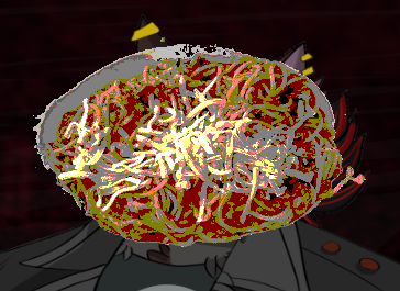
The pacing is economic despite the work essentially consisting of a single scene and an epilogue; it has the confidence to linger in its images and characterize the narrator with subtle mentions of backstory. Seeing that the word count matched the game jam's lower limit, I expected to see more padding, but there's not much here that feels completely extraneous. In terms of presentation, Spaghetti uses both of its two (!) image assets to a great effect: the former's nightmarish mood is effectively realized via digital artifacts and stark colors, and it provides a nice contrast to the mundane photorealism and the offbeat composition of the latter. There is really nothing to add or nothing to change: the concept is executed perfectly.
What is off screen is as important, of course. The spaghetti – in this context most obviously recalling Lady and the Tramp – curiously lacks a visual representation, only being present in the text via its absence, making it a fitting symbol for the protagonist's self-sabotage. No matter how hard it tries, the narrative cannot even bring itself to reveal the supposed centerpiece of the whole thing. This angle is emphasized even further by the Itch page containing a prominent image of the titular dish wholly absent from the work itself, as if a mere paratextual demon haunting it.
The transformation the motif goes through is equally interesting. What lies in front of the narrator is first ambiguously revealed as "not spaghetti" before the game settles on "popcorn", positioning the protagonist simultaneously as an audience to and an actor in the infernal dreamscape conjured from their feelings of guilt and shame. This self-inflicted mental anguish, the work suggests, can be thought of as a kind of private performance where they're portrayed a victim of incomprehensible circumstances, rationalizing their fundamentally nonrational behavior.
On the other hand, it's also a punishment. The self of the narrator is partitioned, the other half comprehending the other's transgressions ("But I always do that. I’m always lying. ... I don’t know what I expected from myself.") but lacking the power to stop them. Spaghetti hell, then, acts as a form of unconscious justice the protagonist inflicts on themselves.
The wolf is an equally deep image. Fourth-wall breaking references to the furry fandom paint it as an object of desire, a fantasy (and, in literal terms, a dream) made real. The text's insistence on its unreality, then, can be read as another manifestation of guilt – even in an escapist environment devoid of consequences, the protagonist cannot allow themselves the carnal pleasures embodied by both MYWOLF and, through food–sex-dualism, the dish the couple is having. How the wolf is specifically and pointedly described as "two-dimensional" further emphasizes the gap between the narrator and other subjects: they are so skeptical of their ability to recognize the equally rich inner lives of others that they're startled MYWOLF is capable of speech.
Worth mentioning is also how the 2D sprite graphics traditionally employed by both visual novels and video games in general are here recontextualized as ontologically suspect, unattainable illusions. The genius of this move is the ambiguity of whether it is criticizing escapism on the whole or the protagonist's woes: it is their own self-deprecation that renders them unable to partake in the most likely harmless fantasy of enjoying a bowl of spaghetti with a wolf.
If you're in the mood for nitpicks, the lack of audio feels like a missed opportunity in a work this formally sharp, and the jam's theme is not present in any self-evident way. Sticking to the defaults of Ren'py with the UI doesn't read as a flaw to me, though, given how deeply Spaghetti is in conversation with its genre – framing it as just another furry visual novel feels right.
Let the masses know that there is no hint of irony in my bones when I declare Spaghetti to be one of the best entries in the game, a compelling exercise in formal minimalism not wasting a single pixel that doubles as a sharp psychological portrait.