FVN Reviews & Recommendations
I recently started reviewing and rating furry visual novels I've played on Itch, but since the platform is not ideal for that (requiring you to follow someone to see their reviews), here's a more accessible compilation of my takes. It's a list of games and short reviews of them split into three categories:
- Can Recommend for finished works or projects far enough that I feel comfortable giving a recommendation
- Upcoming & Promising for newer games that I like and am excited to see more of
- Mixed Feelings for projects I wasn't personally into or didn't feel completely positive about but feel like may appeal to others
I'll also link any longer pieces I've written about the games – hoping to do some more soon. Let me know if you're aware of other writing (reviews, essays, analysis, etc) that would be cool to display here.
Can Recommend

A Handful of Dust
by shiroooo_dev
For you only know a heap of broken images...
Show Review
A Handful of Dust: an excellent read between its appropriately sized plot, grave but personal stakes, and stylish audiovisual touches.
The prose is eminently readable. There are plenty of colorful, effective descriptions, but the naturalistic dialogue that situates the characters perfectly in the familiar-yet-different world is a particular highlight. Crucially for a such a talky piece, the pacing is overall steady, with conversations lingering just long enough to provide a sense of time passing as the characters make their journey while never dragging on past their welcome. The shifts between random chitchat and dramatically weightier topics always feel natural, too. If there's a weakness, it might be the opening containing just a couple of instances of exposition that borders on too convenient – the characters talk a lot about the initial circumstances of how they got to the QZ even though I think all that is supposed to be old news by now (?).
Worth mentioning also is how nicely the sex scene, which errs on the side of plausibility with the logistics, complements the game's tone. I also like how much food factors into how characters think and feel about things; it's these kinds of small touches that help the story convey an impression of existing in a material reality.
Another small writing nitpick, though: while most of the in-universe terminology ("QZ", "herd") feels appropriate, "(the) infected" comes off as kind of clunky and awkwardly formal as the colloquial word for the monsters. Avoiding the dreaded z-word is not a bad move for anything that wants to establish itself as a more grounded take on the subject matter, but I don't think the replacement is quite as punchy – it doesn't necessarily sound like something you'd scream in a fit of panic. I think this is only noticeable because the voices feel so well-crafted otherwise. Besides that, as a recurring editorial issue, the action slips into past tense in places in a way that doesn't read right to me. (Note that I played the first release, maybe that's been addressed by now!)
While the original soundtrack is fantastic, I think the visceral sound design also deserves a lot of credit. The contrast between the loud, weighty sound effects and the eerie, true-to-life silence of the wintry landscapes builds a good atmosphere. On the visual side, I like how the filter used for the backgrounds matches the coarse, pixely style of the sprites, there's some really sharp direction in that one sequence later on, and all the photos looking cohesive together also counts for a lot.
There's a nice amount of meat to the story, despite its fairly short length and patient pacing. As post-apocalyptic literature, I think it lands into an interesting spot, featuring a world haunted by the baggage of the past while also possessing the seeds of something different – the setting feels transitory, a society in the process of becoming (the small pieces of history we get feel very substantial in this sense). I think the text leans into this emotional ambiguity in a lot of ways, most notably as a vehicle for fleshing out and conveying the character drama.
A good image that encapsulates the whole thing is Callum's thought about the species of an infected they kill: "I guess it isn't really one [a primate] anymore." It's a melancholic notion on a surface level, and slaying a bunch of dangerous monsters is nobody's idea of fun, but the challenges of the new world function as a simultaneous ode to the fading importance of the conflicts and the norms of the old. To the characters and Callum especially, the bygone represents normalcy and the traumatic events of his past: "Sometimes, things almost feel normal like this. ... I'm back in high school again." There's also a reading of the woman the two encounter acting as a representation of both what came before (acolytes of Lee Edelman will notice how much space familial connections occupy in her character profile) and the cynical, individualist outlook into human nature a lot of pop culture zombie stuff seems to affirm. Personal healing is, as such, elegantly interwoven with the process of the characters conceiving a new future for themselves and society at large.
(Sidenote: the narrative proximity of guns and dicks is so pronounced it's impossible to ignore. As always, phallic symbolism fans stay winning. The text's description Callum growing gradually more comfortable with inflicting violence foreshadows the similar transformation his relationship with sexuality and romance must undergo.)
Anyway, good stuff. As a genre piece, A Handful of Dust is very in touch with what the ideas it's playing with represent, and as character drama, it offers a fun mix of grounded realism in a thoughtfully constructed and portrayed fictional setting.
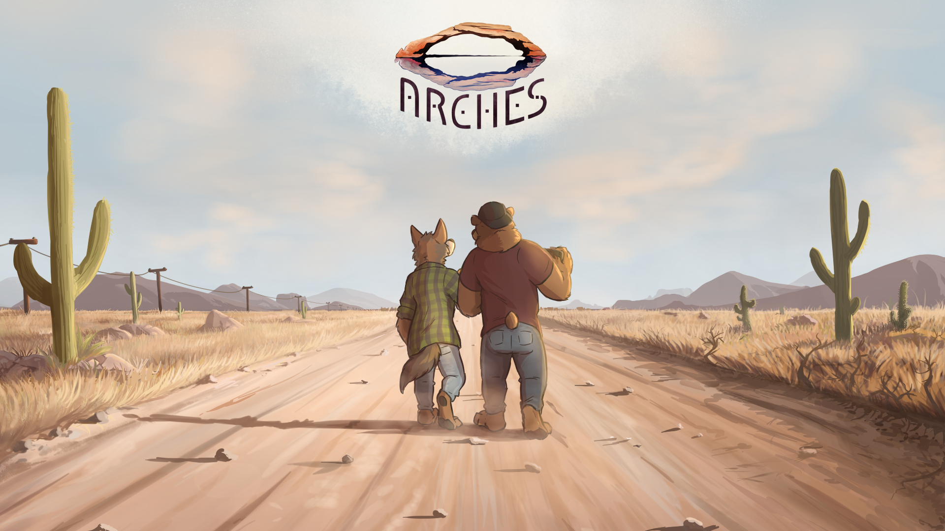
Arches
by Echo Project
Breaking cycles…
Show Review
(Review based on the final build)
In contrast to The Smoke Room, Arches feel somewhat unconventional as a followup to Echo. Coming with a significantly smaller narrative scope and abandoning choice as a game mechanic, it instead laser-focuses on its very good main duo and a few astonishingly compelling side characters, breaking new ground formally while succeeding as a thematic sequel to its beloved predecessor.
The production values, first of all, are off the charts. The sheer number of art assets the game has give it a cinematic flair; it's visually controlled and purposeful in a way few furry visual novels can claim to be. In addition to feeling like a deliberate separation from Echo, the cartoony art style forms interesting contrasts with the game's muted, earthy colors and horrifying subject matter, really tapping into primal, fundamental aspects of a lot of furry art in general – the juxtaposition of fun cartoon animals and grounded adult situations. It feels like a nice thematic echo of the tension between the frivolous initial goal of the characters and the horrors the reader knows are waiting for them. On the music side, the game's original soundtrack accentuates its atmosphere nicely, and the haunting, perfectly tone-setting title screen song practically defines the entire thing for me.
And while such a polished look and sound are not rarities as far as furry visual novels go nowadays, the tight, observant writing more than matches their level here. Given that Echo's most genre-y parts were some of its weakest, occasionally leaning too far towards farce, Arches feels like Howly's redemption tour as a horror writer – and what a redemption tour it is.
The game's sharp, evocative prose and well-flowing action give it a staggering sense of physicality. The reader is terrified with questions of not just what fates will befall the protagonists but how they will live with what they have gone through, both on a mental level and in how brutally effective the game's descriptions of violence are. And while its most horrifying scenes are far removed from the world of jumpscares and spooky monsters, even the more supernatural parts feel boldly and confidently executed. In the age of trope-averse "elevated horror", Arches is refreshingly straightforward, doing what the genre does best without sacrificing depth and complexity of its themes and character portraits. It truly feels like one of the most consistently good visual novels out there, opening with a couple of fantastic scenes that help the game sustain its energy until it reaches the mind-meltingly suspenseful page-turner (well, figuratively) of a climax.
Does the smaller scale of Arches perhaps prevent it from reaching the absolute peaks of the other works in the series? Maybe. But it is still an immensely enjoyable read both in relation to them and as a standalone horror story, skillfully pulling off both a premise and a style that are not the most traditional in the FVN scene. Kudos to the entire team for their hard work.

Campo Largo
by Toledo
Elder Hartley is fine.
Show Review
(Review based on build 0.03.0)
I'm keeping the review short because I want to see the story in its entirety before analyzing it further; so far, it has been quite smart about setting up parallels and differences between its routes. For instance, while Suárez is sort of a subtle presence the completed branch, Tilman's introduction makes for a fun "good missionary/bad missionary" dynamic that lets us appreciate his character in comparison. It's all quite good, but what makes the VN more than the sum of its parts is the subtle yet precise touch with which it offers gentle commentary of this sort while maintaining an empathetic gaze on its characters.
Another example would be the way it depicts Hartley's simultaneous alienation from the country he has been sent to (in the form of being unfamiliar with politics, history, and so on) and genuine interest in being of help to its people. I was in particular struck by how language factors into it. While Tilman is a clear foil both in terms of his Spanish skills and his attitude, the story also comes with good observations about how Hartley is himself hindered by things like the short and homogenous list of approved reading. The meticulous portrayal of the linguistic situation is definitely among the game's strongest suits and probably what most of all helps it come off as something based on real-world experiences. If there's a criticism to be made, I think character voices feel a bit weak, representing an area where the writing could go for bolder exaggerations – these are literary characters, after all, not real people.
All in all, the VN factors the probable reader expectation about providing commentary on Mormonism and missionary work at large into its story in a very interesting way. While you get the sense that we're not building towards a grand statement of any sort, the documentaristic focus on the minutiae of missionary life and the grounded character portraits give the reader plenty to grapple with. I do hope and am willing to believe that what the game is doing becomes more effective with all the branches finished; I think the first ending comes off as a bit brief and simple compared to how big the drama is conceptually. You could maybe say something about the observational approach colliding with the genre elements in a way that compels in theory but also prevents the story from playing into the strengths of both, but we will see.
There's more to remark on – see: the pleasant art style and how the game juxtaposes it with photography and photo manips, the layered magical realist metaphor – but like I said, this is a case where I'm happy to wait and see how my thoughts evolve as the story goes on. How well-considered the nonlinear nature of the narrative feels even at this point counts as a strong endorsement by itself, and it's all polished and professionally made. I'll be back with more later; in the meantime, go play it yourself, dear reader!
CANIDAE
by Ozone Interactive
Embrace the animal inside you, or fight back.
Show Review
A smart, stylish little game featuring a seamless intermarriage of form and narrative.
Juxtaposing the theme of transformation with the unchanging sprites is such a fun way to use the medium – the push-and-pull of reader expectations surrounding how representative it's all supposed to be makes for a potent sense of unease. The pixel aesthetics are the key here, allowing the photobash assets to blend in more smoothly while providing a crucial extra layer of abstraction. Some interesting things happen structurally as well: thanks to the weird character names, CANIDAE opens with a slightly surreal tone, priming you to be ready for anything before steering towards what feels like a more grounded direction.
Another strong choice is the split ending. Only explicating the mechanics in one route is not just economical storytelling – it creates an interesting contrast between where the two paths locate the cause-and-effect dynamics at play. The ending where everything remains more subtle allows for a reading where the boys become what they do; the other surfaces a more literal horror conceit where they're affected by forces beyond their control, at worst enthusiastic participants in the roleplay. Guilt & culpability being big themes, this laser-targeted piece of ambiguity could not serve the story better.
Not going to say more in the interest of not spoiling everything for whoever is reading and still hasn't played CANIDAE, but it's so good, very much worth your time.
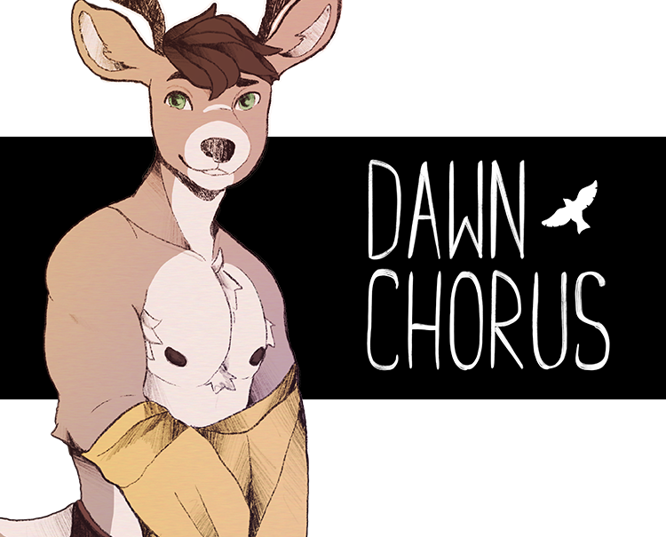
Dawn Chorus
by Dawn Chorus
A queer romance visual novel
Show Review
(Review based on v0.26)
On a purely conceptual level, you could be skeptical about the sheer number of routes in this game, especially considering that their overall plotlines seem pretty similar (at least as of day 2). Somehow, though, it all ends up working pretty well!
I think it has a lot to do with how much effort was put into creating a diverse cast of characters whose personalities, circumstances, and histories with the protagonist lead into very different takes on the same dating sim premise. The smart choice of a grounded, specific real-world setting helps – questions of culture, language, and education factor a lot into the characters feeling as distinct as they do. And it's just cool that it feels like there's something for every player to like.
The writing is also just very good, the dialogue in particular. All of the cast have clearly defined voices, and it always feels like a lot of thought was put into creating interesting moments of different characters interacting together, both in terms of comedy and drama. I'm very interested in seeing what kinds of situations arise in the future as the plot moves on; it's another advantage of the huge cast.
Need to complement the asset work, too. The relaxing soundtrack fits the tone perfectly, and the art is all very pretty, even if the sheer disconnect between the twinky sprites and the unbelievably ripped CGs is slightly funny. I don't feel like there's much to be critical of, honestly. Maybe it would be nice if the routes branched out and had less repeated content, but I guess that is just going to depend on how the main plot ends up developing. Cannot recommend Dawn Chorus enough for those looking for cozy, slice-of-life-y romance.
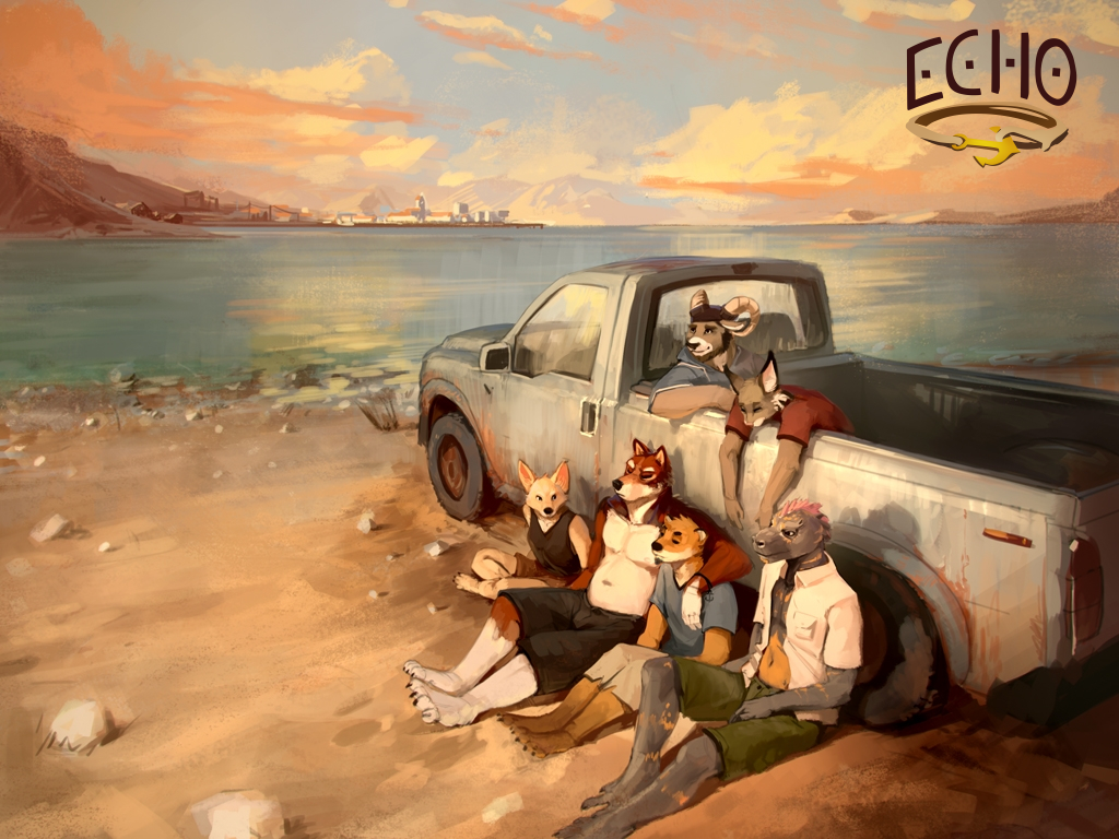
Echo
by Echo Project
You're always moving in circles...
See also: Close Reading Echo's Route Choice
Show Review
Still THE furry visual novel to me. Haven't come across anything else that feels like a masterpiece of its medium in the same way – it uses the route-based structure and the limited game mechanics so interestingly. The characters are such a compelling cast of complicated people, the horror mysteries are engaging, and the strongly established setting grounds the game in a place and time, making it very emotionally resonant in its description of growing up queer in the 2000s.
Echo shows its age in how the writing clearly improves towards the routes that were completed later and in how the production values fall below other Echo Project games. Still, there's something charming about the art style, and the original soundtrack is really good, too.
An easy recommendation for anyone who can handle the horror elements; it's both a great story and a fantastic journey into the formal and narrative possibilities of the medium.
Fatal Force
by darkdragon563
Tragedy or Fated?
Show Review
(Review based on build 1.81)
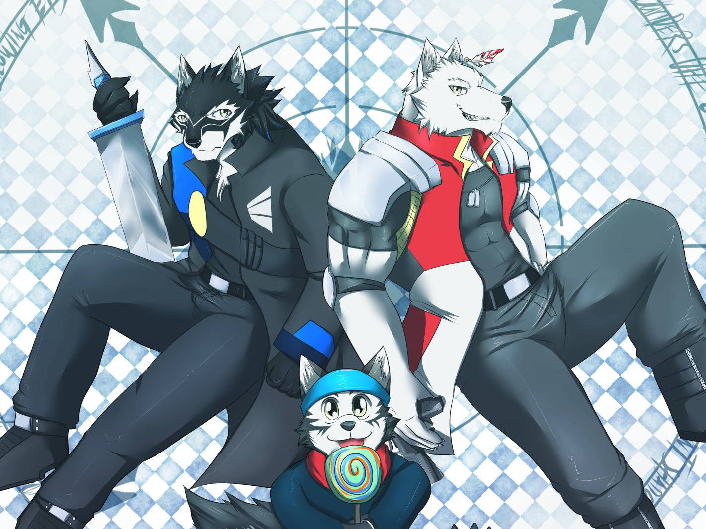
The frankly iconic disclaimer on Fatal Force's itch page warns against approaching it if you "like to read visual novels that doesn't have awkward moments, / weird script / or anything that makes you feel 'edgyness'". Is it worth taking to heart? Well, certainly. But for something dangerously close to (fatal) farce, the VN has got storytelling chops and a steadfast dedication to its hair-raisingly dense plot that may ultimately impress the hesitant reader.
There is a lot in it, though, between the wacky comedy sound effects, the wild plot twists, and the self-aware take on werewolf mythos involving the recurring thread of the protagonist being a furry. Sometimes it all feels a little incessant, and I would call what the game does an acquired taste on the whole, but its modulation of tone is surprisingly graceful. While the story can go from 0 to 100 pretty fast, Fatal Force at least tends to have the restraint to let a serious moment linger, being largely devoid of the kind of quippy bathos that would make its drama feel completely weightless.
And hey, as far as jokes go, the VN has a lot that land – my favorite running gag is how implausibly the werewolf characters go unnoticed and unremarked on by the public. I also like how much of the physical comedy is accentuated with visuals. Come to think of it, while accusations of loving to go for cheap shots ring true, the writing has sharp instincts for when a bit needs some extra emphasis and when a deadpan delivery is preferable. The craft is there!
Another aspect of the game nails is structure – the comic/manga inspiration is evident and welcome. I'm just getting caught up now, but I imagine the game would make for a nice serial reading experience with its chapters that have clear internal arcs and always push the larger narrative forward. The cliffhangers, cheesy and heightened in just the right way, are especially fun. There are other nice formal ideas, too, like the narrator showing up as a character in the story and the playful approach to narrative time where some flashbacks are witnessed by the protagonist diegetically. Beyond the unhinged plot full of superpowers, tragic backstories, and deep, deep wolf lore lies a lot of interesting stuff.
Art-wise, probably the biggest thing holding the game back is that (with a couple of notable exceptions) the characters are quite homogenous in their designs. The use of color isn't particularly bold, the poses of the sprites don't do a super good job at communicating the specifics of everyone's body language, and basically all the werewolves have the same silhouette! While the style is not unappealing, it feels grounded in a strange way when the tone of the story reads as an invitation to go wild and assemble a cast of the gaudiest original characters ever designed. The kinetic, dynamic visuals of the game are good and definitely elevate the fight scenes, but I'm not fully in love with the art direction.
The other big weak point is the prose (of the English translation, at least). The dialogue-heavy, functional style is not the wrong choice for the project, and I do think many of the quirks in its writing work as purposeful elements of voice, but there are plenty of typos, syntax errors, and wonky uses of punctuation that only serve to distract from the experience. Meanwhile, some devices – e.g. ellipses and self-interruption – could also afford to be used more sparingly. It's all readable, and the translation does feel like it communicates the meaning of each line comprehensibly, but a steadier editorial hand would help a lot.
Still, Fatal Force earns my recommendation, at least for a reader with the right kind of discerning taste. The game is pleasantly populist, adventurous enough to surprise, and easy to get invested in. When the plot is throwing crazy twists towards you at the speed of light and the melodrama goes full force, it's simply pretty exciting, and sometimes there's a gag that will make you fall out of your chair.
Flotsam
by Kraaj
Abandoned estate. Abandoned dream.
Show Review
I think Flotsam largely succeeds as a mood piece. The prose is evocative, and the striking juxtaposition of different digital aesthetics creates a nicely uneasy atmosphere, although a lot more could be done with it. There's some really good sound design in the game, too, which really makes a difference with the presentation being so sparse-but-functional. Its biggest advantage is the moody setting, though – the parallels between a building physically in decay and a YouTube channel in crisis as haunted places are both delicious and suitably Gothic.
I was initially slightly unsure about the tone. The premise is so bleak it borders on farcical, but I think a couple of instances of strategic deadpan humor and what the game ends up doing with its protagonist won me over. I would also say that the VN sort of falls into an awkward middle space between plotty and fragmentary, with a lot of things happening but some beats having more of a clarity of purpose to them than others.
Still, Flotsam doesn't overstay its welcome and manages to feel like a cohesive whole. Would love to see more of this kind of tight, focused shortform work.
Hearts Faster Than Light
by Arcadia Adair
Furry drama... in space!
Show Review
(Review based on Chapter 13)
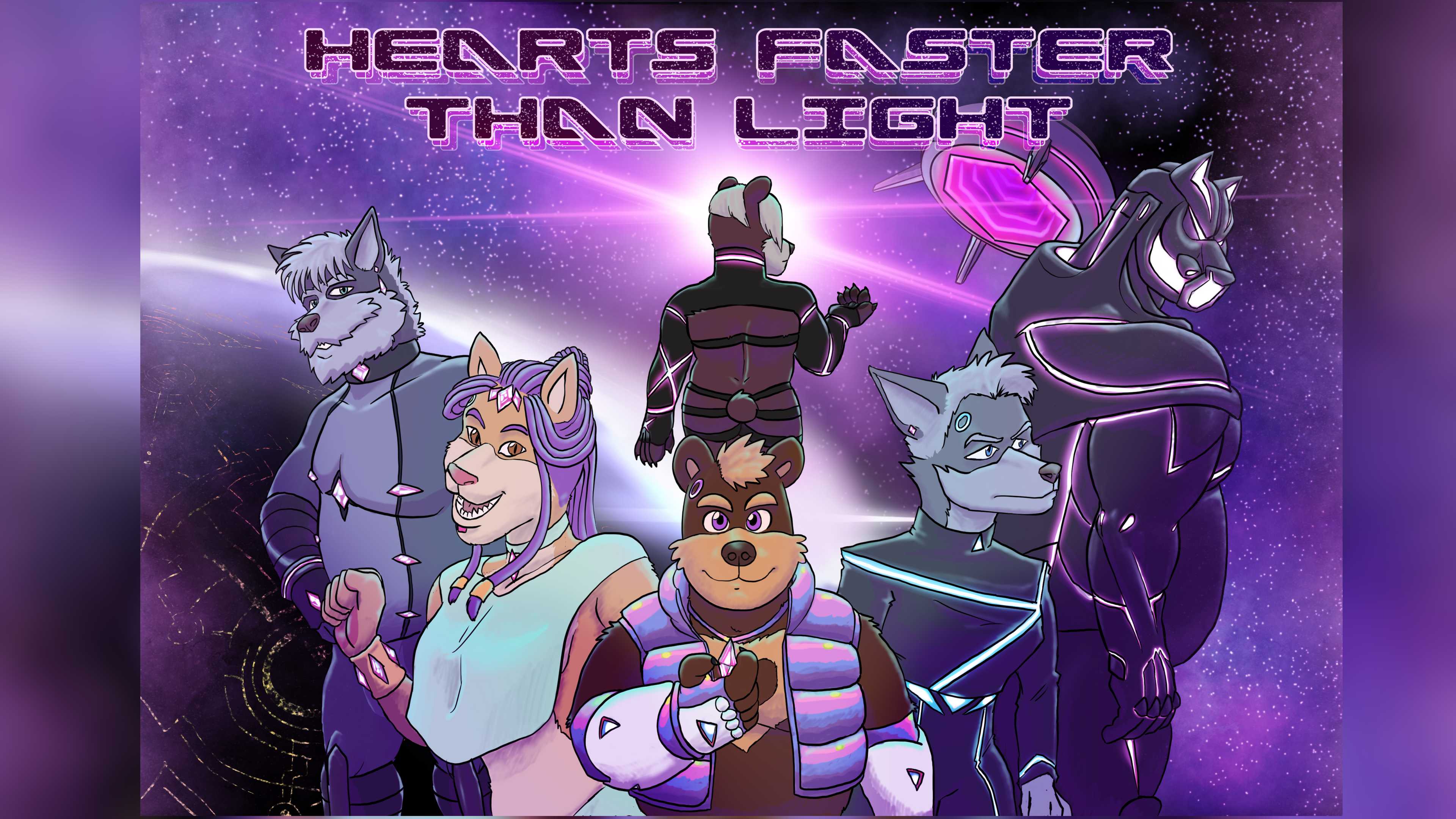
Hearts Faster Than Light feels like the kind of thing many other visual novels would love to be. Its engaging mix of comic-inspired visuals and a tight, fast-paced story is pure joy to read – it's light but not weightless, easy to get into but not without depth.
In addition to just being very exciting formally, the game is made with a sharp eye for visual storytelling, especially in its latter chapters. There is so much precision and purpose to how the characters are rendered and how the stylized backgrounds and the smooth panel transitions drive the action of each scene. It feels simultaneously confident in its stylistic choices (such as the limited color palette it mostly sticks to) and infinitely playful, deploying new aesthetic ideas and finding new ways to tell its story at a stunning pace. You feel a constant temptation to linger in every illustration and analyze and appreciate what it's doing.
With how many characters, factions, and concepts Hearts Faster Than Light introduces in fewer words that some furry visual novels would use to describe a character eating breakfast, it's an achievement that its setups and payoffs feel easy to follow and that there's always clarity to the emotions of its drama. It's a good choice that many of the game's worldbuilding ideas double as tools for delivering exposition in an engaging way – it can do all those little memory flashbacks without feeling messy and fragmentary.
And the complexity budget is just well spent in general: while the character portraits feel a little archetypical, it works fine with the tight pacing. The story is in constant motion, wisely using action and plot development to elaborate its characters instead of pausing to examine them. I really appreciate the game's restraint and commitment to moving forward.
The characters, themes, and worldbuilding of Hearts Faster Than Light are in perfect harmony with its inventive, ambitious formal choices, and being such a breezy read, it's hard to think of a kind of person I wouldn't recommend it for. What are you even doing if you're not playing it?
I’ll Breakup With Him, It’ll Pain
by WagleUnagi
Some relationships aren’t meant to be
Show Review
(Review based on build 0.11.5)
Besides a singular achievement in misusing Ren'Py as a general-purpose game engine, I’ll Breakup With Him, It’ll Pain is a charming, wacky visual novel experience that is guaranteed to make you feel every emotion at once.
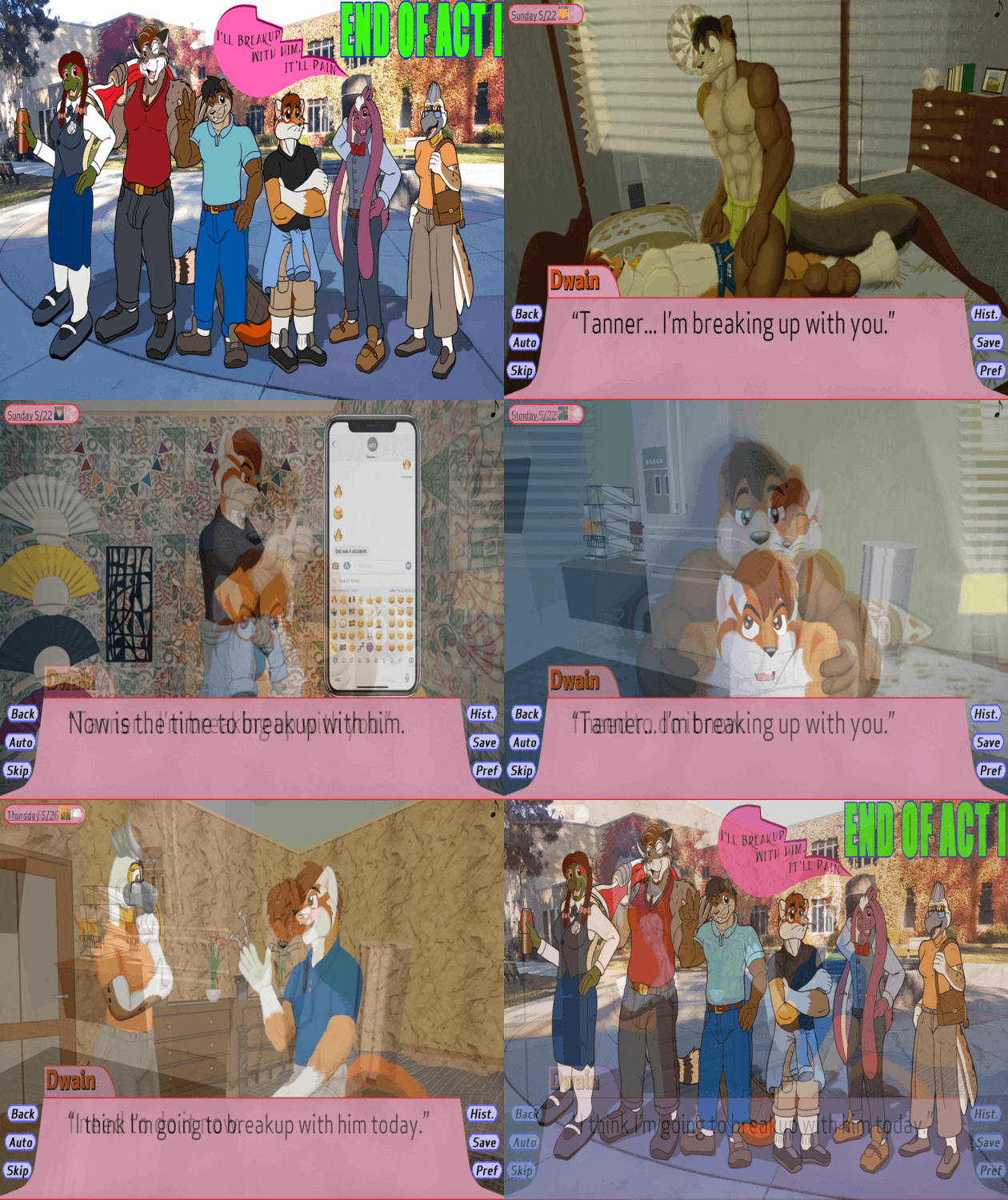
IBWHIP is a stunning barrage of formal experimentation, and even its arguably less successful choices (like many assets seeming like they came from different games and some sprite animations being fairly clunky) come together to make it a game that is never boring to look at. You can think that it has showcased every kind of gameplay and visual effect that can be conjured from the depths of Ren'Py, and you will always be wrong.
While the numerous minigames provide the VN its most stunning setpiecs, I think some of the more deranged text styles – like the leaky effect the word "cum" and its variations tend to be lovingly rendered in – are what truly keeps me up at night. Some of them are just fun to look at. Others, like coloring parts of dialogue with pride flag overlays, strike me as fantastic, non-intrusive ways of conveying implications and delivering exposition. And with tons of sprite animations and complex background compositions also used, even a lot of the game's traditional VN scenes convey their mood effectively and feel visually distinctive.
As far as characters go, Dwain and Tanner feel kind of purposefully flat in a way that complements the narrative around their loveless relationship, but the weird escapades of the delightful side characters are easy to get invested in. What I feel kind of uncertain about, meanwhile, is whether the central structural device – branching the story by providing the player opportunities to breakup with him – works.
The breakup scenes themselves are fine, many of them even among the VN's absolute highlights, but I'm not sure if all of them successfully push the emotional drama forward. Sometimes I wish they spent more time on the question that the game seems to be asking with them: why is Dwain initiating the breakup right now, and what does it imply about the characters and why the relationship was not meant to be? Many of the endings do feel worthwhile as fun, absurd side episodes, elegantly paying off plot details introduced previously during the day, which makes me think the game could perhaps punch harder with its character drama as well. I guess I'll just have to wait and see where all this is going.
Would I recommend IBWHIP? Well, not without a slight hesitation; I'd at least call it an acquired taste, only fit for the refined palate of true FVN aficionados. Sometimes it's kind of slow, especially during the more mundane parts, and sometimes it's doing so much weird shit that it gets kind of exhausting. But if you're hungry for formal experimentation, looking for a refreshingly non-traditional FVN story, and in the mood for anything and everything, there is likely no better game to play.
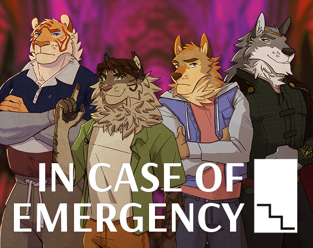
In Case of Emergency
by phibbean
...break glass.
Show Review
One of the tightest, smartest, and most affecting visual novels I've ever read, carried by its insightful, consistently funny writing and enhanced by some strategic visual flourish. Takes plenty of big swings while always remaining deliberate and cohesive as a text.
As a narrative, In Case of Emergency is very conscious of the kind of thing it is. The game's premise is not the easiest one to pull off – mishandling the obvious artificiality of the fantasy quest would definitely have made the drama feel weightless – but it does not stumble. The snappy pacing leaves just enough time for the reader to think about the unnerving implications of the mechanics, for instance, and the arcs of the characters are elegantly echoed in many aspects of the plot in a way that is as subtle or unsubtle as it needs to be. No scene feel like it's wasting your time by being pointless or deliberately obtuse in its intentions, but the game does not hold the reader's hand, either. It's such a difficult balance to strike, and the VN nails it.
Playing it, I was constantly floored not just by how amusing the jokes were but how purposeful they felt. In this sense, ICoE's greatest assets are its ability to invent and develop ongoing gags, making its flights of absurdity have a crucial sense of consistency to them, and its commitment to character voices. A lot of characterization is delivered via how the cast bounces off of each other – consider, for instance, how Kieran's and Cedric's shared history is depicted by their sense of humor and how what the game does with Luke and Wes mirrors how they feel about being the center of attention. I feel like there's also a lot of sharp storytelling in how both worlds are framed with the use of jokes.
Worth noting, too, is how gracefully the story's tone flows from scene to scene, largely thanks to considered touches of comedy. It feels like it always knows when to go for something over-the-top, when to merely punctuate its action with a funny line or two, and when to fall back to melancholy with bits that clearly just conceal a sadder emotion. And the scenes where the game forgoes humor entirely, meanwhile, are instantly unsettling in contrast.
How smooth ICoE feels to play through also owes a lot to its structure and how it works in terms of gameplay, with major choices being clearly signposted and plenty of minor choices providing replay value. Every path feels like a complete story on its own, but there's also a decent amount of horizontal story development – various aspects of the characters are foreshadowed even if you don't choose their path, and when you do, bits and pieces of the main quest are recontextualized. It also works as a means of building anticipation, since completing the VN once gives you a pretty good idea of which scenes are character-specific and, as such, how the other paths will likely play out. With its structural setups and payoffs, ICoE is interactive fiction at its best, flourishing in instead of being burdened by its nonlinearity.
While I can see someone accusing the VN of being occasionally barebones in its presentation, the simple fact that the sprites of the main characters are animated gives it a lot of life. Emphasizing them and drawing attention away from the stock photo backgrounds simply feels like a very functional choice; the worlds portrayed in the game are both archetypical and exaggerated in a way that makes it natural for them to look somewhat nondescript.
And despite the lack of polish (I really wish the UI was more thematically appropriate), the game does, to be fair, pull off a couple of absolutely stunning moments of visual storytelling I will definitely not spoil. There's humor, too: everyone else donning traditional fantasy garb while Luke has his dumb tacticool military gear is one of the best visual jokes I have seen VNs do with sprites. While ICoE's influences are varied and what it has to say about escapism and growing up hits hard for its universality, it's also very in touch with its own form and the possibilities granted by it.
All in all, I can't compliment ICoE enough – it's the kind of thing that will renew your faith in the ability of this medium to produce unique, deeply compelling stories that feel equally comfortable being literary works and self-indulgent furry porn. I wish every FVN was even half as confident and sharp in its storytelling, or at least even half as entertaining.
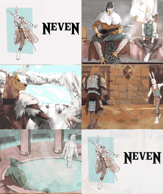
NeveN
by NeveN
The tale of a bard going on an adventure in a world full of mysteries!
Show Review
(Review based on build 0.24)
NeveN is a neat fantasy story that doesn't stumble over its vast lore or considerable length; conventional but eminently readable. Vague spoilers to follow!
One question I kept going back and forth between while reading: does the game break new ground as a (sort of) "reluctant chosen one" narrative? While where the plot eventually leads does feel like a pretty intriguing setup, NeveN inherits a lot of the mechanisms you'd expect from that kind of thing – if you share my distaste for the trope and the "magic systems" school of fantasy writing in general, you'll probably be more into the grounded parts of politics and intrigue. Still, you can tell there are a lot of fresh ideas at play, and I'm looking forward to seeing what happens next.
Erik is a likeable, well-rounded protagonist, and I like that he's kind of horny without falling to caricaturized hypersexuality where wanting to fuck everything would be his most prominent character flaw. As for the route characters, how all of them are integrated into the world and designed to mesh with different parts of Erik is smartly done, and the game is starting to use them to pull its story into divergent directions – which is, IMO, a huge part of doing a route-based structure well.
Barring a noticeable amount of typos/ESL-isms near the beginning ("this kind of falcons", "we are in big troubles", "there has been... hostile reactions"), the writing is polished. While the narrative voice is mostly blunt and effective, I appreciate Erik's personality peeking out every now and then, and there's a precise, careful sense of physicality to the action and descriptions of magic. It simply feels good to read, plus I imagine the songs were a heroic translation effort.
Pacing works beautifully scene-to-scene – there's a constant narrative momentum, and I can't think of many instances of scenes dragging far past their welcome. I do think some cracks show in the big picture, though, as NeveN is not quite as skillful with long-term setups and payoffs.
Despite how lengthy the on-ramp to the central reveal of Chapter 5 is, it doesn't feel like a satisfying mystery – there are initial clues, fairly predictable further developments, and finally the resolution as a surprise twist coming essentially out of nowhere. Given the huge scope of the story, I think it really should deliver information and foreshadowing more gradually. The political subplots feel like they do this slightly better.
Also, even if no scene is fatally boring by itself, the prologue in particular is full of sequences where the reader is told that something will happen, and then it simply happens without much fanfare. Where NeveN really sings are its huge surprises and tense scenes of characters reacting to new information – on average, it's considerably less engaging to read when Erik is just doing something he was told to do.
A part of it may be that despite the fun main characters and the wide array of compelling side players, Erik is very often alone with someone, making the narrative retreat back to familiar dynamics instead of allowing it to explore new interactions. Group scenes feel like rare treats when they maybe shouldn't – the main cast doesn't really hang out together that often! Making each scene feel novel in some way is something to consider, I think, when the plot contains this much recurring material (in terms of scenes dealing with performing, politicking, combat training, magic lore, etc), and NeveN doesn't feel like it quite pulls it off.
If there's something else to gripe about in the writing, it's probably that it can be overtly explanatory at times, particularly when it comes to things like character traits and feelings. Besides robbing the text of some amount of intriguing ambiguity, it makes it feel less like we're experiencing the story from Erik's perspective, as his perceptions lean so strongly towards accurate and useful instead of specific to him as a person.
Also, a lot of the magic exposition doesn't really pass the "shouldn't he already know this" test – I see no reason to outright explain the very basic stuff, like how activating a brand works, when it could be shown and implied with ease. This feels especially true since Erik is not depicted as being someone who doesn't give a shit about brands; he would know stuff through cultural osmosis even without purposefully researching it. Other pieces of worldbuilding, such as the different places and civilizations of the world, are conveyed more smoothly.
Regardless, NeveN does score points for making its lore comprehensible enough that you never feel lost when things are happening. The in-game dictionary really helps, alleviating the burden of there being a mountain of invented terminology; I found myself checking the powers associated with each god pretty often, so it's a nice feature to have. Being written in Erik's voice is what really makes it work, injecting welcome flavor in each description.
The technical implementation is not the most graceful one out there, though – the notification popping up even for previously unlocked words is distracting, and since the list gets pretty long eventually, a visual indication of fresh entries would be cool. Love the idea and the execution, the UX could just be iterated further.
Speaking of that kind of stuff: the plain presentation just kind of detracts from the mood, you know? I don't know if the backgrounds are just low-quality or if it's the filter, but they look pixelated, which clashes severely with the story, being such a digital texture. Along similar lines, you really feel the 2010s flat design of Ren'py's default UI not being the most natural fit for fantasy, and the logo is inappropriately bare in its design. I do, however, like how it reflects the motif of symmetry associated with the titular deity.
The art rules, though – even if the sprites having so few variants makes the game feel very static to play through, the detailed, diverse designs are a joy to behold. Also, crucially, the distinct base poses feel considered in terms of what they communicate about each character and give everyone a unique visual identity. While the lack of expressions is hard to ignore, the design instincts on display are superb.
All in all, NeveN is not without its weak points, but I can definitely compliment the creators for their cohesive, well-built work that never feels burdened by its already immense size or by being developed simultaneously in French and English. A must-read for fans of the genre.
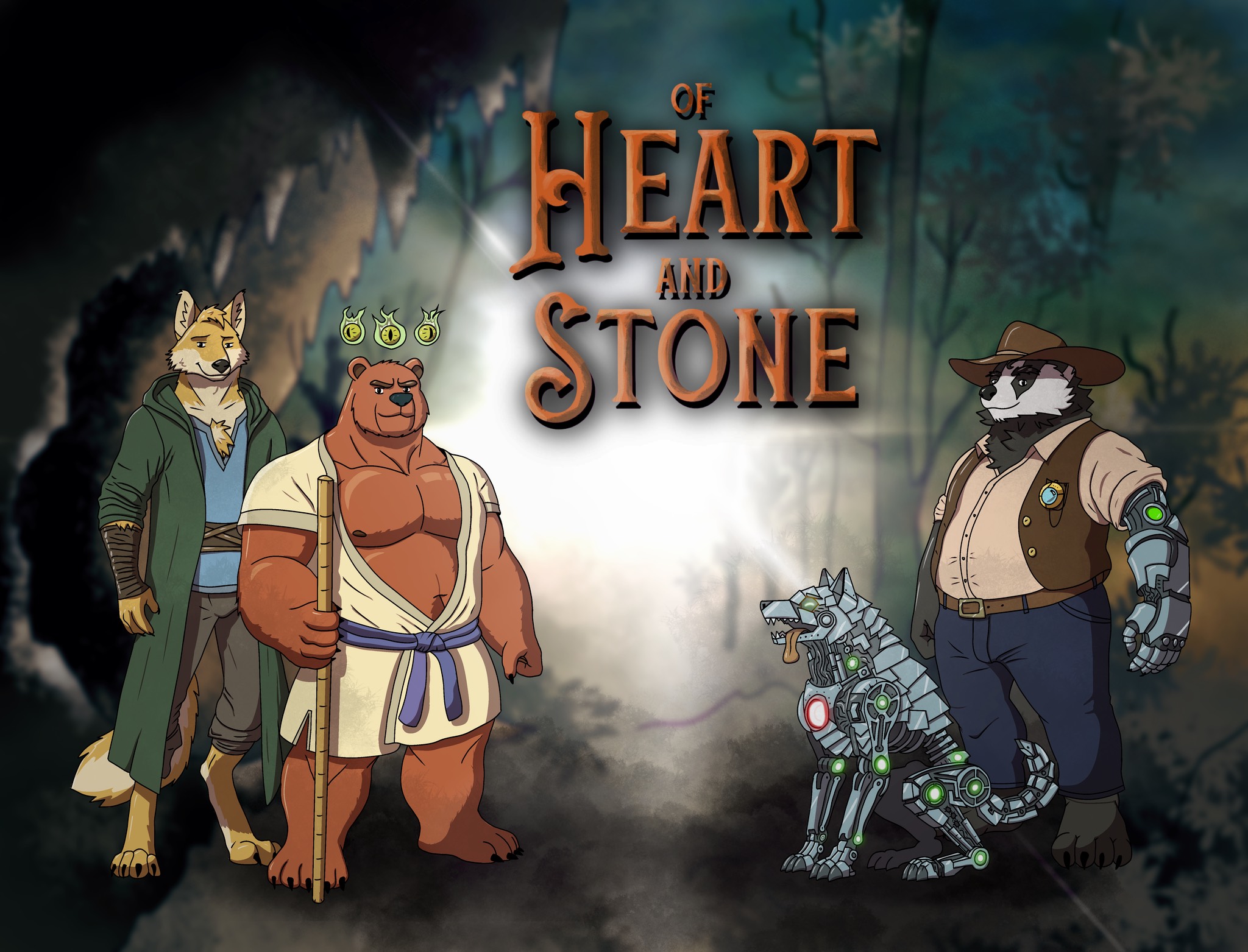
Of Heart and Stone
by Sol Harries
A short furry VN
Show Review
Perfectly competent as a short story; has all the essential elements and nothing more. While how the characters and especially their relationship are set up could afford to be more precise, the singular plot beat Of Heart and Stone is essentially built around lands on an emotional level. Crucially for this kind of thing, every scene has a clear purpose and moves the plot forward, and besides maybe one instance of magical technobabble going too far, the writing is breezy.
While the character designs of the protagonists stick closely to the archetypes, the use of color is tasteful, and the amount of expressions and animation is appreciated. I also like the mechanical wolf having a visual representation, since it's such a fun detail in the story.
Generally speaking, just a cute, simple, efficient read. No opinion about the narration, since I played without it, but since the work was presented as a proof-of-concept for the engine, some notes about that:
– The aspect ratio not being fixed leads to issues with the title screen on wide displays. In general, I feel like it's going to be a lot of work for the developer to make everything work properly on all kinds of screens; being able to position things precisely in relation to each other is often nice.
– Breaking sentences across multiple text boxes is, IMO, a big no. Not sure if the UI can't accommodate enough text or if the lines are just too long, but I'd say it's something to avoid.
– Not having to sit through a loading screen is definitely a big advantage of writing the engine in HTML, but on the flip side, visually seeing the backgrounds load on slower connections is distracting.
– The engine is fairly buggy in general; both skipping ahead fast with space and moving backwards have a tendency of breaking stuff.
– While I understand that the use of dialog tags in this story has more to do with it being an adaptation of a script not written with visual novels in mind, traditional dialog boxes are definitely nice to have.
– More granular settings would be great, audio sliders in particular.
All in all, while the engine could use further development, a solid piece with a lot of effort visible in all aspects.

The Red Ballet
by Pink Narcissus
Is this what you wanted?
Show Review
(Review based on build 0.6)
What jumps out is the sheer amount of effort the writer-artist-musician has put into the project, but The Red Ballet is the kind of captivating, idiosyncratic artistic whole that it takes more than just hard work to pull off.
Crucially, the steady directorial paw ensures every piece fits together and makes even some debatable weaknesses feel purposeful. For example, while the writing is somewhat prone to emotional extremes and yelling-in-all-caps-type melodrama, the presentation – between the exaggerated expressions of the sprites and a multitude of tasteful visual effects – supports the transitions in tone incredibly well. The CC assets are thoughtfully curated, too: I knew I was reading something assembled by a pro when an unedited low-res photo of a bus came off as pointedly janky, mundane, and boring in contrast to the drawn and heavily edited backgrounds.
Among the VN's most interesting aspects is its use of nonlinear storytelling. The maze-like structure packed with many meaningful choices and the mysterious framing device add a strong, distinct sense of unease, making it feel like the game is toying with both the reader and the characters. While not every horror scene lands in terms of scares alone, I think this is an area where the VN is engaging productively with its genre and providing an experience that wouldn't work in any other medium.
Similarly, the two routes play off each other in an incredibly smart way. Sid, the protagonist, is suddenly given the chance of his dreams to join a ballet theatre he's obsessed with; in return, though, he would have to enter a sexual relationship with its abusive owner. While that character's route delivers what as of now feels like a familiar tale of "was it worth it?", I think it's strengthened enormously by the inclusion of the sobering other choice where Sid declines the offer and life simply goes on. Being a meditation on (among other things) pipe dreams and what one would give to achieve them, I find it touching that the game is this willing to contemplate the alternative where Sid remains stuck at his shitty store job. We love unglamorous anti-wish fulfillment that nevertheless insists on its working-class characters finding whatever dignity and meaning they can.
I will also say that the story represents one of the more successful attempts I've seen to use furries to explore real-world social issues with its species-as-class allegory. The execution only really falters in the places where the game veers too far into how animal biology affects the state of affairs and comes close to shifting the central metaphor to race; I suppose enough has been said on the internet about why this works less well.
On another slightly critical note, though it arguably serves to distinguish Sid's peers from Misha and his circle, many characters have voices and especially senses of humor with a lot of overlap. Let me just say, the VN doesn't suffer from a shortage of characters who enjoy sex and suicide jokes, and it all gets a little overwhelming when many of them share a scene. This is maybe an authorial tendency worth thinking about, at least with future projects in mind. There was a lot of Emilio hate at the FVN server's bookclub, and I think it comes partially down to his banter being similar enough to what Sid and Awa already do that the game doesn't get to explore a lot of interesting new character dynamics through him. (In contrast, the more reserved and restrained Thanin is a welcome addition to the group!)
Anyway, I don't think I should go deeper into the plot at this point, given the game we're talking about is both unfinished and criminally underread. To put it simply, The Red Ballet is backed by a compelling vision, and the multitalented creator grows more confident in their prose, art, and sound design every update. Go check it out.
Silent Star Symphony
by Pink Narcissus
Play the symphony together. One meaningful something at a time.
Show Review
(Spoilers throughout the review)
Back when Pink announced they were working on a sequel for Stars In Your Eyes, I had no idea what to expect, so in the light of that, let me consider myself pleasantly surprised. There's some really tight plotting in here; basically every story thread from the first VN is followed up on in one form or another, and all the additions are weaved in quite organically. I particularly like how Ruby and the café get reused in a fun scene that never feels like it's coming from a place of "I guess we have to bring back the most prominent side character"-esque obligation. (And as much as it's invoked as a meme, I'm forced to admit that the panettone bit is very funny, and the outside scene it leads into fits in perfectly pacing-wise.)
The single smartest writing decision, though, is the timeskip, which allows us to reunite with the characters when they have interesting new stuff going on rather than forcing us to sit through rote romantic development. It is to its benefit that the VN feels like a true sequel rather than just a continuation, and the split into multiple games makes the status quo shift seamless.
Compared to the author's other works and especially The Red Ballet cinematic universe's general vibe, a lot of this is fascinatingly lowkey in a way I think works excellently for the story being told. At this point, we're already familiar with Luca and Haoyu; it feels right to dial down the drama just a little and trust that the audience's investment in their fates suffices. I do think the game mostly hits the big emotional beats, but its subtler stuff is also very compelling. The relationship is conveyed more so through the little details (like everything we learn about the mattress episode) than grand gestures.
Also, I don't know if this was the intention at all, but to me it feels like there's an undercurrent of nervousness to the relationship that does a lot of work to sell the stakes of how much both of them need this. Like, they're always reassuring each other in this "it's ok for you to feel and want whatever you do" way that is simultaneously sweet and maybe indicative of a need to be the perfect partner who proactively anticipates conflicts and disagreements and deprioritizes their own desires. I think it's an interesting layer that they're written like people who genuinely care about what's best for each other but are simultaneously also perhaps a little afraid of losing what they have. So far, it feels pointed that everything has gone mostly smoothly between them; if we get a third one, I'm curious to see if there's bigger drama on the horizon and how the character dynamics would adapt to that.
Something these VNs have been really good at – and something that counts a lot for making them feel conscientious in their depiction of the disabled protagonists – is averting the worst excesses of both misery for misery's sake and overtly inspirational feel-good. The only thing that gives me a pause in this regard is the ending, which felt jarring enough to make me wonder if it was supposed to be a fantasy sequence for a moment. By themselves, there's nothing wrong with the plot beats and where the characters end up, but it feels like the game has to arrange things in a pretty unsatisfying manner due to everything it wants to include. We have to see Haoyu playing the piano for the first time in a critical moment of melodrama, and we have to jump forward to him being an accomplished pianist, but the fact that there's barely any narrative time between these events really makes it feel like he's getting the short end of the stick here. All of the "how", and the catharsis of Haoyu's self-actualization, is forced to happen off-screen.
This development is presented as such a central part of the story that I'm left a bit puzzled about the seeming carelessness the game treats it with. You get the sense that it clings to those two moments happening as they do so stubbornly, not even making use of the timejump already there in the beginning to provide a smoother setup, that the overall arc becomes a bit bungled as a result.
As far as presentation is concerned, one of the big delights with these things is always seeing how the artist's talents develop, and there's a fair amount of it even though the last one didn't come out that long ago. Ruby got a big glow-up from the last game, especially in the vulva wall art CG, and there's a lot of interesting, adventurous use of light and texturing throughout. I want to specifically shout out the PinkNarcissus Sex Music, which is pretty bold as a mood-setter but works out perfectly in the scene where it plays – a rare feat as far as these things go. I'd add it on my real-world sex playlist if I had one. (The only thing art-wise that makes my soul hurt is using JPEG, the panettone of image formats, for the CGs... It's a deadly combination with the artist's love of noise filters, as the fine details are all mush. Pink, this is an intervention: if you're worrying about file size, please use webp with lossless compression...)
Other than those couple of negatives, I like basically everything here. The implementation of accessibility options continues to be stellar, and it feels like the VN makes use of the two characters' perspectives and their formal dimensions a bit more carefully this time around. The jokes continue to land, and I appreciate how often Pink manages to sneak little pieces of characterization or worldbuilding details into them. For instance, I assume the things everyone remembers about the transmission device are that it may or may not cause brain cancer and that one bit in this game about sending emojis. What a concept, giving the lives these characters live context and texture through humor.
Anyway, in conclusion, Silent Star Symphony will certainly be a nice read for anyone who enjoyed the first one; what worked there still works, and there are some fun new developments as well. Revisiting these characters definitely felt worthwhile.
Spirit: Summoners of Áine-Chlair
by GhostieSpectie
What does life mean to you?
Show Review
(Review based on build 0.4)
Spirit: Summoners of Áine-Chlair is solid in its construction, steadily entertaining, and deeply charming.
While the story is built of material that feels very familiar, it is crafted with a sharp eye for setups and payoffs and comes with plenty of fun character interactions. And although the plot doesn't get rolling terribly fast, no part feels like filler or pure downtime – the slice-of-lifey parts complement the meatier sections well, and details about the characters are sprinkled in at a very reasonable pace. Overall, it's a breezy, engaging read, blunt but effective with its exposition and tonally controlled in spite of the wild range of emotions it is willing to throw at you.
The prose is fine, although uneven at times; at least one scene feels like it didn't get edited much. With the visuals doing so much work, it doesn't hurt the whole a lot, and the dialogue and the character voices are strong.
Speaking of: sometimes, the visual style feels like a burden the game can't quite overcome. Due to the uneven colors, some transitions (such as when a sprite expression fades into another) are somewhat awkward, and how the sprites look in front of the backgrounds just feels slightly off in a way the full illustrations don't. It could be possible to mitigate this by leaning harder into the cutout aesthetic – avoiding transparency and adding some kind of border to the sprites, perhaps. Everything about it just doesn't feel completely purposeful.
However, there is nothing wrong with the drawings themselves. The character and creature designs are very appealing – simple enough to emphasize colors and shapes nicely while still capturing different furry species in a way that makes all the characters feel distinct. (The eye designs feel very crucial here!) A lot of the game's most effectively sentimental and horrifying moments are entirely wordless, although the real visual highlight are definitely the intense, dynamic action scenes with their mix of anime-esque effects and comic book-y panel compositions. Pastiche in equal amounts formally as it is narratively, Spirit's visual storytelling is a constant delight despite the fundamental limitations of its art style.
What can I say, it's good. Some of the game's tricks – like the constant references to other visual novels – could fall flat with worse execution, but Spirit makes them work, largely thanks to always maintaining its contagious sincerity instead of sinking into parody. Definitely a project worth following, looking forward to the next build!

What A Day That Was!
by shiroooo_dev
You wouldn't believe me if I told you.
Show Review
Another neat shortform VN that makes every word count and leans into its literary influences.
The writing is slick. There are plenty of evocative descriptions to set the tone, but Cade's voice is wisely surfaced during pivotal moments. A particular highlight is the fight scene, which reads as very naturalistic in its rising sense of disorientation; in general, I think the game does a good job at painting the perspective of a young adult character who notices, feels, and fixates on things without always knowing why. What A Day That Was! keeps its moments of characterization confidently reserved and understated, trusting the reader enough to not state every subtext out loud.
(One small editorial nitpick: the game has a tendency to repeat information, seemingly not taking the fact that dialog already reveals character names into account. For example, see Mason's introduction, which goes from "my younger brother yelling at the TV" to "Mason: What the hell?!" to "My brother, Mason, is...", which I feel could be tightened. Also, a couple of longer paragraphs could afford to be broken up.)
The plot has just the right amount of complexity for the scope of the project, its elegant simplicity difficult to appreciate if you don't stop to consider how ingeniously laid out it all is. Each detour before and after the main event feels justified, but the game never comes off as stuffed with needless details. The only spot where narrative momentum is in danger is probably the chat with Justin; I would have enjoyed some kind of foreshadowing for it – maybe just Cade offhandedly wondering if he'll see the guy tonight – but it's ultimately not that big of a deal, as the scene is short and clear in its intentions. Another weaker point is the climactic conversation, as the character it involves similarly lacks setup and the protagonist is maybe just a little too quick to accept what he's told. The final beat feels believable as a character moment and brings the whole thing full circle satisfyingly, though.
Background choices are good, and the color coordination feels considerate enough that I wouldn't have minded having longer transitions between scenes to display the images more prominently. The original soundtrack is the real star of the show; besides the tracks themselves being nice to listen to and laying down the game's atmosphere perfectly, their placement in the story – silences included – always feels purposeful. Sound effects are used sparsely, but it feels right to let the music do the talking. The biggest presentational hiccup is text frequently extending far down enough to overlap with the buttons; I'm into how it's displayed, resembling the pages of a book, but some extra padding near the borders would help.
All in all, good work – even if an important scene sort of underwhelming hurts the whole to a noticeable degree, the prose has a constant clarity of purpose to it, and the insanely good music more than makes up for the limited visuals. Plus, the game is grounded and realistic in a way that feels like a breath of fresh air with the average FVN leaning towards melodrama. Recommended read for everyone suffering from Fields of Spring withdrawal.
9:22
by Cockhole
Show Review
(Review based on build 0.9.1)
Delightful. It's been a while since I've read something this committed to simply being constantly fun to read between its skillful comedic delivery and thrilling storyline.
9:22 is good at dropping hints about its central mystery at a nice pace, and it's even better at less direct forms of setup. The kooky, off-kilter tone ups the stakes by preparing the reader for just about anything, and the character interactions are entertaining while still establishing the cast well. The VN is just an amazingly tight package, honestly – no scene feels wasted, and the reader's attention is always rewarded, which is so important for making something like this land.
I also like how well the game maintains its grounded vulnerability; all the silliness and the wacky mystery never threaten to sidestep the effective emotional core. 9:22 may not break new ground by mixing the tension of navigating queerness in an ambiguously accepting space with other forms of secrecy and conspiracy, but it's a parallel that works for a reason. All the different "what does he know, what does he want of me" questions support each other, adding new layers to each character interaction and the story at large. The narrative really feels like a continuous whole with all the thematic synergy; it's good!
I'm also really into the visuals the VN deploys with a stunning sense of precision and purpose. The gorgeous animated backgrounds are instant mood-setters (holy shit, the car scene!), and relying on them instead of stopping to build atmosphere via prose allows 9:22 to maintain a carefree, snappy flow that makes it constantly engaging. The cutout style of the expressive sprites is charming and works well with the movements, creating a feeling of someone moving a bunch of paper dolls around. It's an interesting idea that boils the medium down to its essentials – full-screen backgrounds and character sprites laid on top of them – in a way that makes all the formally adventurous parts hit hard in contrast.
At times, the game feels like it takes minimalism too far, though – some character designs are kind of plain, Kurt in particular. Combined with the rotating outfits (though they are a nice touch and I appreciate how they communicate time passing!), it feels like there isn't a strong sense of visual identity to the cast. It's not a huge issue by any means, but I think either not doing outfit changes or making the sprites a little more detailed would be justified. Still, I like what the game is doing with its style a lot.
I'm gonna hold off further analysis for now and join the ranks of 9:22 stans anxiously waiting for the concluding update, but the game is already easy to like and easy to recommend. Thank you for this gift, Mr. Cockhole.
(Sidenote: while I've been theoretically aware of the author's name being paratextual material, I think booting this game and seeing the Cockhole logo is a pretty striking example of how it can be used to prime the reader for what they're about to experience. Rest in peace Gérard Genette, you would have loved 9:22)
Upcoming & Promising
Dawntide
by Choob
Show Review
(Review based on chapter 1)
Visuals & presentation seem to be the the main appeal of the game, and they're great. The aesthetic looks fresh, not being something you see that often in the genre, and is nicely reflected in the user interface. While the sprites are good, the simple but gorgeous backgrounds in particular do a lot of work to establish the mood and style of the game.
There's maybe not enough story in the first build to get me invested yet, but it's promising. The character introductions are smooth, telling you just enough, and the prose is really good in the parts where it shifts into a more poetic mode. What made me curious to see where the story is going was the clear sense of direction for Riley's arc; at this point, though, the other characters seem less well defined.
Though this is more of a personal preference, with how many choices with (hidden) consequences the first chapter has for its short length, the game already feels complicated in structure. I'm interested in seeing how the final route choice will play out, given that some character setup is hidden in branches the player might not see. It's a hard balance to strike.
Though it doesn't feel like it shows its entire hand yet, it's a project with lots of potential; very excited to see more.
Ever Our Hearts Aglow...
by Galsult
Dare to Into the Dark, in this Psychological Furry Visual Novel With Gay Themes
Show Review
(Review based on build 1.02)
Certified fun for the whole family, if a bit exhausting at times.
It's written in a strong voice, and the character designs are an interesting mix of good taste and that DeviantArt original character flair. I don't think anything summarizes this better than Camry's ridiculous blue anime hair – if you squint your eyes, the balance of colors works surprisingly well, but you can also pinpoint what we're doing a gentle pastiche of. (Well, the love interest bearing a striking resemblance to another wolf from pop culture is a strong candidate.) Plus, the expressions are all so charming; I love Camry's default sprite, where he looks both mildly smug and like he's on the verge of bursting to tears.
As a spoof VN, EEHAW makes several smart decisions. Firstly, in lieu of getting bogged down in parody of specific works or tropes, it's simply a more loosely constructed journey into the tortured WattPad teen's twisted soul; second, the plot and the world are of the exaggerated sort where just about anything can happen. This lack of constraints does ultimately feel like an advantage, as the game can focus on delivering whatever gags pique its interest. The comedic material is diverse and compelling, ranging from overtly dramatic, flowery action ("an tsunami of crimson vermillion red erupted from the volcano of his spine") to shopping montages accompanied by the protagonist's musings about the degree to which third-world child laborers are morally responsible for microplastics pollution.
However, I do think it could push itself a bit more. You can feel the pacing dragging just a little; no scene feels truly extraneous, but almost all could be trimmed down to move things along faster and increase the density of killer lines. I think that the narrative's slowness also comes down to the fact that though the characters are all pretty fun, group scenes are rare – most of the cast exists on separate islands for Camry to interact with one-on-one, meaning there's a lot of potential in character dynamics that remains unexplored. Couldn't Kari have come to the hospital, for instance? It feels especially strange that we don't get more of Wulver.
Furthermore, EEHAW prefers to work in a mode where it establishes a wacky plot point (e.g. the drama with the father) and then sees it meticulously through to its bitter end. While this approach does have its appeal, it can't help but feel like a missed opportunity that the game doesn't use its surreal tone as a license to subvert its setups more. It feels kind of weird to say that there haven't been that many surprises in the story so far!
I will also say that most of what the VN does with form and visuals is good (I love characters screaming so hard it breaks the boundaries of Ren'py's text box), but there isn't a lot of it yet. Really using the medium is one of those things that elevates a good parody to a great parody.
I do hope there's more coming, however! What exists of Ever Our Hearts Aglow... is a solid foundation, and there is so much good stuff I didn't mention because I don't want to just spoil it all. Go play it, if you dare........
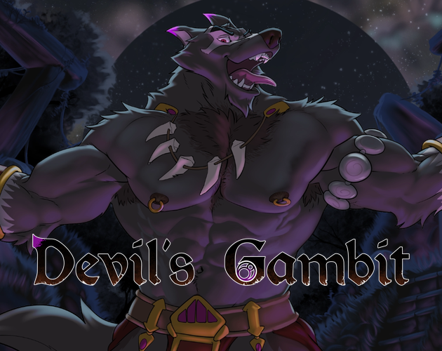
Devil's Gambit
by roddio, Alpha0, Minoh Workshop
I want to eat your heart out.
Show Review
(Review based on version 0.5)
Devil's Gambit: oozing with production value and attention to detail, overall makes for some compelling character drama and mystery, but the writing is not without its more dubious parts.
The biggest nitpick out of the way, first of all: the UI is sort of iffy in general and really stands out as the weakest link in the presentation. Though the paper texture of the main text box works in the context of the story, the borders – being either too sharp and even or fading out gradually – fail to preserve the impression of physical material. Also, the transparency creates a weird effect with the label for the speaker's name, not to mention that the names or the box itself not being colored means there are no prominent visual hints differentiating lines spoken by all the different characters. As a minor UI papercut, the arrow indicating the end of the looks wonky due to not being vertically centered. Not just having the default Ren'py's UI is definitely welcome (even if I'd look into changing the scrollbars and sliders!) since fantasy is a genre it works particularly badly with, but there's a first-draft feel to the execution. I do like the settings menu's layout, though.
While we're here, might as well as mention how breathtakingly good the art is. The illustrations are impeccable on a technical level and detailed to a degree that makes the amount of time spent on them all feel frankly scary to contemplate, and the expressive sprites rise to the daunting task of making a decently large cast of characters seem distinct. Direction feels solid, too, and I especially like the consistent use of colors and lighting, even if a lot of the character-centric CGs are sort of plain and functional in their framing. Amazing work all around; feels kind of pointless for me to even sing the game's praises here, since we can all see it.
My impression of the writing is more mixed. While the prose has nothing serious in it to gripe about, the secondary narratorial voice (in 2nd person) results in some unnatural jumps:
"I am still baffled by questions... However, you have work to do, Hector."
"Maybe there's more left of the old Cadgan than I realize. Well, you won't get anywhere worrying all by yourself."
It's definitely good that this is something you immediately notice happening, but I think some of the transitions could afford to feel smoother. Breaking some of these up into multiple text boxes might help? Besides that, the formal character voices feel all vaguely similar, which is difficult to not think of as a missed opportunity with the different factions and cultures the story involves.
My bigger concerns relate to structure and pacing. Since consecutive past and present chapters near the beginning tend to mirror each other in all kinds of ways, it feels like the game wants to liken the flashbacks to memories. The idea is good, but the execution is hardly Proustian – whatever scene we're reading rolls to its conclusion, a title card fills the screen, and only then does the recollection play out, removing the crucial sense of immediacy from the situation. There are also just a lot of these back-and-forth jumps, and not every transition comes off as fully motivated.
In general, I'd describe the structure as sort of fragmentary and modernist – something I usually like but don't necessarily see working with a narrative that has this much plot in it. The chapters are all over the place in terms of length, scope, and whether they form coherent wholes or not, which makes the story feel like it lacks forward momentum. There are some excellently punchy chapter endings, but sometimes you just follow the characters go about their day for a while and get a few crumbs of information before the narrative jumps to something else. I guess the flashbacks deserve much of the blame here, as the story really picks up after they stop happening or a regular basis, or maybe it's just the game finally getting through the beats of character drama it wants to hit before kicking off the plot for real. The pacing of character introductions doesn't feel entirely right, either; you often get a bunch of new side characters in rapid succession and then don't see them for a while. (To be fair, maybe some are intended to be one-offs instead of recurring players – kind of difficult to tell when basically everyone seems to get a sprite and the writing doesn't always telegraph the difference well!)
In any case, keeping close sight of how every chapter pushes the story forward is important when writing something that plays with narrative time like this. I don't think Devil's Gambit nails it completely – it starts off real sluggish with all the flashbacks slowing down the pacing in the first act instead of being used as opportunities to backfill information later on. The character writing maybe comes off as meticulous to a fault, spending a lot of time on showing Cadgan and Hector interact in both past and present. Less might have sufficed; I think the plot already has enough stakes to it even if we imagine the relationship between the two to emerging more gradually.
Also, this is a small complaint in the grand scheme of things, but I don't find a lot of the chapter titles compelling on their own or interesting in how they frame the chunk of story to follow. For instance: why is Chapter 9, specifically, named "Cadgan" when we learn plenty about him in many others? I think most of them are just kind of literal where something more flowery and attention-grabbing would feel appropriate, given the genre and the tone of the game. Maybe it's symptomatic of the issues in chapter structure I discussed earlier – it's easier to name something when it has a clear point to it and when there are fewer things to name.
What else... oh, this is purely a personal gripe, to be clear, but as a staunch hater of "magic systems", I was kind of disappointed that the main character being a doctor in a medieval setting (cool premise!) turned out to involve more fictional magic stuff than real-life historical inspiration. It does ultimately feel like a very natural way to integrate a lot of information about the supernatural elements into the story, though. The exposition is easy to gulp down with a protagonist who provides an interesting perspective into the world.
I'd call the beginning a little rough, but the fact that there are intriguing literary decisions whose merits you can discuss and debate is already worthy of a glowing endorsement, and the earth-shatteringly good art of Devil's Gambit complements the story beautifully. I will definitely keep reading.
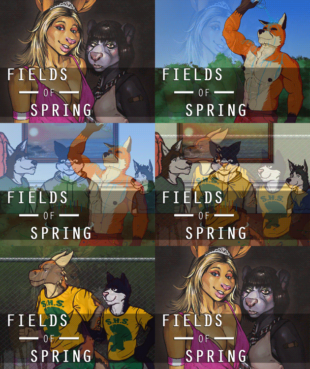
Fields of Spring
by Eymon
All of your problems out there? Leave them out there.
Show Review
(Review based on build 1.1.1)
Fields of Spring: very good. How considered its understated emotions and its slice-of-life monotony feel makes its admittedly slow slowburn truly rewarding even just a few builds in.
The clear highlight here is the writing, especially the strong, starkly naturalistic narrative voice with a constant sense of underlying vulnerability to it. The transition to adulthood is captured with grounded realism rarely seen in the genre. Fields of Spring is also very good at maintaining the separation between the player and the characters, allowing the implications of its restrained drama sink in without resorting to overexplaining itself. It feels very literary in this sense, fitting how there are no choices – form and narrative are in perfect harmony here. All in all, the fact that the game is so engaging to read owes a lot to its excellent prose.
That being said, the game does not earn its slowness all the time. While I like what it's going for a lot and think that the timejumps make it a lot smoother to read, it's hard to deny that the VN feels constrained by its structure on occasions. Its dialogue and character dynamics really flourish in group scenes, which makes me feel like it could have been worthwhile to think of more ways to introduce characters within them instead of giving nearly everyone their own "meet this guy" scene; the first day has, on the whole, a lot of this kind of setup.
If there is something else to gripe about, it's probably the fact that the gray color palette and the limited body language of the sprites make the game look more static than it could be – while this is not exactly thematically inappropriate, it is rarely capable of conjuring interesting images. While there are some pretty good moments with camera movement, they kind of clash with how limited the visual language is otherwise; the visuals lack the clarity of purpose the writing has.
Still, Fields of Spring is already very much worth reading, and with the initial awkwardness of its slightly sluggish setups out of the way, I expect the eventual payoffs to land hard. I enjoyed it a lot, even with not being exact target audience of its specific cultural commentary and nostalgia.
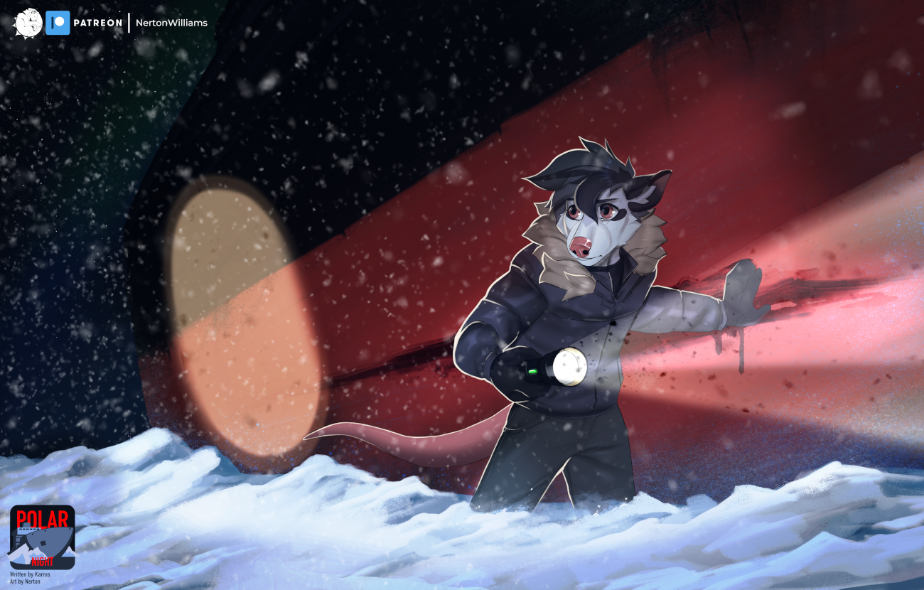
Polar Night
by Karras
A furry horror visual novel set in the frigid Arctic
Show Review
(Review based on v0.1)
An intriguing start; wonderful atmosphere and a fantastic premise. The sprites look nice, even if you do notice that the budget went into having a lot of them instead of expressions. I'm personally less bothered by the stock photos than by the fact that there aren't a lot of assets in general – the game feels visually static when you're staring at the same blurry background for a long time. Given the claustrophobic setting, keeping the visuals interesting could be a challenge unless the plot ramps up immediately.
The prose is imperfect. While the imagery and the character voices are sharp, there are all kinds of minor writing problems, from inconsistent verb tense to punctuation to word order and sentence structure. Most of the time it's absorbing enough of a read for it not to matter, though, being tightly paced and very calculated in how it introduces its large cast and the central mysteries. The purpose and personality of each character is set up in a way that feels both organic and easy to follow, leaving just enough about them ambiguous.
Also, I appreciate how intertwined the game's plot and character drama are. It really avoids the typical VN pitfall where a scene is a drag to read because it's so clearly just about meeting this new guy and nothing else; Polar Night, instead, wisely keeps the reader on their toes. The underlying tension in the character interactions helps the horror atmosphere a lot, making it constantly feel like anything could happen. Bonus points for the fact that the first build feels like a pretty natural standalone chunk of the story; it will be a fun VN to follow if the others keep it up.
What is already here is pretty good, and since the game does such a good job at laying out interesting hints about where it could go, it's very easy to be excited for more.
Silverstone
by BrickZed
It all leads back to the lighthouse...
Show Review
(Review based on version 0.1.0)
Positives first: the writing is largely polished, the art style is neat, the photo backgrounds add a lot of personality to the setting, and I like the UI. I would call Silverstone a solid package on the whole, even if there's much to nitpick and the opening doesn't quite sell the VN yet.
First of all, as mentioned, the UI is really good. The sort-of-retro skeuomorphic vibes are fun, and the layout of the main screen is unconventional but functional. Don't really have anything else to note – I understand that the sprites will be getting more expressions, but them being static does sap a lot of energy out of the experience. As a singular bug report, the "Menu" and "Help" buttons work strangely if the settings are accessed via the title screen.
Just in terms of surface-level writing errors, there are occasional problems with syntax, sentence structure, and punctuation. For example: "Gasping for air as my body vaults out of the tide, the ocean breeze entering my lungs makes my organs feel crisp and raw" – is the ocean breeze gasping? There's also an extra comma sometimes: "all a stupid, goddamn dream", "an itch in the back of my brain, that..." It's noticeable, but nothing too serious.
More generally, I think my main advice would be: tighten, tighten, tighten, both in the big picture and on sentence level. Some character beats, like the Kelsey/Jake feud and Zeke not remembering stuff, are reiterated too many times. There are individual lines that feel too wordy: "She points down with her eyes when I look at her, drawing my attention to what both of them were beaming at." (I think just "She points down with her eyes" would convey the exact same amount of information.)
The game also just has a tendency to overuse narration. Often, the subtext of a character interaction or what Zeke is currently feeling is spelled out even if the implication is already clear. When the "meet the cast" part of the story is this long – the material is not uncompelling, but you do feel the word count – I think it's fine to trust the reader and let them get an impression of who everyone is over time. Not every moment or piece of dialogue needs to be emphasized, even if that risks someone not getting the point.
Comparisons to a certain other VN are probably inevitable, given both works are horror games revolving around a group of friends reuniting in a run-down town amidst spooky happenings. Silverstone is not derivative enough for that to really bother, but I think contrasting the two would be helpful in illustrating a couple of things I thought were lacking here. While pre-route split is not my favorite part of Echo, I think it does get a couple of crucial things right, allowing it to smoothen out the slow opening segment.
Namely: I think the structure feels way more propulsive over there. Chase's project provides the game both a sense of direction and a good excuse to deliver some mood-setting exposition in the early stages. In contrast, Silverstone slows down to a halt when the group arrives at the titular town, since the characters don't really have an overarching goal beyond hanging out and visiting a couple of places. Even worse, the chapter structure is really weak – both the prologue and the first chapter fail to end on a truly interesting point or a stinger that would make you want to continue reading. If you removed the title cards, I would be willing to believe that we're still in the first chunk of the story.
I also think that being more economical with how the supernatural themes and mechanics are revealed ultimately works in Echo's favor. Its brief but evocative dream sequences are enough to set up a couple of big things and keep you wondering while not taking too much attention away from the interpersonal dynamics of the cast. Sometimes less is more – Silverstone tells you a lot, but its descriptions feel self-aware and telegraphed in a way that distanced me from the horror. Is it necessary to call the nightmare world Zeke finds himself in both "liminal" and "non-Euclidean", or to lay out so much about the nature of the antagonist?
I would maybe switch it around and divulge a bit more plot stuff and add a couple of extra hints about Zeke's backstory while keeping the Stranger fully mysterious. I don't think knowing that they're some kind of immortal being adds anything at this point; if they're an intriguing presence in the narrative, it's because of what we see them do. The game feels kind of too SCP-adjacent in a sense, too eager to clarify and contextualize and catalogue.
All in all, releasing this much story content at once was definitely the right move, because the first 25 000 words feel kind of meandering and lacking in payoffs. What we get is more explicit than needed in some places and too vague in others. There is ultimately no big hook yet, beyond promises of lore and backstory and some kind of series of events happening in the future. It's not just quite specific enough to really arouse interest – the evacuation of the town is a fantastic mystery, but we don't learn much about it yet.
The comparison to Echo hurts not because Silverstone feels like a ripoff but because it could afford to be as tight with its writing and as precise with its setups. While I'm interested in reading more, I do hope the game will be a more compelling experience after all the big introductory stuff is over and the plot kicks off for real.
Soulcreek
by Ryuo
A sci-fi furry visual novel.
Show Review
(Review based on build 0.4)
Very nice. Soulcreek is engaging, competently written science fiction; there's a good rhythm to the introduction of worldbuilding concepts and their payoffs, the characters feel like products of their societies and circumstances, and there is a strong impression of the story happening in a larger world with a history.
The prose is good throughout, particularly the dialogue – all the character voices feel really distinctive. Some parts, such as the start of the first Blackzone visit, stand out as especially tight and punchy, establishing an effective atmosphere and making every sentence count. At its worst, the writing feels somewhat utilitarian and literal, giving a functional description of the world and its characters but not contributing much to the emotional landscape of the story or adding symbolic dimensions. The game is never a chore to read, to be clear, but there is some slowness in the first half. Apart from making some of its descriptions heavier and sharper in terms of subtext, it could also perhaps be bolder and less sparing with timeskips.
(Also, as a singular editorial remark, the game uses exclamation marks a lot, and while it's a nice, distinctive part of its writing style, you could probably make them a bit rarer to help keep them emphatic. Especially when they are used in multiple consecutive sentences.)
Byte feels simultaneously like a neat narrative device and a source of some challenges. He's very good for delivering exposition and making scenes of thinking about things and solving problems more engaging to read. However, I'd say that the protagonist only starts to feel like a well-rounded character in the latter half of what I read, mostly thanks to the game paying more attention to the differences in how he and his brain AI feel about some things. The very thorough way the two of them talk about some aspects of the story, particularly the side characters, also slightly robs them of their ambiguity; some things could be spelled out less clearly.
Art-wise, focusing on backgroundless illustrations in the style of the sprites instead of traditional CGs is an interesting choice. While all the scenes with them work on their own, this does lead to the game feeling somewhat visually monotonous on the whole, as VNs rely on full-image art to create scenes that feel interesting and purposeful in terms of color and composition. The way those scenes are animated is very cool, however, and I'm interested in seeing how the game's use of visual elements will continue to evolve.
An easy recommendation for people looking for good science fiction with interesting mysteries and appealing character drama. It's not all killer, but given that Soulcreek improves fairly steadily towards the end of the current build, count me as very excited to see more.
String Zero
by String Zero Project
Cyberpunk Sci-Fi Drama
Show Review
(Review based on version 0.4.5)
To start the review with what is probably the VN's most prominent aspect, the plotting and the worldbuilding sure are maximalist. The cast gets very large very fast – it feels like at least a solid third of the first arc is just character introductions – and even if you manage to keep track of all those people, there's still the mysterious backstory with loads of players who may or may not haunt the present narrative moment. The prose comes with a liberal amount of fictional slang and terminology, on some occasions bordering on impenetrable unless you seek the aid of the hover text explanations and the in-game compendium. And, needless to say, there are many cultures, factions, and technological as well as religious concepts to learn about.
I think this kind of thing is generally a matter of taste to a degree that threatens to render criticism futile, but let me try anyway, and start by listing some ways in which it all worked for me. The plotting is sharp on the level on character motivation; what everyone is doing and why is usually easy enough to grasp. Despite the sprawling extent of the cast and the lack of quieter moments of downtime, the central relationships (the father-son one and the not-quite-lovers one) feel interesting and emotionally believable. All that slang and the sense of the depth to the setting's politics, technology, and cultures do make for a transportative reading experience – it's definitely a well-realized secondary world. (Nitpick zone: I could do without the use of clearly contemporary terms like "himbo", which show up rarely enough to feel like editorial oversights, deliberate or not.)
In general, I enjoy the VN's willingness to throw the reader in at the deep end and present them with an information overload, making it difficult to say which questions are supposed to be answerable and which remain open. Reading String Zero is an active and engaging process: I always felt aware of what I was bringing into the text and where I was succeeding or failing as a reader. It's confidently challenging, never holding your hand such that trying to piece the mysteries together yourself would feel pointless.
To me, the biggest weaknesses are structural, both in the big picture and in the more granular details of when and how information is revealed and how scenes follow each other. The first chapter is by far the roughest part: we open on an abstract sequence so dense with lore that I'm sure I retained about zero percent of it, and the scene with Kavir is heavy with worldbuilding but light on the kinds of strong character moments and actions that would give the reader an easy way in. Everything in the bar works better, though the one-on-one character introductions get a little repetitive, and Ravy's quest to find Crown comes off as a tad too impersonal for being the big organizing principle driving the plot in that segment. Plus, even as the story alludes to everything being a part of someone's (the) Design, it doesn't help make the events themselves feel causally connected.
The gist of the first arc is easy to summarize: Ravy wants to join Kavir's crew, completes a sort of arbitrary task as a test, and is then let in. There's just so much happening between these beats – and specifically in a way seemingly arising from a narrative need to introduce and set up a bunch of stuff rather than as an organic consequence of them – that the story feels more shapeless than it actually is. The political intrigue with the wolves I'm mostly fine with, as it touches on the Ravy/Aerran relationship I can buy being important to establish at this point. Where things go a little too far for me is the cosmic horror incident; the writing does a lot of work to justify an unwise, impulsive decision a character takes, but all I could think was "huh? is this happening now?" because it felt very sudden as an escalation concerning a magic ability we had barely begun to understand. I think the price to pay for all this is that when reading, it's often easier to grasp the narrative function behind why we have to learn about this or do that plot beat now, with how the story progresses as a result of actions taken by characters fading into the background.
But the VN is never a bad read, and besides the confident prose, the top-notch presentation and the high production values certainly help. I think cyberpunk is one of those things that's more fun to do if you go all the way instead of just gesturing in that direction, and it definitely happens here, especially with the music. But what I appreciate most about it is the bold, creative direction that doesn't just spend the entire budget on five million CGs. For example, the most striking scene in the game involves a realistic, tactile animation of rain against a glass surface, which is not the kind of thing you always see being done in this space.
My only criticism – and it's a big one, at least to me – is how the UI prioritizes aesthetics above the comfort of reading. The text box you're looking at for most of the game has a big font size and covers the entire width of the game window, meaning your eyes have to move back and forth a lot if you pay close attention to the shifting expressions of the sprites. I remember one scene where a character was positioned on the right side of the screen being very annoying to read, and ultimately opted to not keep the window in full size. While I can't say how much this boils down to a personal issue, I found the text pretty bad to read compared to Ren'Py's sensibly centered defaults that keep your eyes close to where the sprites usually linger.
On the whole, there's a lot to like, and in some ways, I found myself positively surprised after initially fearing the game's lore-heavy style wouldn't speak to me. And in any case, I think it's an admirably big swing to make something this complicated and this full of idiosyncratic touches (though I didn't go into specifics, I like the mix of technological/mystical/religious elements in the worldbuilding), as easily as it all goes down thanks to the wonderful attention to detail and the slick presentation. I'll definitely stick around for more, and I hope the writing finds it footing with structure as the story moves past its setup phase.
Mixed Feelings
Burrows
by Nikko
Dig a Little Deeper.
Show Review
(Review based on build 0.12.1)
Burrows is another VN I have a lot of complicated thoughts about and have needed some time to assess properly. The positives (the fantastic art and how much of it there is, the polish in everything from writing to presentation, the original premise) are pretty apparent, I'd say; the game looks and feels like a professional project even with a couple of nitpicks to make (like the buttons at the bottom of the screen not being visible against light backgrounds). I'm not in love with every storytelling choice made, though, or how the core narrative is set up and structured in general.
First of all: its tonal unevenness is something I've been paying attention to since the game first came out, and at this point, I think I can pinpoint what exactly feels so off about it. For what is ostensibly a horror story, horror often feels strangely incidental and impactless. Let me explain: the characters go on about how they're trapped in a nightmare, but Burrows being always ready to retreat back to cozy character interactions or porny sex scenes makes the description ring false – there is no sense of escalation or rising tension, and I'm never convinced that the spooky episodes will result in real consequences. It's not impossible to fit everything the game wants to do into a single story, but I feel like the meandering structure just doesn't prop up the dramatic stakes.
The fact that the frequently jumpscare-y visuals have to do so much work in scary scenes feels like a symptom – I think the kind of slowly intensifying atmosphere of dread that I like to see in written horror is not there. Your mileage may vary; to me, the more cinematic kind of horror Burrows is going for simply doesn't feel like it makes effective use of the entire medium. Sure, the game can conjure images that are horrifying and uncomfortable to look at, but it just doesn't hit me in a way a lot of other stories (including furry visual novels) have managed to do with prose alone.
The thing making me kind of hesitant about this analysis is how aware the VN seems to be of the dissonance in Ken's route, where the question of how "real" any of this is and how much it matters is direct text instead of subtext. This theme is clearly going somewhere; I guess I'm just waiting for the other shoe to drop. Still, the stark tonal mismatches do feel like a problem, and I don't feel completely engaged in the horror aspect or the fun character hangouts despite all the routes having covered quite a lot of ground already.
Also, on the whole, Burrows feels somewhat burdened by the routes being entirely separate in terms of cast and location while telling what is essentially the same story. After you've experienced it once, the repetition of plot beats as Grey slowly comes to understand his situation feels slightly tedious in a way the freshness of each setting doesn't completely account for, and the amount of route-specific setup needed as a result of them being so distinct is daunting. I like the idea of this whole setup, and being able to examine queerness across different locales and throughout history is something the game uses nicely, but it does have significant tradeoffs compared to a shared setting.
When it comes to the mystery aspect, meanwhile: without getting into spoilers, there is one character in particular who seems like they mostly exist to fill in lore and save the protagonists the trouble of investigating the mystery themselves. (You could maybe say something similar about several sort of too-convenient supernatural elements.) For this kind of story, it feels like a misstep that the characters don't always come across as active participants with agency and goals – they essentially just wander through the narrative, with many hints about what's going on encountered along the way being more useful for the reader. Some concrete reveals so far feel more impactless than they could have been as a result of the lacking in-story buildup of the protagonists themselves working through the mysteries.
Take all of this with a healthy-sized grain of salt, obviously; besides the game being still unfinished, a lot of people seem to be liking it, so maybe this is fundamentally more of a "not for me" thing. Still, I think what I said here is a fair assessment of why I don't feel fully engrossed by the story, despite everything it has going for it and the lavish production values. We'll see if my opinion changes! Burrows does make a lot of interesting choices, and I'm more than willing to stick to the end and see what it has in store.
Show Old Review
(Review based on 0.7)
Very good. The visual style and presentation are top-notch; the game has a memorable look and feel that works across all the time periods the story takes place in while still feeling cohesive. It even feels like the art has improved during the development period, with some of the first sprites looking less gracefully drawn and posed than the newer ones.
The writing is good; I like how distinct all the main characters and settings feel. The game is frequently pretty funny, and I appreciate how humor tends to be pretty deadpan and mostly delivered via dialogue, preventing it from clashing with the pretty dark tone.
I only have minor reservations – some of the routes (Mark's and Gabe's in particular) feel a bit directionless and meandering at the start, which is kind of jarring due to the prologue (especially the new one!) doing such a good job at establishing the tone of the game. There's just a certain lack of urgency in the cozy hangout scenes that doesn't necessarily feel natural. The writing is still good and tight enough for it not to feel like a huge issue, though, and on the other hand, Hiro's succeeds at establishing the stakes fast.
On the whole, it's a fantastically paced game, but I feel like a slower slide towards the horror elements could have worked well with how the individual routes develop. Singular scenes always work well; tonal shifts between them are less consistent, with darker and lighter sections just kind of coming and going and the characters, as a result, sometimes appearing to be weirdly nonplussed by the circumstances they are in.
Between the intriguing mystery plot and the high production values, it's clearly a VN worth following, and I'm very happy about how it's coming along (the update to the prologue, for instance, was a massive improvement). Can't wait to see more.

Clawstar Wrestling
by horrorbuns
A short story following Eli, a small time wrestler with a big problem named Tremor.
Show Review
The visuals, first of all, were great. I liked how the photos and illustrated backgrounds were edited, making them look cohesive together, and the sprites were nice. Having so many CGs felt worth it, since they complemented the descriptions of action very well.
Unfortunately, I wasn't into the writing as much. I guess my main criticism is that I wish the game would have trusted the reader more and been more comfortable with subtlety. The character writing, in particular, suffers a lot from this – there are some occasions when the narration or dialogue repeats what the other just said or just states a pretty obvious implication out loud. It could have been fun to linger in the ambiguity a bit more, making the reader do more guesswork about what the characters really think about themselves and each other.
It's a bit messy structurally, too. For what is essentially romance, the story is weirdly unconcerned with romantic tension; it feels like we're 90 % on our way to the romance at the start, and the two-week timeskip jumps over some stuff that would have been cool to see, even in some sort of montage. It doesn't help that so much happens during the first day, which contains some awkward transitions due to characters conveniently being in places just when they're needed. Could the game maybe have jumped around more and covered a larger span of time, providing more of a feeling of things developing and making the climax stronger?
As a single, pretty pedantic note, the game sometimes uses double question marks (??), which isn't really done in English as far as I know (but being an ESL speaker, I might be full of shit here). It also felt like a slightly overused piece of punctuation, but maybe it just jumped out because of (maybe) being a mistake.
Still, the final result obviously has its audience, and I'll gladly stick around for future installments to see how the project develops. It's got a lot of promise, even if the writing didn't impress me yet.
Cleaved
by Funky Dog Studios
Go against the laws of reality, pave your own path to the future.
Show Review
(Review based on build 1)
The art is, unsurprisingly considering the people involved, to die for. I like the colorful backgrounds and the detailed character designs; the ones in the first build do a good job communicating a lot about the characters, with the expressions doing as much character work as the prose. I also appreciate the visual effects a lot – the "camera movements" (for a lack of better term) are the kind of thing I love seeing visual novels experiment with. The writing, unfortunately, did not land for me at all.
There are constant tense errors and sentence fragments in the first half. Action scenes feel particularly weakly written – the often awkwardly formal narrative voice has trouble conveying urgency, and the rhythm is hurt by the clunky phrasing ("He stares at me deeply, truly relying on my commitment this time to ensure we get the best outcome possible"). Dialogue is thankfully a lot better, making the later parts easier to get through, but on the whole, the prose doesn't really feel like it went through much of an editorial process.
I would normally be thankful for the relatively fast pacing (especially compared to other works in the genre), but in this case, the game often feels like it runs through things too quickly. The faux-in media res opening is a great example: the game starts in the middle of a tense situation and then immediately delivers a lot of mood-killing exposition via the protagonist's thoughts. There's no need to be so brutally efficient – let the scene play out and worry about getting information across later.
Along similar lines, a lot of the can-I-trust-this-person drama inherent to the premise is fast forwarded, with the protagonist being in friendly terms with the characters he meets basically immediately. As a result, the character interactions feel sort of conflictless, and I was more invested in comparing how the two branches of the story present the world (which, to be fair, is a neat use of nonlinearity!) than the actual events of the story.
While the protagonist being a physicist could be a great idea for a story like this, the vague, plain way it's written about is somewhat jarring. Like, he's not researching a new branch of theoretical physics or performing technobabble-fueled experiments about holes in the topology of spacetime and quantum entanglement or something; he's just building some kind of portal. I'm not asking for realism or even plausibility here, but some flavor would be nice – the protagonist's profession is described so loosely that it doesn't really affect his characterization in an interesting way. It does not feel like I'm reading about the adventures of someone who thinks about the world through the lens of theoretical physics. (In fact, he seems more like an engineer, and I'm not sure if this is supposed to read as a worldbuilding detail. Is this set in a world where science is way more advanced and/or different?)
There are some interesting ideas in play, particularly with structure and worldbuilding, but the whole feels unpolished and the first build doesn't really sell the game as being better executed or having more storytelling ambitions than a lot of similar VNs. An obvious hook, beyond the fantastic art, is missing.
Fragments of the Past
by Tavios
Against the odds of the ancient world, will their love make it through? Read Fragments of the Past to find out!
Show Review
Review based on build 0.2.0
I very much appreciate seeing furry visual novels tackle historical fiction; there's not a lot of that out there. But Fragments of the Past feels unpolished even by the standards of this sort of indie work in a way that looms over the entire reading experience. For instance, while I can see the idea behind the art style, I think the execution ends up accentuating the unconfident linework and the sparseness of the environment in addition to looking severely out of place with the photo backgrounds and the one that appears to be... a Minecraft screenshot? The attention to detail needed to pull off the highly stylized look just quite isn't there.
Similarly, there's a decent amount of typos and grammar errors to be found (e.g. "emptyness", "Nabisin plant another kiss"), and the prose is often burdened by awkward phrasing ("my efforts had gone to fail", "the constant fear their relationship posed for both of them was dangerous"). On a more technical level, it's not just the tense that's inconsistent, but the grammatical person, too – though predominantly making use of third, I'm pretty sure the writing jumps to 1st and even to 2nd person in places, possibly while trying to convey the viewpoint character's internal dialogue. This kind of thing is not particularly difficult to notice and makes the game come off as unedited.
And as far as the story goes: can't say much with how little there is at this point, but I think it avoids the most common pitfalls plaguing this kind of thing. The swift pacing is on point, even if how thoroughly various plot points are explained borders on repetitive, not to mention the narrative's tendency to spell things out making the characters feel like they lack complexity and interiority. As for structure, it maybe feels kind of weird to open on a grand mystical exposition dump and then immediately transition to something a whole lot more grounded. I suppose the magical elements don't take long to return to the limelight, but still, one has to wonder it would have been more interesting to learn some of the lore later on or if it could have been a bigger factor in the character drama-focused beginning. To be clear, though, I don't think this represents as big of a concern as the rough prose.
The project has its strengths, namely the unique premise and the pulpy, propulsive storytelling, but I feel like multiple aspects of the execution prevent them from shining through. On the whole, the VN could afford to be more mindful, consistent, and deliberate with both its writing and its visuals. Fragments of the Past has my moral support in any case because it's definitely something I'd like to see more of, but I do also hope it can grow and improve from its current state.
High Seas
by GatrGroh
An epic and romantic seafaring adventure with pirates.
Show Review
(Review based on 1.0)
High Seas! Competently constructed – the prose flows well, and the pace is quick – but perhaps not my thing on the whole.
Taking the setting into account, the presentation could afford to be slightly flashier; the logo is minimalistic in a way that just doesn't match the vibes, for instance. But the style the sprites are rendered in is pretty, and the colored highlights are a nice touch, although Isaiah's are barely visible against his fur. The character designs themselves are varied and get everyone's whole deal across pretty well, and with the strong voices and nice descriptions of speech patterns in the narration complementing them, the whole cast feels decently individualized.
The structure feels slightly awkward since there is so much repeated content and reiteration across the routes – you could probably do something more elegant, like having smaller choices to select between character-based variations of individual scenes. With the narrative essentially still in the introductory phase, just keeping things linear for now and then doing the split later on could also work. Here in the first build, it just doesn't quite feel like the four routes are telling their own stories, looking at the same central narrative through their own perspective, or even characterizing it in their unique way, apart from the explication of a particular character relationship only happening in one route. At least to me, routes feel earned when they're distinct enough from each other, whether it is due to plot, tone, genre, or something else. High Seas doesn't reach that bar yet.
As the protagonist is both eager to get away from their former life and not in any particular danger of being harmed (the story only entertains that possibility half-heartedly and in passing), there is not much tension to the start of the visual novel, at least of the interpersonal kind. Honestly, these feel like some pretty friendly, caring pirates, even if they do have a vested interest in keeping the guy alive and well! While there might not be anything inherently wrong with making the major conflicts external, and some of that does show up near the end, what gives me more of a pause is all the characters having such anachronistically modern values and conceptions of things like boundaries.
Presented with a pirate story that seemingly goes out of its way to avoid any edgy, thorny aspects of the premise, the question that comes to my mind is: why this subject matter, if not for the thrills and delights of reading about morally gray characters living dangerous lives? If you're looking for light, low-conflict, porny pirate stuff mostly adopting the aesthetics, this is precisely the game for you, but I guess it's just not an interpretation I found myself really enjoying. (Maybe I'm in the minority opinion here, with the popularity of Our Flag Means Death and all.)
How it goes
by Kur
Show Review
(Review based on build 6.0)
I'd direct us to examine the elephant in the room, but How it goes has no less than three things going for it that jump out immediately and color the entire reading experience. So, let's get through all of that first:
1) Catholicism
Between its frequent invocation of cross iconography (including the one taking a hauntingly strategic position on the purple wolf's crotch) and its fictional worldbuilding replicating Catholicism as-is, complete with a so far unseen furry pope, the religious elements of How it goes are not difficult to not make note of. And while conservative and Christian furries have always been hanging out in their own corner of the fandom, this kind of thing is still something of a rarity in the VN scene. It is, inevitably, going to come off as the defining aspect of the game.
But how trad are we talking here, exactly? Though all the characters are devout Catholics, the subject actually comes up surprisingly rarely – the theological implications of the alternate furry dimension are handwaved away in a Narnia-esque move, and religion isn't really a source of conflict. For anyone excited to read that kind of story, I'm sorry to tell you that there is no Furry Martin Luther, no Furry Reformation, not even a Furry Great Schism.
Probably the most straightforward expression of the VN's religious values is the wild abortion plot point, which one could charitably call slightly misjudged. To be fair, it's too early to say whether the game will unpack some of the deeply uncomfortable weirdness in there, but it already feels like it's making a value judgment by ahistorically postulating that the very concept is foreign to its sort-of-idealized medieval world.
So is the work's reputation as a "Christian FVN" accurate? Yes and no. However, its prominent inclusion of faith leads into bewildering results when combined with another notable feature of the game, namely:
2) Romance, or Lack Thereof
As a portal fantasy featuring the protagonist entering a strange world inhabited by anthropomorphic creatures, most notably a wolf they happen to befriend, How it goes is playing with story ideas familiar to anyone who has cracked open a popular furry visual novel or two. The basic starting point is identical to that of Far Beyond the World, while others (Adastra, Soulcreek, Lyre...) realize the premise slightly differently.
Except... all of those are predicated on romance, in some form or another.
An entirely unspoken but strongly felt source of tension in the text is its mix of Catholicism and the clear influence of indie games featuring on-screen gay sex. You're staring at shirtless anthro wolves – a detail given a brief worldbuilding explanation later on – designed with the sensibilities of what gay furries find sexually attractive, and it is first baffling, then hilarious how steadfastly the game refuses to acknowledge this dimension of reader reception. Many tropes and stock scenes of the genre show up: the characters frequently touch and explore each other's bodies with the pretext of fascination with a species they're unfamiliar with, and the narrative finds combat-adjacent reasons to describe their physiques. There are several euphemisms ("Hey Dylus can I lay [sic] with you?", everything about the swordfight where the protagonist manages to "last longer than the most of our soldiers") that feel too right to be fully accidental.
And yet, they don't bang, kiss, or even h*ld h*nds romantically. It's kind of like watching a horror movie where the monster just never shows up.
The plausibly horny subtext and the nearly asexual text collide to make something uniquely troubling in its ambiguity. It's difficult to separate your reading of the work itself from biographical speculation, and impossible to not read into things like the detailed animation depicting a character drooling. I'm not even really sure if writing this review is a good idea, or what I would want the author to think if they stumble upon it. I guess I can only hope you find peace and clarity, Kur, wherever you are.
Anyway. With all that said, let's address...
3) The Writing
The first line of the game reads: "Complete darkness envelopes me; is what I see and I'm what it sees is me". It's pretty representative of the 45 000 words that follow.
Don't get me wrong here: I don't expect miracles from one-man team indie games and am fully sympathetic to the plight of ESL speakers, not to mention thinking that a unique voice, if well utilized, can turn into a real asset. But if a line has to be drawn between one's ultimately insufficient but genuine best effort and the appearance of no editing at all, it's not unclear where How it goes lands. Errors in capitalization, punctuation, spelling, and vocabulary plague the majority of text boxes to the point that even running the script through any form of mechanical spellcheck would help massively, and on a deeper level, the literary intent is often muddled or even impossible to grasp. I had to conclude that a line was probably meant to convey the exact opposite thing because it made no sense in context on more than one occasion.
In terms of style, there are a couple of things worth noting. Character voices are not terribly distinct as a result of some tics, most noticeably the tendency for lines to end with "hehe" or "haha", that could afford to be ironed out. The caps lock yelling is too heavy – that being said, I did enjoy that one paragraph where a character went back to lowercase for two words in the middle, as if to catch their breath.
Though the writing feels mostly comfortable with the conventions of the medium, things you can see on the screen, like what the characters look like, are often described in a dry, purposeless manner. I guess "dry" is not a bad word for the narration in general, in part due to the vocabulary being so limited. There is a segment in the party scene where everything from doors and stairs to tables and the whole ballroom is plainly described as "big", an adjective the game uses almost 50 times in total. Reaching for the thesaurus would not be a bad idea, but more importantly, the game fixates on utilitarian details that just don't really convey atmosphere.
---
Those are, to quote Finnish president Alexander Stubb, my three points about How it goes. On a more positive note, the story does above the rough initial impression, generally speaking; plot development and low-conflict character scenes are paced appropriately, and exposition usually relates to what is happening in the story even if delivered via various contrivances. The worldbuilding feels kind of loose and abstract, but there's texture to it in the important small moments.
Characterization maybe leans a bit too much towards Backstory Syndrome in the sense that everyone's tragic past makes more of a difference than how they interact with the world in the present moment. It's nice that the protagonist feels like a relatively active character and has plenty of agency, though.
Art-wise, I like that the VN is confident enough to lean into its plentiful visuals, especially during the action scenes. There is, however, some variance in quality. The perspective is seriously off in some of the earlier backgrounds, anatomy and proportions range from pretty good to quite sloppy, and the bright, saturated colors often form images that lack contrast. The dev's evolution and experimentation with different styles are neat to observe, but I think the results are consistently inconsistent across the board. Menawhile, I can't really compliment the audio direction – epic tracks play during inappropriate moments, and music is mixed to be very quiet compared to the sound effects.
I guess that's all I have to say about this one-of-a-kind VN experience. A recommended read for anyone who likes stories that fire on every layer of intention and unintention at once.
(P.S. nothing that I've seen so far has clarified what the name is supposed to refer to, but I can forgive it because there's an amazing title drop)
Lookouts
by paranoidhawk, coldoggo
A fateful meeting of queer outlaws in the desert.
Show Review
Some might call the jam version of Lookouts too brief and subdued to impact. I disagree! I think it hones into an important, compelling message of queer solidarity: the two protagonists have more in common with each other than their respective gangs, and there is no reason for them to be antagonistic with each other. There is an endearing spark of joy, an almost comedic touch to how foregone the conclusion is. And thanks to the subversive structure doing as much with what isn't there as what is – the absence of the conflict-that-never-was provides the ending much of its catharsis – the game manages to rise above its short length.
But if that version is a testament to the powers of minimalism and scope management, the full release reveals how optimized the narrative was for its shortform format all along. And it's not just the writing – as an example, let us consider the art direction. While the sprites are expressive and charming, there isn't much range to how they convey emotion, which you really feel when presented with like 20 times more stuff to read. The backgrounds and the CGs start to feel similarly monotonous; the style isn't bad, but it's a big tradeoff for a longer story that intends to cover more ground in terms of tone. I would have to agree that the action climax loses a lot of its sense of danger as a result of the characters looking so cute, and the game doesn't go far enough with this dissonance (which a lot of furry art grapples with) for it to seem entirely right.
As for the new story content, it's a mixed bag, largely because even a lot of the good stuff can't help but feel a little extraneous to the gentle character drama the story orbits around. I appreciate the main duo getting more hangout time in the town segment, and fleshing out the setting is not a bad idea; regardless, the side characters don't come off as too essential or super intriguing on their own. The card game, while neat, is kind of a weird detour without there being any further payoff for it.
The back half, though, feels far too obligatory, as if it was more of a consequence of stretching the story and being forced to do some kind of bigger finale than this aspect of the plot absolutely demanding to be elaborated on. Even if the fight scenes are exciting and pleasantly physical, it's difficult to not feel like the jam version didn't lose much by leaving all of this out. What is made more explicit here is the tension between different masculinities, with the two protagonist's common cause & self-recognition via the other being contrasted with the toxic, violent pecking order of the gangs. But this angle was already subtextual in the original, and I don't think the new material adds enough depth to justify its existence in this sense.
Really, the fact that the villains remain as cartoonishly evil as you could imagine based on how they come off as unseen characters is kind of disappointing – I thought the expanded version would humanize and complicate them a little, or at least provide some kind of twist. Another thematic thread that goes unexplored is, unless I missed something, the text not commenting more on whether the leads saw anything positive in the intersection of transmasculinity and the life of an outlaw. I don't necessarily need moral ambiguity here, but I think imagining the town as a more or less straightforward utopia and the gangs as just bad is the less interesting option compared to both of them representing their own forms of freedom from the norms of regular society. In its simplicity, the setup we get once again feels like something that made more sense in the short version.
On a more technical level, the pacing is just kind of meandering in a lot of places. I think I would primarily attribute this to the choice to make the textbox fit in so little text – there are many places where a description or a thought had to be split across multiple screens, and there isn't that much variety in paragraph length. The rhythm just feels off. The prose is not propulsive, and you can see every longer line struggling to fit in the space it has been given. Textbox-to-textbox flow is one of those invisible VN writing skills that don't get talked about often, but I think it's an area where Lookouts could afford to be improved.
I didn't bother writing separate reviews, but the jam version of the game is something I can recommend with no asterisks; I think it packs quite a punch for how little of your finite lifespan it demands. The full release, in contrast, finds itself in an awkward middle ground. It's not enough of an overhaul to make up for the weak points it exposes in the process of elongating the narrative, but that also means we lose a lot of the powerful minimalism of the original work. And, in general, what should one make of a short story being expanded into something that is substantially longer but not substantially richer in its themes, characterization, or even really plotting?
I'm not too surprised about the positive response to Lookouts, to be clear. If there's something fans love, it's filling in the blanks and just giving them more of a thing they already like. But just personally, count me in as a part of the shadow opposition that feels more attracted to the all-killer-no-filler jam version.
No More Future
by Sedge
Live forever, at a price...
Show Review
(Review based on build 15.1)
No More Future has a lot of good stuff in it, but the reading experience is not a constantly compelling one, and I'm left with a lot of lingering questions about where the story is going and how all the elements will play out. Here are my thoughts in detail:
The art is pretty charming. The visual contrast between Isaac's detailed, expressive sprite and the simple, stylized designs of the other characters is a good touch, and the comic segments are fun, though maybe a little too reliant on panels in their presentation and somewhat cramped as a result. (It also took me some time to get used to how they do text; it's just a jarring shift from the usual visual language of the medium.)
My feelings about the story are, in comparison, way more complicated. Primarily, I'd say that No More Future is somewhat laborious to get through, at least for the first 6 or 7 chapters, due to some structural decisions – namely, a lot of exposition that feels really crucial for setting up conflicts and their stakes coming very late. The problem of whether Isaac continues to be the same person post-Transition or not is raised very early, but it takes until the clarification about how Abilities and souls work before you actually understand the metaphysical presuppositions in play and, as a result, what answering this question will actually entail in the story. For a pretty long time, I wasn't sure whether all the talk about 'souls' was supposed to be literal or metaphorical!
Not frontloading the VN with minutiae about the rules of the setting is definitely the correct creative impulse, but the risk of its central concerns feeling too vague to get invested in should also be a consideration. I do think the whole thing is a really neat way to dramatize philosophical issues about the mind, wrapping them in a fun science fiction framework, but how it unfolds narratively is weird.
I think the worldbuilding has hints of similar issues. It really takes a while before a couple of big twists are revealed, and as a result, the cultural and historical detailing comes off as undercooked – the setting isn't really characterized by how people in it think and behave, just by what we're (eventually) told directly. It's telling that despite some big differences in both technology and legislation (apparently self-defense is illegal???), everyone mostly feels like a person of our time, Isaac in particular. The sociological imagination either isn't there or is too limited by the narrative need to present important details as twists.
And while this is kind of a CinemaSins nitpick, sure, I'd also lean towards calling the narrative device of Isaac being so ignorant about everything sort of clumsy. It doesn't feel like the big science fiction elements (Abilities and how everyone became a furry) are something normal people would know that little of, especially when there's not that much to know with all the mysteries and uncertainties.
How information is revealed is not the only aspect of the game's structure that I find kind of questionable. Despite being a linear VN, it's somewhat awkwardly like a route-based one in that various characters have their own storylines that seldom cross over and don't always push the overarching main plot forwards. I'm also not sure about how they are prioritized – the family subplot feels like something that would carry a lot of dramatic and emotional weight, concerning characters Isaac has a lot of history with, but it gets strangely little attention and is largely driven by coincidences instead of Isaac's actions.
It's obviously too early to judge how everything will pay off, but right now, No More Future doesn't feel like a particularly smoothly structured whole, oscillating between slice-of-life and plot development and not always focusing on where its stakes would most naturally lead. Emblematic of all this is that despite the VN being divided into chapters internally, I had no clue where I was when reading and had to consult the files to get an idea. Apart from singular scenes starting and ending, I didn't get a strong sense of the larger structure present and the direction things were heading at any given moment.
As for prose: there's a clear narratorial voice, which is good. It does lack some versatility and could be more adventurous, though – the opening section, for instance, doesn't really manage to sell the emotions the protagonist is feeling.
A bigger problem is that much of the time, the writing feels listlessly long-winded and imprecise in its intentions, spelling out what it already managed to imply and adding unnecessary details. Too often, its endless elaborations fight against the rhythm of the prose and soften the dramatic or comedic impact; as an example, the lava lamp bit is fantastic, but the thorough explanation hurts the landing. Just cutting the joke there could have made for a really funny moment!
I would imagine that around 10–30 % could be safely cut from most scenes by eliminating redundant lines and tightening the rest. Consider this (spoiler-free) exchange, for instance:
d "...Say, could you tell me more about what happened tonight? To [character], I mean."
i "Hmm...?"
"The sudden question surprises you somewhat, its unclear purpose raising many doubts in your mind."
The latter clause ("its unclear purpose raising many doubts in your mind") feels like a clunky, purposeless elaboration of what exactly is so surprising about the question. Excising that part, what we're left with ("The sudden question surprises you somewhat") provides no extra information; we know the question was sudden from context, and Isaac's reaction already tells us they were surprised. Some kind of quick comment ("Why is she asking that?") to really underline Isaac's surprise would not feel out of place, but the line is pretty long for containing so little information.
I think the script could use some aggressive editing of this sort – cutting lines that don't contribute and making sure the ones that do feel punchy and weighty. Despite the writing being very polished in terms of grammar and spelling and the narratorial voice being instantly recognizable, I can't really recall a lot of singular lines that left an impression or felt especially impactful in their context, which really accentuates the issue.
Some tightening could also be done on a narrative level. No More Future has a bad habit of jumping into a surprising event of a character showing up unexpectedly, only for them to banter with Isaac for so long that the momentum of the scene is lost. It's nothing too egregious, but maintaining a tighter grip on what is actually happening and what the reader is invested in would help. Also, timeskips and montages are rare treats; even if the game does usually manage to find some point to its transitional scenes, they start to feel kind of repetitive at some point. The writing could afford to be bolder with narrative time.
Anyway, for the most part, No More Future's exploration of transhumanism is fun to read; I find its interrogation of the legal aspect, especially, to be both pretty thrilling and a sharp idea for a dramatic focal point. Putting the unsubtle trans subtext (the term for becoming an android being called Transition) in place, though, I'm not sure what to think about that aspect. Maybe it's that the conflict is so external – the biggest point of tension is proving a metaphysical truth, and most of Isaac's thoughts about their new body boil down to the surface-level android stuff their life now consists of.
Besides, metaphor and textual reality collide somewhat awkwardly in the pronoun choice. Picking they/them, I guess I made Isaac explicitly non-binary, but this going unremarked in the narrative feels strange with all the transhumanism, if not direct gender thematics, in play. If I was put into an android body, I feel like this is probably something I'd have some thoughts about! Then again, I'm not really sure what to think about the protagonist–player-relationship here in general – though written in second person, the game really feels like it makes the distinction crystal-clear, containing no choices and making Isaac a straightforwardly separate entity with their own history and thoughts. I guess I'm just waiting to see how this part will pay off later; no idea how it's supposed to be read as of now.
That's about it, I think! Don't mistake this review for a pure pan – I didn't want to enter spoiler zone too hard by going deeper into every scene and narrative choice I really liked, but there are a lot of them. What I would say is basically that No More Future often feels like it gets ahead of itself, building up huge twists and getting sidetracked into fruitless tangents instead of making sure that the basic building blocks of every scene, every line, and every subplot hold up and that there's a satisfying dramatic flow to it all. There's definitely an enjoyable core to the VN, even if the presentation isn't always favorable towards it, but I think I would just prefer a tighter, smoother package.
Tales From the Underworld: Promise to Water the Flowers in my Apartment
by Melaisen
A comforting furry VN of a man summoning a demon.
Show Review
I think I ultimately have some criticisms too weighty for the overall impression to lean towards positive, though I don't think the VN is all bad. The art style is nice, and the colors feel cohesive across the art and the edited photo backgrounds. Many of the small visual touches, like the particle effects, are good. Even while I have my gripes with the writing, there are strong aspects: the dialogue is fun to read thanks to the vivid character voices, and there's some solid imagery. I really dislike the game's tendency to break lines across multiple text boxes, but apart from that, I think the prose has a decent flow to it.
To me, the shakiest part of the whole thing is how it works as a standalone story with the larger world and characters the author has apparently developed in other works. We're already off to a rough start when the first scene is a long stretch devoid of anything visually engaging where Sebastian – whose perspective the story never returns to – thinks about his backstory and various aspects of the setting to get the reader up to speed. The VN is supposed to be about Gavino, but its attention strays quite often elsewhere; we're constantly learning about complex worldbuilding tidbits that are of secondary or tertiary interest to his arc, and many scenes are focused on advancing our understanding of Sebastian in a way that clashes with him being presented as a mysterious, even threatening figure. And though it's not a short game, I feel like I ultimately learned less about Gavino than I would have wanted to.
I think these storytelling priorities are occasionally reflected on the sentence level as well, with the writing being just a bit too eager to explain itself and unpack its implications. (Consider lines like "This demon, this man, so tall and imposing, but he’s so gentle with you." that just tell the reader something they're probably already thinking.) We're putting the cart before the horse here, I think; the script reads too much like a guided tour through worldbuilding and character ideas the author had rather than a fully realized narrative. And I don't think the character profiles are bad by themselves, but for all the care put into them, I was left wishing there had been a stronger sense of interiority, development, and ambiguity.
I'll have to go into plot spoilers for this part, but as a related note, the big elephant in the room is how the game's apparent interests affect Gavino's arc. It is a story of a suicidal person in a world that sucks but has a genuinely pleasant afterlife full of demons breasting boobily, and there's a tension to this premise that I think demands to be navigated very carefully. There are gestures towards regrets Gavino feels about his decision, but I don't think they weigh as much narratively as the fact that everything works out just fine in the end – we don't see the consequences his death might have had on other characters, and he even gets to reunite with Sebastian. It's all neat and satisfying and, as such, quite troubling to read in a way the VN doesn't register as being entirely aware of.
To illustrate what I mean, let's hone in on one particular detail: the title. Knowing what the story dealt with, I assumed it would manifest as a symbol of Gavino's worries about how things would go on in his absence – "who will water my flowers when I'm gone?" – ultimately demonstrating that there are still things worth caring about in this world. What we get instead is a frankly jarring aestheticization of death where at the moment of his passing, his body bursts into a bunch of beautiful flowers. It's really hard for me to see the point of not only downplaying the inherent tragedy, messiness, and brutality of someone taking their life but also using an imaginary magical device to turn the act into something the text explicitly describes as beautiful. (Well, rhetorically: like I said, my impression, accurate or not, is that the VN just really wants to show us the cool afterlife without ruining the vibes too hard with how we get there.)
I was rotating a more charitable reading in my head where death ought to be seen as a pure metaphor and what the story actually revolves around is just Gavino moving to a new place; maybe it was the boyfriend's backstory that put the idea in my mind. But I feel like I can't go there because some scenes, like the grocery store visit, do rely on the tension and the emotional impact of Gavino really, truly dying.
That's what it comes down to, I think: besides being a questionable portrayal of the subject in general, the VN struggles to make its dramatic stakes feel congruent with how it ends. Gavino's suicide is both centrally important and essentially irrelevant because both his relationship with Sebastian and his self-improvement transcend the barriers of life and death. The grief is inferred; the catharsis of things working out is shown. Given this, I feel like it was just a mistake to build the story so unambiguously around a depressed person deciding to kill himself.
I have some smaller nitpicks on the UI side of things as well: a couple of strange UX decisions rendered the reading experience pretty terrible for me. One of Ren'Py's best parts is that you get all sorts of convenience and accessibility features for free. This VN removes the text speed slider, which is something I can truly see no justification for, and to make matters worse, there's no line end indicator, so fast readers smashing spacebar to skip to the end might accidentally proceeded to the next screen instead. Many other features – the skip button, proper saves – are missing or only available via keyboard shortcuts, too, and the only quit button I found was hidden in the preferences menu, where it had no reason to be. Whatever the game gets from all this does not feel like a worthy tradeoff.
That's about it, really; I want to stress that I see no ill intent here, nor do I dislike everything about the game's writing and art, but there's just a lot going on both in concept and execution that I had a very difficult time getting on board with. I think the serious subject matter demands serious criticism to match, and I hope what I said here came off as constructive.
The Proximity Principle
by eno_geko
Can a friendship built on rules truly survive?
Show Review
Cute, funny, stylish. There are a lot of good small touches in the presentation (intentional or not, the aspect ratio feels nostalgic in how it's reminiscent of pre-widescreen video games), and the charming art is a good fit for the tone of the story. I also think the excellent prose and dialog demonstrate a strong voice.
In terms of plot development, it's more of a mixed bag. There are interesting choices in the structure – by spending a lot of time on the main characters meeting each other but largely eluding the parts where they're actually friends, the game comes off as slightly distanced, helping it maintain the tension in the question of what the central relationship is really like. I think I like the singular science fiction element considerably less; though you get some fun parallels, it doesn't really go anywhere in the end and makes the story feel much less cohesive. There is also a sense that The Proximity Principle is about two things, whether a rules-based friendship can work and the proximity principle, which it fails to fully reconcile. Someone who only read the ending could be surprised to learn that the first theme was there at all.
Also, this is more of a nitpick, but using 2nd person and presenting the protagonist as an audience stand-in feels weird when the sprite is visible throughout and he is ultimately kind of his own person. I wonder if giving up that angle could have made the character development stronger; in comparison, Ashley feels very nicely fleshed out with all we learn about her.
The VN is worth reading for the very good ingredients alone, even as one of those "less than the sum of its parts" cases. But in my opinion, it's not quite focused and diligently edited enough to feel like a complete success in its shortform format.
Rain Check
by radcanine
When it rains, it pours
Show Review
(Review based on build 1.0)
There's nothing to complain about in the art – I especially appreciated the dynamic title screen! – and the music is pretty neat, but writing-wise, Raincheck is unfortunately just kind of a slog to get through.
In terms of structure, it seems like a bad idea for the first build of a mystery/thriller game to be so sparing with the mysteries. I can tell that there is something going on with the rain thing (at least in how it relates to the themes of luck and possibility), but the rest of the strange happenings the plot opens with don't really coalesce into a narrative hook. So far, itfeels less like a mystery story with interesting, concrete questions both the reader and the protagonist are investigating and more like a passive guided tour through a few hints about weird events. Regardless of how future builds shape up, I think the game would benefit massively from getting to the point faster; the beginning, with nothing immediately intriguing in it, feels more like the start of a slice-of-life romance story.
On the sentence level, meanwhile, the prose is not bad on the whole, but pacing continues to be the weak point. As nearly everything is described at such length, the story is unable to foreground the important stuff; it should be a lot more comfortable summarizing unimportant details to make the reader pay attention to whatever actually matters. It kind of feels like a "show, don't tell" overdose to me – what could be told in one sentence often gets shown in five instead, harming the pace and flow of the narration. There's a lot of room for tightening, including outright cutting or moving a few scenes that don't really lead to anything in the first build.
Also, there is a lot of repetition throughout. Some examples:
- The purpose of the protagonist's visit is first told in internal monologue, then repeated in the dialogue with the cab driver, then finally mentioned again by the receptionist. Once would be enough.
- In the lost wallet scene, the idea of it perhaps being at the front desk is repeated a few times.
- There are a few instances of dialogue immediately repeating what was just narrated. For example: "I didn't expect to see Rou here at all..." -> "Hey, Rou! I didn't know you'd be here."
Due to all of this, the writing feels pretty raw and imprecise in what it is trying to do, despite the game apparently having multiple cowriters/editors. The kind of editorial exercise I would recommend for it is just going through all the scenes, thinking about their purposes (moving the plot forward? character moments? mood-setting? introducing or reinforcing motifs? etc.) and then tightening the prose by slimming down everything that doesn't contribute to what you're trying to accomplish. If an action a character does is only an incidental detail, don't spend more than a single sentence on it; if an idea has already been established not too long ago, don't repeat it without adding to it.
Between not really setting up anything especially interesting and being glacially paced, the first build did not feel like a good first impression – I'd say that it could use substantial reworking. My best wishes for the project regardless; the concept is not bad, and I'll probably revisit the game after it is further along.
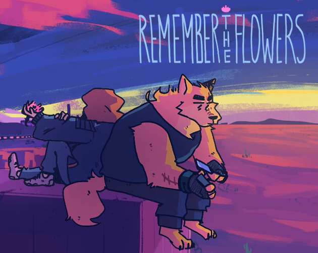
Remember the Flowers
by Jericho, Azzy-Lionblood, Alusiren
Set out on a journey of self-discovery, both past and future.
Show Review
(Review based on build 16)
(NOTE: watch out, major and minor spoilers abound! since the game presents so much of its basic premise as a mystery, it's impossible to talk about in depth without going into details. go play it first if you don't want to get spoiled!)
The initial review I wrote for Remember the Flowers was pretty positive, even if hesitantly so in a few places, but my feelings have soured somewhat since then. Some of this is due to the last couple of updates solidifying some specific criticisms I had, some just due to sitting with my thoughts for a while and reading comments other people have made.
The game's art is still good (and there's a lot of it), but apart from a few killer moments, I think its visual storytelling is kind of slight and imprecise on the whole. It's pretty common that I find myself looking at an illustration and asking: what is being communicated here? What is the story trying to emphasize by saying this with an image? What artistic decisions have been made, and how do they complement, enhance, or subvert the story being told by the prose? In a medium built on visual abstraction, I think there can indeed be too much of a good thing – apart from the images themselves often feeling weightless, the animations and the effects lose a lot of their impact as a result of the story deploying them in scenes that don't merit that level of underlining. Good direction is sometimes about being considered and purposeful and sometimes about showing restraint, and I think RTF has a tendency to fail in both directions.
I'm also kind of wondering whether putting all available resources into sprites and CGs was a good decision after all. In my prior review, I noted that the use of stock photos endows the worldbuilding with an eerie aura of dissonance – it's all so familiar but so wrong – but in hindsight, the art direction suffers a lot as a result. Beyond the specific designs of the characters (one minor nitpick, though: King is way overdetailed, failing to match the visual language of the other sprites) and a couple of well-established worldbuilding details, like how the Axiom works, there's simply not much that will make me say "oh yes, this is a scene from Remember the Flowers". In a visual medium, I think science fiction lives and dies by its sense of specificity, and it's a shame that it feels like not a lot of that is achieved here despite the clear amount of work put into the visuals.
16 chapters in, I feel like some fundamental structural issues are coming into focus. While I think the game is far too comfortable with wheel spinning on slice-of-lifey character interactions in general – the story can execute its big moments just fine, but the road to them is not always propulsive – there are specific setups that it takes way too long to follow up on. In particular: with Cooper being introduced as what felt like a major character, it's strange that basically nothing of impact has happened in his B-plot yet, even when it keeps popping up constantly.
The real culprit behind the main story advancing so slowly is probably the fact that the VN has to introduce a whole new cast of characters after Cooper goes to take a vacation away from the main action. Even worse, it takes a long while until Silver, the new dramatic focal point (?) – besides Axel, maybe – appears, with many, many words being spent with characters like Vita and Rose, who don't feel like they amount to much.
It's just kind of inelegant! I wish the game had figured out some way to make its major players show up earlier, and to elaborate on the (?) hanging out in the last paragraph over there, had more of a clarity of purpose to its cast in general. It often feels pretty hard to tell who will end up becoming important and who's just a random side character. How liberal Remember the Flowers is with giving minor characters sprites doesn't help, not to mention many of them just not being appropriately exaggerated in a way that would make them feel memorable and purposeful even without extensive screentime.
Also, continuing with character writing woes, I think the game has a bad habit of dumping personal lore somewhat clumsily; people in it often just talk about their backstories or relationships in a way that doesn't feel motivated by the present drama or plot events. While I get why they would share important information with each other, it just often feels like there's a narrative flow missing. I think the early Cooper section was a lot better with this due to the wolf feeling like someone who had their own agenda guiding their interactions with Cyrus; everything with the new crew is somewhat dramatically inert in comparison, with Cyrus getting to uncomplicated, friendly terms with everyone pretty fast. It's weird that there is no proper thematic fallout from the betrayal, and it's just not as exciting to read with the lack of conflict.
To give the game some credit it deserves, nearly all problems are in the big picture – the prose is clean and polished, and even many of its slower scenes are engaging to read on a basic level. I think it's just one of those cases where being tighter, more focused, and more deliberate would have made all the difference. Things do seem to be picking up slightly in the latest chapter, so who knows, maybe the final payoffs will be worth it after all; consider this review to be as preliminary as the previous one. I'll do a final writeup at some point, maybe after the game is finished.
Show Old Review
(Review based on build 13)
Love almost everything about this, the visuals & music in particular. The character designs are some of my favorite in any VN; the use of color in fantastic, and the designs of the main characters look unique and communicate a lot visually while still feeling like they belong in the same world. The mix of different art styles is nice, and how each is used feels purposeful.
The extensive use of photo backgrounds that seem out of place in the futuristic setting could be seen as a flaw, given that the worldbuilding is otherwise very good at making the world feel like a distinct place, but I kind of like the uncanny effect it creates. Can't really criticize where the game focuses its resources on, either; the graphical presentation feels like a huge part of why many scenes land so hard. Remember the Flowers puts the "visual" in "visual novel" in a way many games don't.
The writing is consistently good. The first arc feels like the tightest & most focused one, which I think may be due to how naturally it intertwines plot, worldbuilding, and character development. Instead of communicating characterization through story, the later parts have a bad habit of relying on what feel like direct infodumps, and Cooper's character introduction remains the smoothest overall. In general, there's also a slight lack of momentum after the big twist. I'm hoping the next arc regains the strong sense of direction of the first parts – their slice of life-y hangout scenes were more engaging due to how purposeful every scene felt, both on a micro and macro level.
But this is a small flaw in a story that, on the whole, really succeeds at spinning a fairly generic premise into very interesting directions. Though I may grumble about the slower pacing in the latter half of the story, it does manage to establish the characters strongly enough that I'm pretty invested in seeing what happens next.
Sanctuary
by SanctuaryFVN
Aid a mysterious prince and embark on a journey to your own haven.
Show Review
(Review based on build 1.1.0)
Sanctuary is clearly a result of a lot of care and work. So far, though, it doesn't succeed at charting its own course through familiar genre waters, leaving the storytelling feeling light and to-the-point to a fault.
I will say that the art is polished, and the presentation doesn't have outstanding flaws apart from the drunk effects being a bit aggressive. On the other hand, write this off as a stylistic preference if you wish, but I feel like Ran's heavily detailed character design maybe borders on too busy. There are a lot of highlight colors and they're applied to fur in a lot of different ways it's not super easy to make sense of; the soft gradients in the neck area give an impression of natural coloration, but the patterns on his chest and sides are more like tattoos.
I'm also not sure how well the character profile is communicated visually. "Purple for royalty" makes sense as an association, but Ran's magical powers are less obvious by just looking at him despite there being all sorts of imagery you could play with. While I want to stress that the sprite isn't bad to look at, the design comes off as more of a first draft based on tentative ideas than something fully specific in its intent, you know?
The story kind of feels like it's still finding its footing, too. A lot and not much happens simultaneously – events take place and the machinery of the plot rolls forward, but the game feels unwilling to complicate things or take detours, losing the joy of the journey in its rush towards the destination.
For instance, consider the beginning before the two main characters meet. The protagonist wakes up, contemplates their situation for a bit, gets some fresh exposition via a newspaper, and heads out to a hunting expedition we only glimpse the very end of. It's kind of a bland stock opening, but more damning is how utilitarian and pared-down the writing feels, as if everything only served to anticipate the story kicking off with Ran's sudden appearance.
And while the viewpoint character feels like a fairly transparent vehicle for self-insertion – not a bad thing inherently, I would say – the lack of texture & history extends deeper. The world and the people living in it come off as set dressing in equal measure, only here to facilitate the story the game wants to tell. The backgrounds being so blurry that individual details are difficult to make out seems emblematic, since the setting of Sanctuary feels more like an abstract, video game-esque world of quests to complete and resources to gather than a physical space its residents exist in. It doesn't help that the jumpy structure creates an impression of the guys fast traveling everywhere, or that the adventuring guild concept is reminiscent of many a game (I think I located it somewhere between the structure of Dungeons & Dragons and the worldbuilding of Pokémon Mystery Dungeon in my mind).
I guess the other half of this is that the central character conflict, though not troubled in its execution, is sort of hopelessly archetypical. The stuck-up prince improving his pretentious ways through his unlikely friendship (or more?) with a commoner is a tale about as old as written literature, and so far, the game doesn't do much to breathe new life into the conceit or frame it in a unique manner. While reading, I found myself waiting for the moment when our central duo takes shape as truly distinct characters – there is lore about Ran's powers and background, but I'm not sure how much it does to enrich and define his role as someone in these particular fish-out-of-water circumstances. A dearth of specificity, of grounding, of compelling little details that immerse you in the text, haunts the VN.
Being formulaic is not a sin, and in all fairness, it's entirely possible that Sanctuary just hasn't shown its hand yet. Also, with prose and production values this solid, I imagine it will have no trouble finding an audience invested in precisely what it has to offer. Just personally, though, I can't really say that it connected with me at this point. I guess my primary advice would be: think beyond mechanical plot progression, and don't be afraid to linger in the details and the ambience.
Spark Hearts
by sparkheartsdev
Explore the world of virtues lost in the furry visual novel, Spark Hearts.
Show Review
(Review based on build 1.0.1 Alpha Public)
So, Spark Hearts. Let's just start with a pretty easy observation: the production values are difficult to appreciate when the project is even more of an early alpha release than the average FVN. A lot of visual assets are unfinished, the story doesn't go anywhere, and the engine is both buggy (some saves I made got stuck on load) and missing crucial features like the back button. The audio is pretty good all around, but the rest is more impressive in terms of the effort you can see going into the project than what it actually is.
Furthermore, while the results are difficult to judge with the environments in such a crude state, I'm not sure if the VN makes a convincing argument for its 2D+3D style. The camera spinning around is a cool effect, but the sprites being so easy to clock as two-dimensional cutouts hurts it a lot. I think stronger art direction and polish (lighting the scene properly, using shader tricks to make it feel less out of place visually, etc) would be needed to really bring the aesthetic together. There's also something wrong with the sprites in general; they look very blurry, which you can see by looking at the itch page's screenshots.
Narratively, the game opens with a heavy exposition dump. We hear a lot of clunky, incredibly abstract platitudes about "good and virtue" (with lines like "one must create a world of good and virtue not just for your own world, but also for the world of others"). The world was full of virtue, which was then lost and regained and lost again (?), but what does any of this really mean for the people living in it? The planet apparently being at a risk of falling apart metaphysically unless everyone gets their virtue on feels both too literal and too vague as a means of turning the central philosophical topic into tangible stakes for the narrative. Surely there is more interesting stuff to say about what it means to live a good life?
A similar lack of specificity and grounded details haunts the next longer scene, where the protagonist meets the rest of the cast in what is ostensibly the most prestigious educational program in the entire world but what seems to involve mostly hanging out and saying truisms about virtue. At this point, how nebulously the conflict continues to be defined starts to feel acutely frustrating – these people are supposed to fix societal problems, but the game just doesn't bother explaining what they are beyond the protagonist wanting to "help people".
Also, the infodumping is as graceless as it was in the opening, with every character loving to say basic facts about the setting out loud. I feel like these top-tier academics would already know most of this stuff, particularly as it pertains to the very hyper-elitist program they were chosen to attend.
Between all that, the exaggerated characters, and the self-conscious references to visual novels and anime, the writing just comes off as kind of juvenile. There are some nice comedic moments, but despite the heavy-handed tone in which this whole virtue thing is discussed, Spark Hearts doesn't really manage to turn its big themes into anything resembling coherent points about the world we live in or compelling conflicts for the fictional characters to care about. Given that what the initial release contains is only "Chapter 1, Part 1", there's plenty of time for course correction, but I think the story starts on a pretty sour note regardless.
The Blue Cloth
by Eymon
Time passes slower on the road.
Show Review
The Blue Cloth stuns with its production values – the intricate sound design pulls off some tricks you rarely see in FVNs, and the amount of art assets is admirable for a game jam project. There's a lot to like in it, even if the narrative feels ultimately too messy.
Regarding the art style: it clashes somewhat with the tone in a way I think works in the game's favor. You see, the story itself is quite grounded and detail-oriented, conveying how much this trip sucks by centering material & logistical concerns (they even use lube!) while the bright, cartoony visuals suggest a lighter and more stylized fantasy journey. The mismatch ends up feeling meaningful as an "expectations vs. reality"-style dissonance; it's a nice bit of visual storytelling.
Another cool thing The Blue Cloth does is characterizing the existence of furries in the setting with the fact that the ones we meet are based on domesticated animals and with the art depicting them as somewhat human-like. You immediately get that all these species have some level of familiarity with each other – considering my later gripes with the game's exposition, I like that it manages to convey this aspect of the world without telling us anything.
The relationship between the Levis and Alfrin feels very real and is intriguing to read about. What the game does is more of an exploration of the dynamic between these two people connected by duty, not choice, than a simple arc of a character going from A to B – there's a literary undercurrent to it that I enjoy. It might be worth it dialing down the subtlety slightly and concluding on a more explicit note, though; the finale (particularly the orb scene, which feels kind of unclear in its purpose unless you read it as a metaphor for masturbation & gay self-discovery) can come off as a little underwhelming. While I ultimately think the central relationship more or less works, I wouldn't say no to exaggerating and elaborating the drama just a little.
However, worldbuilding is handled far less gracefully. Some stuff works – I like how magic is used to represent Levis' insecurities, and I think a lot of the dialog fills its purpose as flavorful idle chatter even when ostensibly feeding the reader lore. Still, on the whole, it's hard to shake the feeling that you're reading a lot of exposition about a magic system and related societal phenomena without ever really getting a proper payoff within the boundaries of this particular story. Everything just betrays the fact that the game uses a pre-existing setting; if inventing it from the ground up just for this thing, there's a lot you'd likely try to simplify or clarify.
The Blue Cloth almost succeeds as a standalone read. Dividing its attention between three characters and lingering on extraneous worldbuilding fluff, it's just not quite as tight and focused as being this short of a read demands. That being said, I'm more than ready for further tales set in the Clothverse, should the author go forth with their plans to return to the project after finishing Fields of Spring (which rules, by the way).
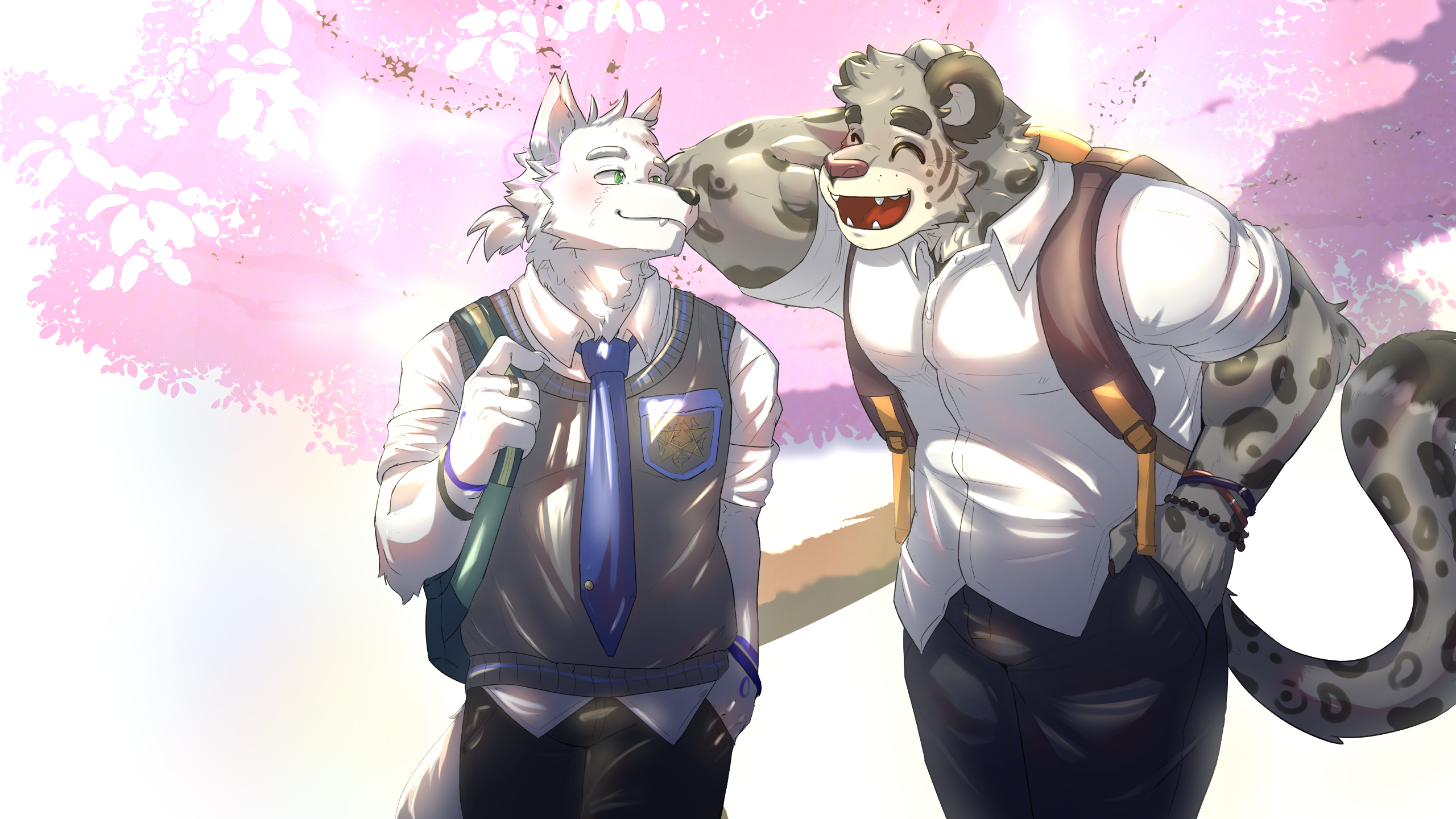
The Legend of Divinity
by Spark of Mad
TLoD
Show Review
(Review based on build 0.1)
The elephant in the room, first of all: the translation is a little rough. Besides some lines lacking translations (a bug that will be fixed soon, I presume based on the discussion in the comments), strange vocabulary and weird phrases are used sometimes, and the tense changes from time to time. It just doesn't really get past the effect of "ok, I'm obviously reading an imperfect translation" – comprehensible but unpolished.
As for the story itself, it's a fine start. Things move along relatively fast, and there are enough nice character moments that you already get a decent feel of the core cast (?). The biggest omission is probably the fact that the game has still not shown what magic looks like in this world, resulting in it feeling severely indistinct – all the details about potions and magical weapons are interchangeable with any other fantasy setting. The fact that the influence of Harry Potter in particular is so clear demands the story to do a little bit more in order to differentiate itself. Also, in a similar vein (though translation could be to blame here), both the academy's ultimate purpose (fighting is mentioned a lot; is this like a military school?) and the protagonist's reasons for enrolling feel kind of vague in what feels, if intentional, like a weird artistic choice.
That kind of thing is really worth establishing right in the beginning to give the reader a very concrete vibe about what to expect. The first build just doesn't provide enough information about the core aspects of the setting and the narrative to contextualize the initial story beats in a satisfying way. Apart from that, it's a functional start – the art of The Legend of Divinity is charming, and the character designs are nice. A pretty solid package all around, just too insubstantial so far.
To Whom I Loved
by SimonRatFilled
Show Review
(Review based on version 0.0)
The visuals were great, but though the prose was decent, I was let down my the writing on the whole.
The sudden narrative shifts were jarring. For this kind of thing to succeed, I think the writing needs to work harder in order to set up and telegraph what's coming up. This pretty short build felt like a mishmash of three different stories with their own genres and tones, and the transitions between them were pretty awkward – it was not a particularly smooth reading experience.
Also, the game splitting some lines into multiple screens by commas felt weird, since it wasn't even done every time. There's a small punctuation inconsistency with it, too; the rest of the sentance starts with capitals sometimes but not always. Not sure why this was done, honestly. If it's for the sake of rhythm or something, I recommend thinking of another way to do what you're trying to do, as this was just kind of weird and annoying to read.
Hard to give more concrete feedback, since the story didn't really get anywhere yet, but I feel like reworking the start to be more careful with tone and more clear about how all the different plot elements play together would help a lot. The backgrounds and the sprites looked nice enough, and I would gladly see them in a slightly better written version of the game.
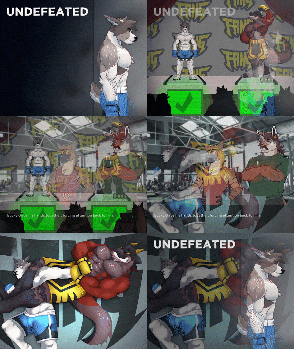
Undefeated
by Leo
Don't stop fighting until you hear the bell.
Show Review
So, Undefeated. Technically very solid work all around, and a finished VN is always an achievement to celebrate, but I find myself ultimately unconvinced by many of its narrative and structural decisions and underwhelmed by how the central storyline pans out.
Rereading the beginning with adjusted expectations (light on plot, heavy on character), I enjoyed it more than during the first go. The characters really make the whole thing – the central trio has good voices, and the personalities create natural opportunities for both comedy and tension. Later parts expose some weaknesses, though, in particular how heavily characterization relies on tragic backstories. Redline and Bruce seemed more interesting when introduced, as guys who just kind of are like this instead of guys who became like this as a result of what happened to them, and I think the reveals also solve a lot of inter-character conflict in a way that feels somewhat unearned. Also, it's a little strange how similar all the backstories are; by the end, I think the protagonists started feeling more like a collective, sharing the same burdens and wanting more or less the same things, than individual people.
I'd say the pacing of how everything plays when you read the story is actually pretty good – the weird part is just how long all the timeskips are in-universe, a choice presumably motivated by the characters suffering numerous injuries and, realistically, needing time to recover between fights. With the characters being stuck in one place as weeks and weeks pass, it feels a little strange that Zander's and Redline's friendship develops so slowly, as if nothing happened between the scenes the game chooses to show.
There are mechanisms for portraying the march of time with more impact – montages, flashbacks, etc – but Undefeated doesn't really use them. It's a small nitpick in the big picture, but I think it contributes a lot to how heavy and sluggish the character drama can feel at first, before you figure out the rhythm of how the game depicts the lives of the cast.
But if characters are hurt a little by the in-story timescale, the results are outright disastrous for the mystery plotline. The heroes feel quite passive, incurious, and lacking agency in general, but when combined with them taking months to do anything to investigate or resolve the urgent, immediately suspicious plot point in the heart of the story, you get something endlessly frustrating to read. Even worse, the eventual answer for why any of this is happening is not particularly interesting or surprising, nor are its consequences narratively satisfying. You can sense the game writing itself into a corner: the enemy is simply all-powerful, and even when the central trio figures out the truth, there is no non-contrived way for them to possibly fight back.
While I'd say that Undefeated definitely fits within the genre of mystery (there's a big central question relating to what instantly comes off as a shady conspiracy and clues leading to an ultimate big reveal), it feels like the construction of the plot relies entirely on sleight of hand. Besides the characters being powerless and not terribly inclined to take an active part in solving the case, the worldbuilding is quite unclear both when it comes to FANG itself and the world outside of it. Even after finishing the game, I'm not perfectly sure how dystopian the vaguely-futuristic setting is meant to be and how ordinary the events that take place are supposed to feel to the characters, if this is just business as usual in this world or something they should be more suspicious of. As for the fighting league the characters are employed by, it's a little odd how unaware they are of its inner workings at times; I'm not sure if I can buy anyone believing in the cover-up story for Zander's situation.
Basically, it feels like there would be no mystery at all if the game was a little more eager to deliver important information and the characters a little smarter and more invested in the conspiracy they're thrown into – the material itself is so simplistic and so thinly spread across the nearly 150 000-word visual novel. It doesn't feel like the right way to make this kind of plot work.
I think how straightforwardly the plot develops also affects the game's message. Undefeated doesn't really challenge or complicate its plain, inspirational "never give up" foundation, and it never quite manages to mesh that with its attempts at social commentary – the gestures towards addressing more intricate subjects (corporate greed, homophobia, social media and the surveillance society) feel ultimately hollow with how the game ends. There's nothing wrong with dreaming up a story where problems are solved with punching stuff really hard, but the very idealistic ending does give off a sense that the game is biting off more than it can chew here and venturing into territory it's not thriving in. The narrative framework we get is fine for addressing personal issues the character face, but it doesn't function with the systemic as well.
All in all, you can sense the tension between the character drama, which occupies a lot of narrative time, space, and focus, and the central mystery, which is insubstantial in comparison and often forced to stall for time. As an example, incredibly little of importance happens before the central trio grows close enough, as they kind of need to be friends for the climax to play out. It just doesn't really feel like everything the story wants to do works gracefully as one big package. That being said, I think Undefeated really shines in its more lowkey, slice-of-life and character-focused moments – the overarching plot is largely a burden, but there's a lot of good stuff in the middle.
My feelings towards the visuals and the fantastic soundtrack are more positive; there's nothing major to complain about, really. The character designs are superb – in particular, I like how everyone has a recognizable style and color scheme even across all the different outfits. (Undefeated also knows how to break this rule; there's a really good moment when you see Bruce in a flashback and he's wearing something radically different from his present-day fits. It's a basic thing but jarring in the perfect way, really solid visual storytelling.) And even if the fights lean towards plain presentation-wise, the smooth prose brings clarity to the action and remains consistently engaging to read.
I guess my sole issue is that the stock photos chosen for backgrounds look quite incohesive together and don't do a lot to communicate the big worldbuilding point that the entire facility is supposed to be underground. Even if baffling from an in-universe point of view for many reasons, it's a fun choice that does a lot to establish the oppressive atmosphere of the place, and it would have been nice to see the visuals reflect it more clearly. It's just hard to think of the characters as being actually trapped deep underground when they're standing in front of photos obviously depicting above-ground structures. The UI is very nice, though; as a small presentation nitpick, I think the content warning doesn't need to show up every time when you boot the game.
Ultimately, I can't help but feel like that though executed with a steady hand, the underlying story outline just isn't that good. Mysteries are haphazardly developed and the answers aren't that intriguing, characters overcome every problem they're facing with one big, unsatisfying happenstance, and the simplicity inherent to it all makes the thematic conclusions ring futile. It's a great premise in search for narrative scaffolding to make it work as a story – frustratingly, the only thing Undefeated is in desperate need of is more time in the planning oven, its most glaring flaws being plainly visible in the summary. The fact that it remains pleasant enough to read on a moment-to-moment basis is a testament to just how solid the writing, the art, and the music are, but I wish they could have existed in the context of something more compelling on a fundamental level.
Show Old Review
(Review based on version v0.5.0)
Compelling on a basic level but makes plenty of weird decisions. Hard to say anything conclusive at this point.
Undefeated looks good enough; its stock photo backgrounds create a fitting sense of nondescript monotony, although you could argue that it doesn't really take opportunities to establish the setting visually, contributing to the worldbuilding feeling vague. Besides that, I'd say that the fights being so static kind of feels like a missed opportunity. I like the character designs a lot, though.
(note: spoilers to follow! talking about this game without addressing plot details beyond what the itch page explains would feel very difficult.)
There is something a little weird in how the main plot is set up. Soon after the game begins, Zander learns that he will, supposedly due to a quirk in the matchmaking algorithm, be forced to fight the strongest guy in the league again and again until he wins. I don't think it's controversial to say that this plotline is implausible on so many levels – the fact that the contracts require fighters to, specifically, win a match before they can quit is very weird (since the setting is vaguely dystopian, why not just make quitting very difficult in general?) and the league being unable or unwilling to override the whims of the algorithm is similarly given very little justification. All that is, by itself, fine; it's a conspiracy plotline. The situation is supposed to be shady.
What is less understandable is that the characters themselves are all so willing to take this at face value, sort of accepting the obvious conspiracy as something that just happened instead of seeing it as such. They don't really investigate the situation at length or ask the questions the reader probably will, such as: is this some sort of plot against Zander in particular, or is he just a random bystander? Are the ratings of the fights really so good it justifies running the same curb stomp matchup over and over again? (Media attention is brought up occasionally, but the characters don't make the connection that it could be why someone wants all this to happen.) Does the league have a vested interest in giving Bruce easy fights he won't injure himself in?
How slowly the main plot develops and how passively the characters treat it is just so frustrating; months have passed in-story, but it feels like Zander has barely any idea what is going on with the weird events he got swept up in and what he should do in response. If some readers find the plot to be simply too contrived, it's probably because of this, not the concept inherently.
I imagine why the game is written this way mostly boils down to how the stakes and the pace of the plot don't fit together with the needs of the character drama. Even though the conspiracy overwhelms the entire story (it takes so long before you even see a normal fight), the arcs of Zander and Redline don't have a lot to do with it yet – you could take the basic character profiles and put them in a version of Undefeated where Bruce isn't a factor and both of them just live a normal life in employment of FANG.
Not to mention that, at times, the game just gets very heavy to read with all of this happening at once! Like, is it really necessary or interesting for Zander to have such a difficult time connecting with people and making friends when the impossible situation he has found himself already carries enough dramatic weight? Does he need to continue being such an asshole to Redline long after the reader has warmed up to him and would probably just enjoy watching the two try to solve the problem together? The external and internal conflicts feel like they are fighting for attention when they should be complementing each other; I don't hate anything about the game's characters or the drama it spins around them, but it really feels like a structural mistake that the main plot has to spin wheels while all that happens. I think cutting some beats and spending less time on psychologizing the characters to get to the point faster would probably be worth it.
That being said, it sometimes feels like there's a slight satiric edge to Undefeated, and I'm left wondering how much of it is on purpose. Zander's situation essentially mirrors what most professional athletes go through: the rewards of moving up in the league are big (benefits gained by winning fights are constantly mentioned), but so are the risks (the gruesome injuries the fighters suffer are explicitly linked to similar real-life issues). The only difference is that in this dystopian exaggeration, the protagonist has no real chance of success and can only choose either being battered until he dies or quitting and breaking his contract with life-ruining financial consequences.
It's like any sports story about facing impossible odds – just without there being anything inspirational or cathartic to it. Could you call the VN a satire of that kind of stuff, an anti-narrative where the fights are deliberately unsatisfying and the plot will eventually be resolved with something else (like the exploited athletes rising up against the unjust system)? Maybe! Too early to say, but I'm not opposed to that kind of reading.
In any case, I can say that in spite of all the problems I have with its storytelling, the strange undercurrents of Undefeated at least make it a constantly engaging read. The prose is clean, and the game never lingers too long on any scene even when the story itself moves slowly; solid work all around. It's just too easy to feel hesitant about how smoothly the eventual payoffs will land and how much they will do to rectify the narrative developments so far to justify anything but a mixed review just yet.
MAY WOLF 2023
My reviews of the entries for the 2023 game jam in which participants made wolf-themed visual novels, optionally using provided sprite assets. Approximately ranked from best to worst; don't take the order too seriously.
The Flying General
by Loudo
Some limits can never be crossed.
Show Review
Love everything about this – the tight but purposeful pacing, the careful setups and payoffs, the occasional deadpan humor. The animations and the cross-cutting give the game a nice cinematic feel, which it uses effectively both to get across its intriguing worldbuilding and to build its atmosphere of desolate beauty.
The VN's most important assets are its fantastic instincts for what to reveal and what to keep ambiguous. In spite of the game jam's prompt, it doesn't get bogged down by the romance, confidently keeping its character portraits interesting but vague outlines and making its slower moments count thematically. It's not the shortest game in the jam, but out of what I have read so far, it may be the best at making every word matter.
I'm blown away by what The Flying General accomplished in around 8000 words and with mostly premade assets, sketching out a fascinating world and establishing a clear visual identity for itself, and I hope it gets lots of love as people go through the jam entries. (There are some polish issues, most notably the audio mixing, but I'm just excited to play it again once they are addressed.)
Labor of Love
by Rainy Midwest Studios
Inspiration can strike at the worst of times.
Show Review
Well written, patiently paced, elegantly constructed. The main characters are suitably archetypical – you get what their deal is pretty fast, but the game's gratifying dramatic arc explores their relationship with a sharp eye for interesting details and conflicts. In the end, it felt like a complete, satisfying story. And while there's not a lot of visual flair to the VN, its few tricks it has are used well; the transition to the embedded narrative near the end was pure cinema.
There Are Two Wolves Inside Of You; Both Of Them Are Gay
by WagleUnagi
A world where everyone can split in twain, you’re stuck on your lonesome feeling incomplete.
Show Review
I'm in awe. While the story is hard to judge in this state, TATWIOYBOTAG sold its central concept perfectly – it is examined from many directions in a pretty small amount of words, and there are already plenty of fun worldbuilding tidbits, such as a pronoun system that would make Jordan Peterson cry.
Visually, it's kind of an attack on your eyes sometimes (what on earth is going on with those speaker labels?), but in a way that feels consistent with using recolored sprites to represent people splitting in twain in its playfulness. I cannot wait to see more, and as a game jam entry, it's safe to say that it represents an interesting, original take on the MY WOLF subject matter.
Before You Depart
by Team Lycoris, Camazule, Bowser Puma, Arcadia Adair, CetusOtter, Rackoon
Slice-of-death visual novel.
Show Review
Very nice. The polish and the amount of effort put into every facet of the game is seriously impressive, especially for a game jam project. Given that staring at those same three sprites for like 20 games in a row gets inevitably kind of monotonous, I appreciate the choice to forego the game jam sprites in favor of original character designs, especially in how it allows the project to fully pursue its own visual style.
Narratively, the story is not necessarily the most original or subtle take on the concept, even if it is very delightful as an interpretation of the basic MY WOLF premise. But the prose is good and the dialogue is good (apart from the shouting section that leans too far towards melodrama, being so long and in ALL CAPS, and feels kind of unearned to me as a result), and the visuals and the music add a lot to the atmosphere. It's a satisfying read all around; my thanks to everyone involved for their hard work.
Moonlit Field
by ErebusWulfe
Let's have a little chat in our secret place.
Show Review
Instantly absorbing between its slick presentation and wonderful atmosphere. The cute sprite art and especially the detailed animations are a joy to look at, and I like how the photo backgrounds are curated and edited to ensure the game has a coherent visual style. The narrative, even if probably something you've probably seen before, has a lot of funny and emotional moments. There are a lot of bugs, but I'm impressed by the effort put into this and how well the final result comes together.

Go Golf Go!
by eyematerror, HypoNova
A furry romance VN... and GOLF?
Show Review
This one was a lot of fun! I'm not convinced it needed to be as long as it was (in particular, the characters who ended up just being anime references felt somewhat superfluous), but the snappy pacing made the game a pleasure to read through regardless. While the slow unraveling of all the magical bullshit was definitely one of the highlights, I do like that the story also discussed some fairly grounded ideas about sports and competition. In the end, I think it struck a nice balance between these two extremes. Apart from all that, I liked how the romance felt like a fairly essential part of the plot without dominating it entirely, and appreciated the effort put into making all the sprites. A very solid entry overall.
A Cheesy Romance
by lasagnalover69
Two men have a sexual awakening together.
Show Review
Like its central subject, the lasagna, A Cheesy Romance has layers to it. It is true that the game's trek through the thematic intersection of sex and food doesn't necessarily break new ground, making familiar observations about how desire manifests and develops. However, the simple premise is elevated by the work's precise, nearly documentaristic gaze. In A Cheesy Romance, sex can be titillating and it can be funny, but it is also always something more – an account of the inherent absurdity of being an intelligent pile of meat and organs wired to feel strange urges.
The game's most potent thesis statement can be found in its split ending, where rejecting the transgressive direction the story takes leads to a facsimile of a heteronormative endgame. This choice is a testament to the visual novel's willingness to be in conversation with its reader: what are you here really for? What did you expect, and what do you desire? also they fuck the lasagna
Mithridatium
by City of sneps
Blood most precious
Show Review
A nicely atmospheric little game with effective moments of understated solace. There are some rough edges, like some of the photo assets being distractingly low-quality; still, the pieces fit together well, with the macabre, sardonic mood and the flowery, occasionally weird prose complementing each other perfectly.
The setting, while intriguing and competently worldbuilt, does feel like something developed for a larger project – judged purely as a standalone work, it's not terribly efficient, spending a lot of its time on details that don't get paid off yet. But wrangling its micro-arcs competently, the narrative ends in a good place, feeling satisfying both as the conclusion of this particular story and as a prelude to whatever may follow. I'm glad it got released despite missing the game jam deadline!
Blossoming Love
by NeveN
Show Review
Not bad. Short and sweet; really doesn't overstay its welcome, and there is some pretty effective character work done via small details. The non-linear structure elevates the story, which is pretty standard stuff otherwise – there is a nice sense of tension and momentum to how the plot develops. The presentation felt a little lacking, however, and it's not the most creative interpretation of the provided assets, either.
So Long as We Both Shall Live
by ragmaan
Love is eternal for as long as you live
Show Review
A pretty fascinating entry. It doesn't necessarily feel like there's a lot to it beyond the initial shock, but the prose is good enough to make it an engaging read, and I like how the concept is in conversation with the MY WOLF trope without feeling purely like a meta joke. While visually unpolished, the game has some good ideas there and there, and a nice atmosphere overall.
Sink or Swim
by Bluestuffeh
Show Review
A competently made package. While the tone occasionally dips into "well that happened" territory, it just underlines the social awkwardness of the present situation instead of acting as a distraction from the character drama. Every scene feels essential and the pacing is solid; the only kind of unsatisfying thing about it that the beach/swimming motif is abandoned after the opening. There could have been something – a frame story, a metaphor the story returns to – to tie it all together.
Cathexis
by GatrGroh
A short furry visual novel about BDSM.
Show Review
Not badly written, just feels like a pretty thin wrapper for a bunch of sex scenes. There are some decently funny (I love how the names Dom and Seb also serve a bluntly utilitarian function of making sure the reader knows what they're getting) and insightful (the discussion of cathexis) bits, but not a sense of there being something more under the surface. With the presentation also being fairly plain and a lack of CGs feeling kind of unfortunate, I guess it's the kind of game you like mainly if you're into it.
Night | Time Dreading | Fever
by Hollow
Pair up with a Wolf to help figure out who or what is attempting to kill you (again).
Show Review
The premise is creative and the plot is competently laid out, but both the investigation and the romance feel streamlined in a way that robs them much of their tension, despite the gritty premise. I do appreciate the well-utilized formal gimmick, however; it felt like a nice change of pace, since many of the games submitted for the jam don't really do anything with player choice. Visually, it's not the most polished entry – the sprites feel weirdly positioned, and the fact that all speaker names are in blue makes scenes with lots of characters kind of annoying to read.
April Showers
by TheBjakery
They say April showers bring May flowers. What do they have in store for Peter?
Show Review
What is there is pretty compelling and promising. There is a good amount of polish, and the original character design looks nice. I can't help but feel like it's all setup and payoff, though; the opening of the story did not make it seem like this would be its entire extent. Maybe the climax could have felt more conclusive with stronger framing and a tighter focus.
After Passion
by Akiba, Lavan, Ryezun, Jaden Black
A post My Wolf story.
Show Review
I will admit that the presentation feels pretty fresh. But while the character portraits achieve a nice sense of specificity, the thematically inessential high concept premise and the backstory of the setting feel inconsequential to the mundane romantic drama, reducing their impact to a few amusing gags. I find myself wishing the game had either developed them further or excised them entirely; in this state, the whole is hard to appreciate.

Welcome Home
by ScalesandTails
Never thought you'd be back so soon right?
Show Review
A solid execution of its pretty basic premise, with enough nice details and bits of the character work to make the setting feel lived in. But I feel like this really could have used some more time in the editing oven – the constant capitalization and punctuation errors and the frequent stray spaces, for instance, are actively distracting. There is also kind of nothing in terms of presentation.
Noodles & Love (release 1.1 - for playdate)
by Raccoon Formality
Gay furry visual novel dating sim for the Panic Playdate handheld.
Show Review
The choice of platform certainly earns the game some uniqueness points, and the limited visuals give it a very distinctive look. The engine feels kind of ungraceful, though, with the text box being so small that a lot of lines are awkwardly forced to span over multiple screens and with the sprites being so large that you can only see the faces (well, lucky that the assets were familiar).
On the writing side, my main impressions were "fast" and "utilitarian" – a lot of happens and a lot of locations are visited, but nothing really leaves much of an impression, and even the central relationship feels mostly like a hint of things to come in a theoretical continuation. I think the fact that the titular noodles don't really factor into the story epitomizes the problem pretty well. Some kind of hook or high concept premise missing, something to make the game stand out.
RogueStarRiver
by Vanillabell
Show Review
The writing does not feel particularly strong with the frequent punctuation errors, but there is some good dialogue. The two plot threads don't necessarily come together; there are a couple of thematic connections that are orbited around, but the payoff isn't as explicit as it maybe should have been to make this kind of shortform work feel cohesive. The presentation, meanwhile, is a bit plain – the custom sprites clash with the art style of the game jam assets, and the lack of movement and animation makes the fight scene feel static. Good music choices, though.

MOWolf
by chukkonius
A my wolf novel about getting to Mowing.
Show Review
Deranged, but not necessarily in a good way? Between all the weird quirks (like so many typos it seems intentional and the dialogue and narration UIs being used very weirdly), the prose is close to unreadable. The RPG elements, which seem to be the main point of the game, do not lead into some sort of punchline and are not visualized in a way that would funnily emphasize their realness in this world, if that's what is supposed to be happening. The vibe is stumbling across someone else's inside joke you don't get and have no way of enjoying.