🛈
Reading Furry Art is (hopefully!) a recurring series of articles in which I analyze interesting furry artwork in brief.
Reading Furry Art: Longing (Drake, 2023)
Furry art gets lots of appreciation in the form of social media traction, but sometimes I feel like we could be a little more active in our response to it – share our thoughts, leave a little comment sometimes instead of just hitting that like button and moving on.
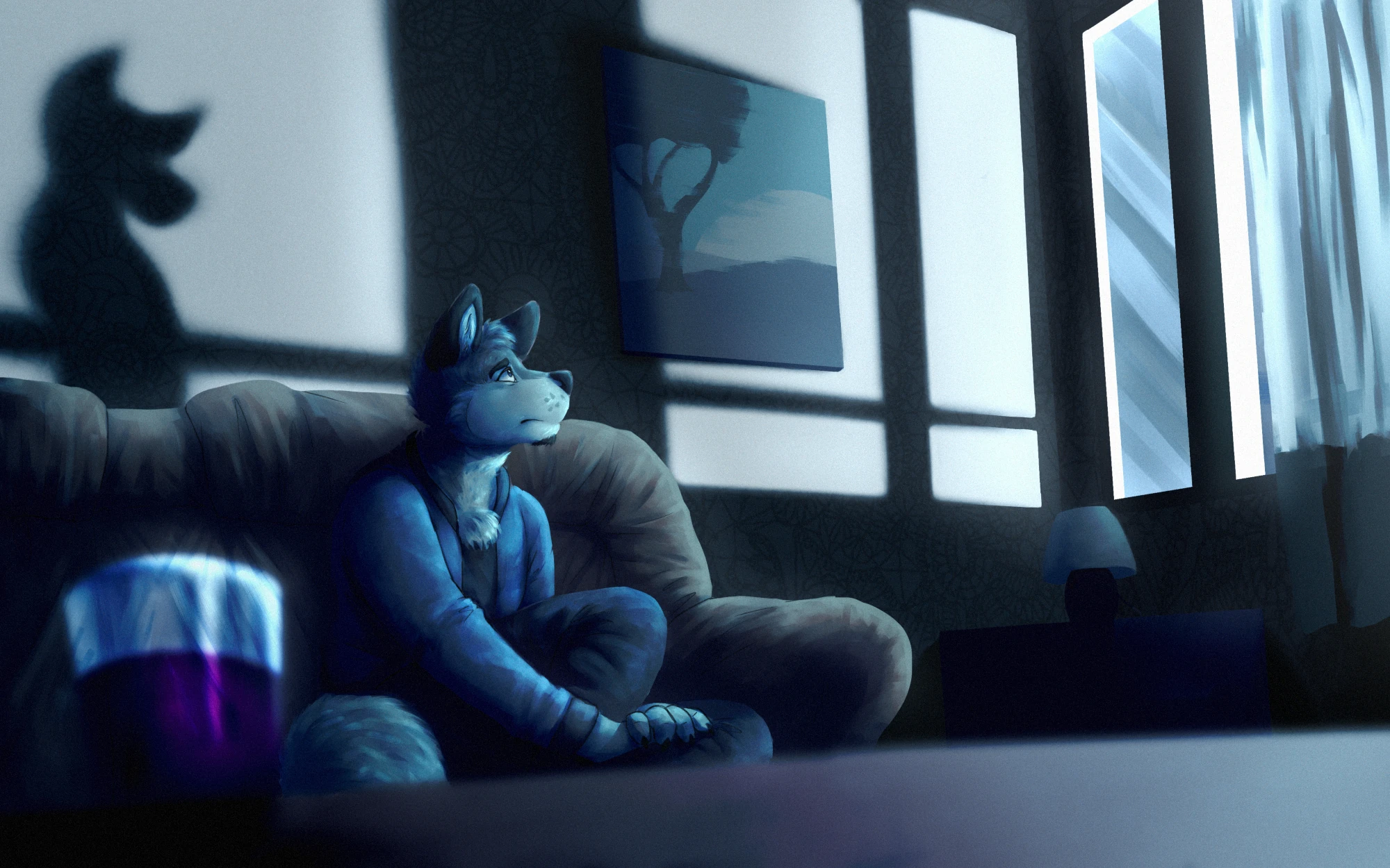
Of course, microblogging-oriented social media is kind of an awkward medium for commentary that doesn't fit in a single paragraph. Good thing this website exists, then! Today, in the first installment of something I'd ideally like to do a lot more of, we're looking at this piece by Drake:

Looking at it, I'd say that the emphatic interplay of lights and shadows dominates the picture – at first, you might find your attention drawn to the patterns projected on the wall by an unseen light source shining through the window instead of the canine.
This is sort of unusual both in the context of furry art in general and the artist's body of work in particular. Drake loves to use lightning like this, but he usually does it to emphasize characters, framing them with stark lines and geometric compositions that delineate the foreground from the background. (Some of his character illustrations for reference.)
Here, the canine is mostly in the shadows, and other details – the painting depicting an appropriately nightly scene, the shadow on the wall – are highlighted as prominently. The overwhelmingly cold color scheme (the purple drink provides the sole splash of warmer hues) adds to the visual effect: the canine's clothes or their gray, brownish fur, all enveloped in pale blue glow, fail to stand out with their colors being reflected everywhere else in the room. Worth noting, too, is that the right side of the image, though containing fewer objects of interest, is illustrated with sharp, precise lines in contrast to how blurry much of the left side is. Also, the density of details it is rendered with compares to the character.
All in all, I think it's fair to say that there is not a single clear focal point. Your attention is guided towards a lot of different spots – the character, but also the window, the shadow with its powerful contrast, and even the drink, which does jump out by breaking the otherwise very cohesive palette in spite of sitting in the foreground all blurry.
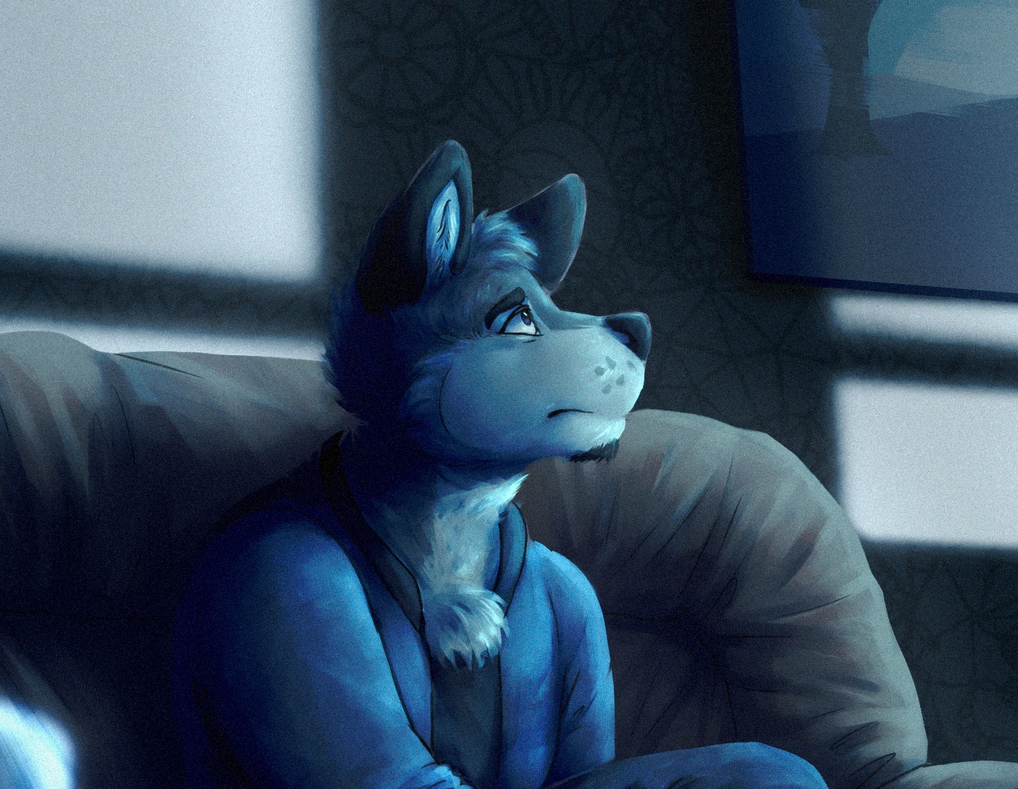
Besides creating an ominous, barren feeling of the character being consumed by their surroundings, I think this evokes a delayed response in the viewer. You kind of have to use your eyes to get what's going on – it takes a moment to notice where everything worth paying attention to is, and the canine's expression is not immediately obvious. Speaking of...

On the whole, I think, there's a pretty clear sense of emotional clarity to the piece. The wistful melancholy the accompanying social media captions characterize the piece with feels fitting: (Last night I stayed up / Late alone imagining / That you'd still be here; i stayed up late / and far into the distance i watched, / i tried to find you there).
But maybe there's something more specific to it; the canine's expression doesn't seem just sad, even if that layer is definitely there. I feel like the ever so slightly raised eyebrow, the barely parting muzzle, and the inquisitive ears point gently towards surprise. It may be too early to say whether it's a positive or a negative one – the canine is looking slightly upwards, as if having just noticed something – and, notably, we don't see what the character sees, just their somewhat ambiguous reaction.
There is another element to the piece, of course.

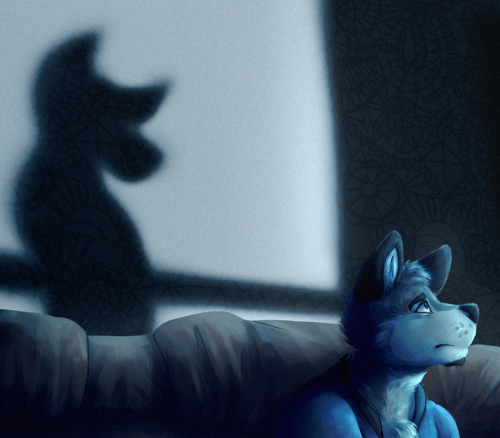
First of all, another patented Drake trademark: this kind of use of textures. The shadow looking more solid and definite than the wall it sits on by the virtue of retaining the pattern of the wallpaper, otherwise lost in the stark lightning, is absolutely gorgeous; it's a nice visual touch and effective storytelling.
Anyway, what stands out to me before all else is how anatomically stylized the shadow is compared to the canine. I would forgive you for mistaking it for their shadow at first, and I'm sure that initial impression is purposeful, but I think the exaggerated silhouette (even the species is impossible to tell for sure, though the pointy ears and the long snout are certainly canine-like) makes me lean towards reading it as an entirely separate entity. Besides, everything in the image that affirms the feeling of separation and solitude is equally applicable to their end – "i tried to find you there", and, in fact, did I?
Also, continuing with the theme of lines of sight: in what feels like a pretty trippy effect, while whoever or whatever casts the shadow is not looking towards our canine (instead facing away, if we move them where they should be), the shadow itself is. Note also the slight distortion – the right outline of the light area is kind of bent.
What does this mean? The emotional state being conveyed here is even less clear, but it's hard for me to not read the shadow's pose and the paradoxical manner in which they both look at and face away from the canine as being darkly playful, conceited, maybe somewhat accusatory. In combination with this, I feel like the ambiguity of the shadow and its unseen source (recall the drink, which could be a signal towards the unreal) make for a startling, even threatening atmosphere. In any case, there is certainly no trace of a happy reunion or quiet comfort here – the longing is neither answered nor reciprocated.

I'm not necessarily calling this a horror piece or anything – it might, in the end, lean more heavily towards sad – but I think there is definitely some kind of tension at play, trying to parse the essence of something we can only observe through its shadow and another party's reaction. The colors and the composition pull all sort of tricks, trying to direct your attention elsewhere and letting the whole unfold gradually; there's an effective slowburn subtlety to it. (Funny that a piece so reliant on the visual act of looking also makes examining it such an involving experience.)
Anyway, I hope I've succeeded in articulating why I like it the artwork a lot. This was a fun writeup to do, even if it took me a lot of effort and many attempts; guess I need to flex those image analysis muscles some more. Looking forward to examining whatever interesting furry art I come across next!
This was Reading Furry Art. If you happen to share my fondness for the piece in question, you can find it and Drake on Twitter, Tumblr, and Bluesky.
If you're reading this, you've already found me. Follow me on other platforms, though, and maybe even yell at me on Retrospring if you've got something to say.